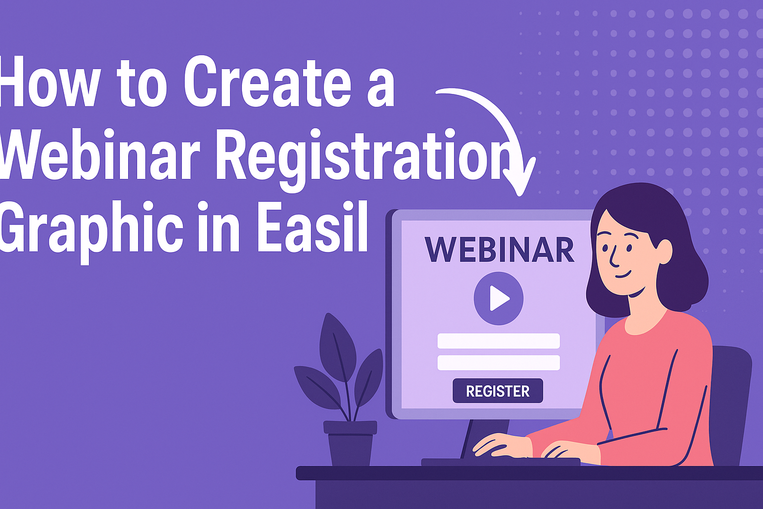
Creating an eye-catching webinar registration graphic is crucial for attracting attendees.
In Easil, users can easily design an engaging graphic that includes key information and visuals to draw in potential participants. With the platform’s user-friendly features, even those with little design experience can produce professional-looking results.
Customization options in Easil make it simple to match the graphic to a brand’s style.
By using attractive colors, fonts, and images, creators can make their registration pages stand out. This helps to emphasize important details like the date, time, and registration link.
Embarking on this design journey can be a fun experience.
Those eager to enhance their webinar marketing will find Easil’s tools helpful in making a lasting impression on their audience.
Understanding Webinar Graphics
Creating engaging webinar graphics is key to attracting attendees and conveying information effectively.
This section explores the importance of visual design and the right graphic dimensions to use for webinars.
Importance of Visual Design
Visual design plays a crucial role in a webinar. It captures attention and enhances understanding.
Good design can make complex information easier to digest. Using relevant images or icons can illustrate key points without overwhelming the audience with text.
A well-designed graphic encourages interest and helps viewers remember the content.
Color choices also affect how people perceive a webinar. Warm colors may convey excitement, while cool colors can suggest calmness. Ensuring that designs align with the webinar’s theme improves overall presentation.
Graphic Dimensions and Formats
Choosing the right dimensions and formats for graphics is essential for a polished look. Many webinars are viewed on different devices, so it’s important to use responsive designs.
Common dimensions for webinar graphics include 1280 x 720 pixels for landscape presentations and 1080 x 1080 pixels for social media posts.
File formats also matter; JPEG and PNG are popular for images, while PDF is often used for documents. Each format has its strengths. For example, PNG supports transparent backgrounds, making it versatile for various designs.
By considering dimensions and formats, creators can ensure their graphics appear clear and professional across all platforms.
Designing Your Webinar Registration Graphic
Creating an eye-catching webinar registration graphic is essential for attracting attendees.
Key aspects include selecting the right template, customizing visual elements, and ensuring your branding is prominent.
Choosing a Template in Easil
Starting with a template can save time and effort. Easil offers a variety of webinar registration templates designed for different themes and styles.
When selecting a template, consider the event’s topic and target audience. A corporate webinar might benefit from a sleek, professional design, while a creative workshop could use vibrant colors and playful fonts.
Easil allows users to filter templates based on style and format, making it easier to find the perfect fit. After choosing a template, he or she can easily modify it to suit specific needs.
Customizing the Visual Elements
Once a template is chosen, customization becomes key. Users can change colors, fonts, and images to make the design unique.
It’s important to maintain readability throughout the graphic. Bold text can highlight important information, such as the webinar title and date, while lighter fonts can be used for less critical details.
Incorporating high-quality images or icons can elevate the design. Easil allows for easy image uploads and adjustments, ensuring that visuals complement the text seamlessly.
Incorporating Branding
Branding is crucial for any webinar graphic. It helps create a recognizable identity.
Easil makes it simple to add logos and specific brand colors to the design. Consistent branding enhances trust and professionalism.
He or she should use the same colors and typography that are present in other marketing materials. This approach creates a cohesive look across all platforms.
Additionally, including social media handles or website links can drive engagement. When attendees feel connected to a brand, they are more likely to register and attend the webinar.
Optimizing for Conversion
Creating an effective webinar registration graphic requires focus on specific elements that drive user engagement.
By honing in on the call-to-action and understanding color and typography choices, it becomes easier to attract and convert potential attendees.
Best Practices for Call-to-Action
The call-to-action (CTA) is one of the most critical elements of a registration graphic. Its design and placement can significantly impact conversion rates.
-
Be Clear and Direct: Use simple language like “Register Now” or “Sign Up Free.” This clarity helps guide the audience’s actions.
-
Use Action Words: Incorporate active verbs that prompt immediate response. Phrases like “Join Us” encourage users to take action.
-
Placement Matters: Position the CTA in a location where it stands out. Ensure it is easy to find, preferably above the fold.
-
Visual Emphasis: Make the CTA button pop using contrasting colors. Bold fonts also catch the eye, making the CTA harder to ignore.
These strategies ensure the CTA effectively drives visitor engagement and registration.
The Psychology of Color and Typography
Color and typography choices in a registration graphic can influence viewer emotion and behavior.
-
Color Psychology: Different colors evoke different feelings. For example, blue can convey trust, while orange often inspires urgency.
Choose colors that align with the event’s message.
-
Consistency: Keep color schemes consistent with your brand identity. This builds familiarity and trust.
-
Font Selection: Use clear, readable fonts. Sans-serif fonts are often more accessible for digital graphics.
-
Hierarchy and Size: Establish a visual hierarchy using font size. Headings should be larger, guiding the reader through important information.
By thoughtfully combining color and typography, the registration graphic will be more appealing and effective in converting visitors.