Creating a timeline design for a website can seem challenging, but it doesn’t have to be. With the right tools and steps, anyone can craft an engaging timeline that effectively highlights important events or milestones.
Using Sketch, a popular design app, streamlines this process, making it accessible to both novice and experienced designers.
In this guide, readers will discover practical tips for leveraging Sketch’s features to produce a visually appealing timeline.
From choosing the right layout to incorporating dynamic elements, these insights will help take their website’s storytelling to the next level. By the end, they will feel empowered to create timelines that capture attention and communicate information clearly.
Getting Started with Sketch
To begin designing in Sketch, understanding the interface is essential. Setting up a new document correctly allows for smooth workflow.
Knowing the right tools makes the design process easier and more effective.
Understanding the Sketch Interface
The Sketch interface is user-friendly and intuitive. At the top, there is a menu bar with options for file management and editing.
The left sidebar shows the layers and symbols, helping users keep elements organized.
The central canvas is where all designs occur. Users can zoom in and out to focus on details or get a broader view.
The right sidebar contains important properties and settings for selected items.
Familiarity with these components helps streamline the design process. It also enables quicker navigation between different functions.
Setting Up Your Document
Creating a new document in Sketch is straightforward. Users simply click on “File” and select “New.”
It’s important to choose the right artboard size based on the project—be it for web, mobile, or other platforms.
Each artboard can be renamed for better organization. Setting up grids and guides can assist in aligning elements consistently.
These features ensure a clean and professional look for all designs.
Saving the document in the right format is crucial. Sketch files are saved with a .sketch extension, which is necessary for future edits.
Essential Tools for Web Design
Sketch offers a variety of tools tailored for web design. The Shape tools (rectangle, oval, etc.) create basic designs. Using the Text tool helps in placing and editing content effectively.
The styling options enable users to customize colors, borders, and shadows. This is vital for creating visually appealing elements.
Symbols are another important feature. They allow designers to reuse elements across the project. This not only saves time but ensures consistency throughout the design.
Using these essential tools, designers can create compelling web layouts that look professional and polished.
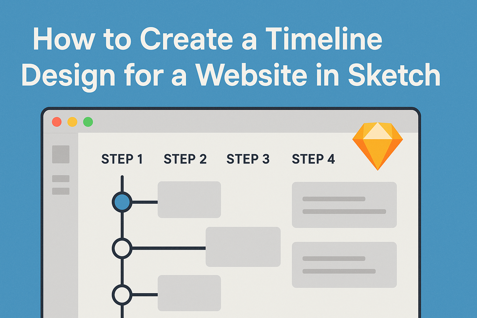
Designing the Timeline Structure
Creating a well-structured timeline design for a website is crucial. It helps users follow the progression of events clearly and efficiently. This section covers essential elements to consider when designing the timeline structure.
Defining the Timeline Layout
The layout is the backbone of the timeline design. Choosing between a vertical or horizontal layout depends on how much information needs displaying and the overall website aesthetics.
For a vertical layout, items are stacked one on top of the other. This is effective for showcasing numerous entries without overwhelming the viewer.
In contrast, a horizontal layout spreads out entries side by side, making it easier to compare events simultaneously.
Designers should use clear divisions for each time segment. This could include lines or boxes to separate events visually. Make sure to maintain a balanced visual flow to enhance user engagement.
Creating a Scalable Grid System
A scalable grid system is vital for maintaining consistency across various devices. Designers should select a grid system that allows for flexibility and adjustments.
Using a 12-column grid is a common choice. This enables easy alignment of elements and provides enough space for details.
Designers can adjust the grid based on screen size, ensuring the timeline looks good on mobile and desktop.
Effective spacing is also key. Margins and padding help make content readable.
Keeping the grid responsive enables the timeline to adapt without losing its structure on different devices.
Adding Time Markers and Dates
Time markers are essential for guiding users through the timeline. They serve as reference points and should be clearly visible.
Designers should use bold fonts or icons for markers, ensuring they stand out. Each marker should be accompanied by a date. This helps users understand when events occurred at a glance.
It’s also helpful to consider color coding for different types of events. For example, major milestones might be highlighted in a distinct color, while regular updates could use a muted tone.
This visual distinction adds interest and aids navigation, enhancing the user experience.
Styling Your Timeline
When designing a timeline, attention to styling can greatly enhance the visual impact. Key elements like color schemes, typography, and graphics play vital roles in making the design engaging and easy to read.
Choosing a Color Scheme
Selecting a color scheme is crucial for creating a cohesive look. It helps set the tone of the timeline and conveys the right emotions.
A good starting point is to choose a palette with 3-5 colors that complement each other.
Consider using a primary color for important milestones and secondary colors for supporting information. Tools like Adobe Color can help to visualize these combinations.
Ensure that the colors chosen maintain good contrast with the background for better readability.
Lastly, think about the psychology of colors. For instance, blue can signify trust, while green might represent growth. This can add depth to the timeline’s message.
Using Typography in Timelines
Typography significantly affects how information is perceived. Selecting appropriate fonts can help create hierarchy and improve readability.
It’s best to choose two to three fonts that work well together. One can be used for headings and another for body text.
They should be easily readable, with sizes that differentiate between titles and content.
Using bold or italic styles can emphasize essential dates or events. Ensure that the font sizes are consistent throughout the design to maintain order.
For best results, avoid overly decorative fonts, as they can distract from the information presented.
Incorporating Icons and Graphics
Icons and graphics add visual interest to a timeline. They can represent events and help break up text for easier navigation.
Choosing simple, meaningful icons is key. Each icon should relate directly to the text it accompanies. For instance, a clock can symbolize time-related events, while a book could represent research milestones.
Graphics, such as images or illustrations, can also enhance understanding. Placing them next to corresponding points will provide visual clues and context.
Make sure these elements are well-sized and do not overwhelm the timeline design.
Finalizing and Exporting
At this stage in the design process, it is crucial to ensure the final design is cohesive and ready for use. This includes checking for consistency, optimizing design assets for web use, and preparing for export.
Checking for Design Consistency
Consistency across the design creates a professional look. He should carefully review fonts, colors, and spacing.
Using a consistent color palette ensures that all elements align with the brand’s identity.
Tools like Sketch’s style guide can help keep things uniform. He should pay attention to elements such as headings, buttons, and icons. A checklist can assist in verifying that sizes and styles match throughout the design.
Optimizing Assets for Web
Optimizing images and graphics is essential for fast loading times. He should check file sizes and formats, choosing JPEG for photos and PNG for logos or icons.
Using image compression tools helps reduce file sizes without losing quality. This way, users get a smoother experience on the website.
Additionally, organizing assets into folders based on types or pages simplifies the development process later on. Naming files clearly also makes it easy for the development team to find what they need.
Exporting Assets and Code Preparation
Before exporting, he should select the correct settings for each asset type.
In Sketch, he can choose multiple formats, such as SVG and PDF, depending on the project requires.
When exporting, it’s helpful to create a structured export hierarchy.
This includes categorizing assets into folders that match their use in the project.
He should also prepare any necessary code snippets or symbols that developers need.
Providing clear documentation alongside the exported files can ease the transition from design to development, leading to a smoother project rollout.