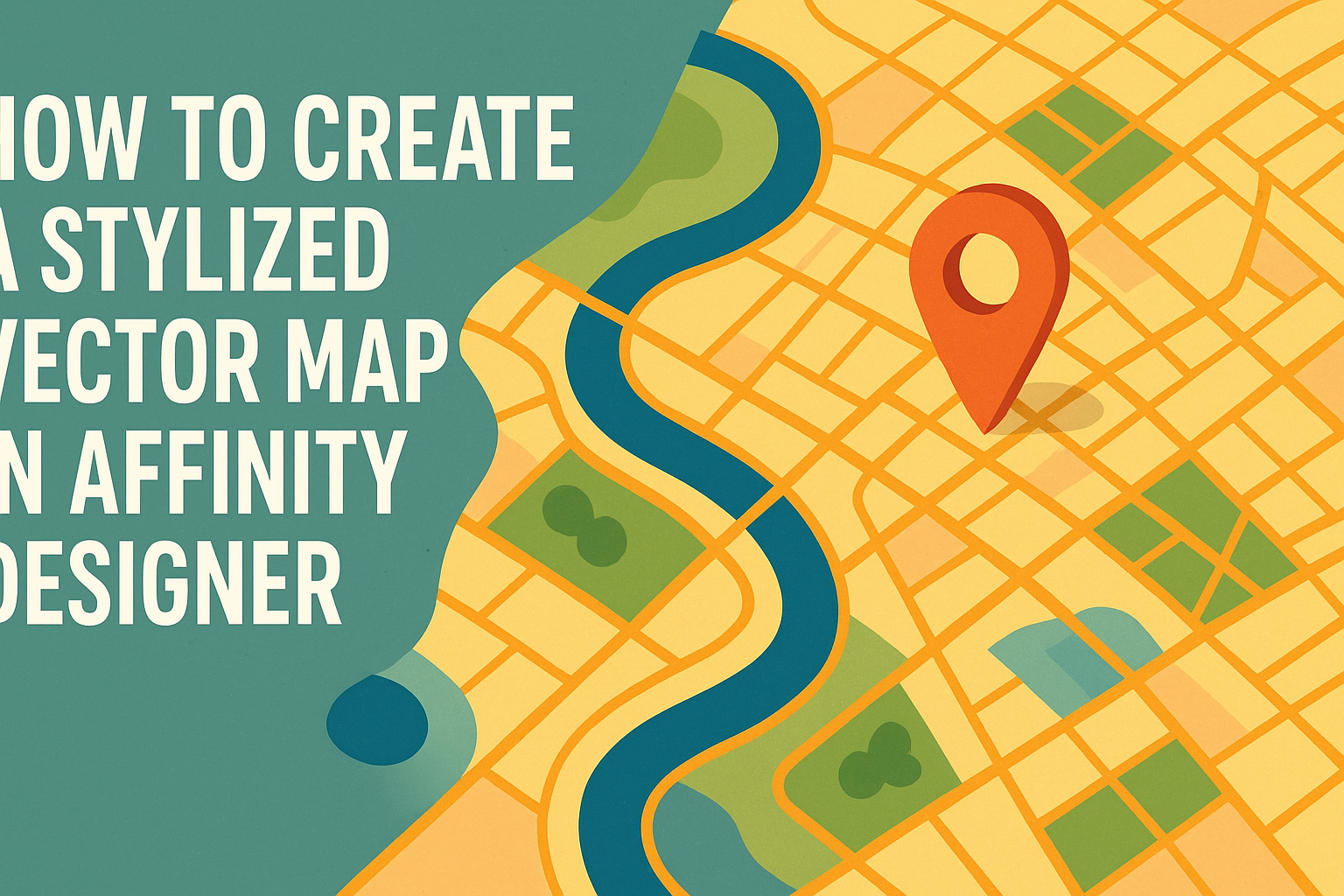
Creating a stylized vector map in Affinity Designer can be a fun and rewarding project for anyone looking to blend creativity with digital skills.
With the right techniques and tools, anyone can turn basic map elements into stunning visual designs that stand out.
This guide will help readers navigate the steps to transform ordinary maps into unique artwork.
Using features like the Pen Tool and custom brushes makes the process smoother and more enjoyable.
By learning how to incorporate styles and colors effectively, artists can bring their personal touch to every map they create.
Whether for a personal project or professional use, stylized vector maps offer endless possibilities for creativity.
Readers will discover helpful tips and resources throughout the article, enabling them to develop their own style.
Following along will provide the knowledge needed to craft eye-catching maps that not only serve a purpose but also tell a story through design.
Getting Started with Affinity Designer
Affinity Designer is a powerful tool for creating stylized vector maps. Learning how to navigate its interface, set up a document, and import map data is essential for a smooth design process.
Understanding the Interface
The interface of Affinity Designer is user-friendly and intuitive.
It features a toolbar on the left, allowing quick access to tools for drawing, shaping, and coloring. The context toolbar at the top provides options based on the selected tool, making adjustments straightforward.
On the right, the Layers panel helps users manage and organize their design elements.
Understanding how to navigate between the Designer Persona for vector work and Pixel Persona for raster design is crucial. This flexibility lets a designer easily integrate textures into their vector artwork.
Setting Up Your Document
When setting up a document, users can choose the document size and resolution.
Starting with a new file, she can select File > New, which opens a dialog box. Here, she can specify the width, height, and DPI (dots per inch).
Choosing the correct DPI is important for print quality. A common setting is 300 DPI for printed maps and 72 DPI for digital displays.
A well-organized document structure with layers for different elements, like backgrounds and markers, will make the design process smoother.
Importing Map Data
To create a stylized map, importing existing map data is often helpful.
Users can import data in formats like SVG or PDF. By selecting File > Place, they can insert the map into the workspace.
After importing, designers can lock the layer with the map for easier tracing.
Using vector tools, they can outline important features and create a stylized look. It’s also possible to modify colors and styles to match the intended design.
Making the imported data fit within the document’s layout is essential for a professional appearance.
Creating the Map Elements
In this section, the process of designing individual components of the map will be explored. This includes drawing landmasses, adding roads, and styling water features to create a visually appealing map.
Drawing Landmasses and Shapes
To draw landmasses, the Pen Tool is essential.
Users can start by sketching rough outlines of the desired shapes. It’s helpful to keep landforms simple yet identifiable.
After creating the basic shape, applying the Fill option gives it color. Different colors can represent various terrain types, like green for forests and brown for mountains.
Users should keep the edges slightly irregular to mimic natural coastlines. This adds a more organic feel to the shapes.
They might also consider layering shapes for islands and lake areas to add depth.
Adding Roads and Pathways
When adding roads and pathways, the Line Tool is a practical choice.
Users can draw straight or curved lines to represent different types of roads.
To enhance their visibility, lines can be adjusted with varying stroke widths. Using a dashed line style can represent trails or secondary pathways.
Placing small icons or symbols at junctions helps indicate points of interest, such as shops or landmarks.
It’s important that the design remains clean and not overcrowded for better clarity.
Stylizing Water Bodies
Water bodies like lakes and rivers should be visually distinct.
The Pen Tool can help create smooth, flowing shapes. Users can apply a blue gradient fill to simulate depth.
Adding effects such as opacity variations creates a more realistic look. A soft blue color with hints of white can mimic the sparkle of sunlight on water.
Including small waves or ripples using a Brush Tool can add dynamic elements, showcasing movement.
Carefully placed labels for rivers and lakes enhance the overall map readability.
Styling Your Map
Creating a stylized vector map involves careful choices in color, texture, and decorative elements. These choices enhance the map’s visual appeal and help convey its message clearly.
Choosing a Color Palette
Selecting the right color palette is crucial for any map design. A cohesive color scheme can establish a mood or theme for the map.
Using tools like Adobe Color or Coolors can help in finding complementary colors. For instance, a palette with soft blues and greens is perfect for depicting water and land.
Consider the map’s purpose; vibrant colors may work for a tourist map, while muted shades suit a historical map.
It is important to maintain contrast between land, water, and text to ensure readability.
Limit the palette to 5-7 colors to avoid overwhelming viewers. Balance bright colors with neutrals to create an inviting layout.
Applying Textures and Patterns
Textures and patterns can add depth and interest to a map. They transform flat areas into visually engaging sections.
Affinity Designer offers various brushes and textures for this purpose. For example, a subtle paper texture can provide warmth to borders.
Incorporating patterns in areas like fields or forests can indicate different terrains. Using repeated motifs ensures consistency.
Layers play a vital role. Designers can overlay textures on top of color blocks and adjust transparency for subtlety.
A well-placed texture enhances details, drawing attention without distracting from the map’s information.
Decorating with Icons and Landmarks
Adding icons and landmarks makes a map easier to navigate and more relatable. They guide users and enrich the visual storytelling.
Choose simple, recognizable icons that relate to the map’s theme. For instance, a mountain icon can symbolize hiking trails, while a sun can indicate tourist attractions.
Affinity Designer allows for custom icon creation, making maps unique. Incorporating a legend helps explain the symbols used.
Landmarks can be depicted with illustrations or stylized graphics. They should be distinctive but not overpowering.
Strategic placement of these elements ensures that they complement the overall design instead of cluttering the space.
Finishing Touches
Adding the final elements to a vector map enhances its visual appeal and usability. This section focuses on integrating labels and typography effectively, as well as applying layer effects and adjustments that can elevate the design.
Adding Labels and Typography
Labels give context to a map by identifying important places and features.
It’s best to choose fonts that are clear and match the map’s style. Serif fonts can add a classic feel, while sans-serif fonts usually look modern.
When placing labels, consider their hierarchy. Use larger text for main locations and smaller text for secondary details.
Bold text can highlight key areas, while using a lighter font weight for less important notes can improve clarity.
Ensure there is adequate contrast between the text and the background. This helps readability.
Utilizing text outlines or shadows can add extra emphasis when needed.
Layer Effects and Adjustments
Layer effects can add depth and interest to a map. Affinity Designer offers various options, like shadows, glow, and bevel.
Applying a subtle drop shadow can create an illusion of elevation, making elements stand out.
Color adjustments can enhance the overall look. Adjusting brightness, contrast, and saturation helps create a cohesive appearance.
Users can select multiple layers to apply these adjustments at once.
Using blending modes is another technique to help layers interact effectively. For example, a multiply mode can blend textures with the base colors.
This technique can add unique visual flair while maintaining the integrity of the overall design.