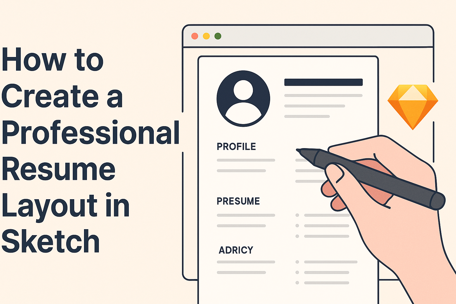
Creating a professional resume layout in Sketch can greatly enhance job prospects. A well-organized resume not only showcases skills and experience but also demonstrates attention to detail and creativity.
With the right tools and design principles, anyone can produce a standout resume that grabs the attention of potential employers.
In this article, readers will discover step-by-step techniques to design a resume that balances form and function. By focusing on elements like layout, margins, and typography, individuals can ensure their resumes are visually appealing and easy to read.
Learning how to effectively use Sketch for this purpose will equip them with valuable skills for future projects.
Whether starting from scratch or looking to improve an existing design, mastering these tips can make a real difference. The journey to a polished resume begins with an understanding of design fundamentals and the tools at hand. Embracing this process will lead to a resume that not only tells a story but also visually represents the individual behind it.
Setting Up Your Workspace
Creating a professional resume layout in Sketch begins with setting up your workspace. A well-organized workspace ensures a smoother design experience.
Here are the key steps to get everything ready for effective resume design.
Installing Sketch
To start, the user needs to download and install Sketch. Visit the official Sketch website and click on “Download.”
Once the download is complete, open the file and follow the on-screen instructions. After installation, they will need to create an account or log in if they already have one.
Make sure the system meets the requirements to run Sketch smoothly. Use the Mac app as it does not support Windows. This user-friendly design tool allows for smooth operations once set up correctly. After installation, they can explore other features by checking out additional resources.
Familiarizing With Sketch Interface
Once Sketch is installed, it’s time to get familiar with its interface. The main screen displays various options, including the Canvas, Inspector, and Library panels.
The Canvas is where the design work happens. Users can drag and drop objects to create their layouts.
The Inspector is crucial for adjusting styles and properties of selected elements. The Library panel enables access to reusable assets like colors and symbols.
Understanding these areas will help users navigate Sketch efficiently. They can explore Sketch’s tutorials for quick tips and tricks.
Using Templates for Resume Design
Using templates can speed up the resume creation process. Sketch offers various templates that can be modified to fit personal styles.
Users can browse through existing templates or create their own from scratch. Templates come with predefined layouts, making it easier to focus on content.
To access templates, check the Getting Started guide on Sketch’s website. Users should choose a template that suits their profession and desired look.
Customizing templates can enhance creativity while maintaining a professional appeal. This approach saves time and allows for easy adjustments.
Designing Your Resume
Creating an effective resume layout in Sketch requires careful planning in several key areas. This includes choosing a layout that best showcases experience, working effectively with text and fonts, and adding style through colors and graphics.
Choosing the Right Layout
Selecting the right layout is crucial for catching the eye of potential employers. A common choice is a two-column format that allows for clarity and easy reading. The left column can hold contact details and skills, while the right can display work experience and education.
Tips for Layout:
- Use grids to ensure even spacing and alignment.
- Keep it simple; don’t overcrowd the design.
- Ensure there is enough white space to make the information stand out.
Working With Text and Fonts
Text plays a significant role in how a resume is perceived. Using standard, professional fonts like Helvetica or Times New Roman can enhance readability.
Font sizes should vary to create hierarchy, with headings in larger sizes and body text smaller.
Key Points:
- Limit font styles to two or three for consistency.
- Maintain a clear structure with headings and bullet points.
- Avoid overly decorative fonts that may distract from the content.
Adding Style With Colors and Graphics
Colors and graphics can make a resume visually appealing but should be used wisely. A primary color scheme that matches the industry norm helps in maintaining professionalism.
Subtle use of color can highlight sections like headers or key achievements.
Color Use Guidelines:
- Stick to two or three main colors to avoid chaos.
- Use color contrasts to differentiate sections.
- Graphics should support the text, not overwhelm it.
Creating Custom Icons and Shapes
Incorporating custom icons and shapes can personalize a resume. Simple icons can represent skills, contact information, or hobbies. This provides a visual element that makes the resume more engaging.
Icon Creation Tips:
- Keep icons simple and easy to interpret.
- Ensure consistency in icon style and size throughout the resume.
- Use shapes to frame key sections for added emphasis.
Refining Your Design
Creating a polished resume layout involves careful attention to the details. Key elements like alignment, spacing, and visual hierarchy significantly impact the final design. It’s important to refine these aspects to ensure the resume looks professional and is easy to read.
Alignment and Spacing
Alignment is crucial for a clean and organized layout. Ensuring elements are consistently aligned helps guide the reader’s eye through the resume.
Using a grid system can assist in achieving precise alignment.
Spacing also plays a vital role. Adequate white space around text gives it room to breathe. Properly spaced sections create a more inviting appearance.
This can be done through margins, padding in text boxes, and line spacing. A good rule of thumb is to maintain consistent spacing throughout the document.
Visual Hierarchy in Design
Visual hierarchy directs the reader’s attention to the most important information first. This can be achieved through font size, weight, and color.
For instance, using a larger, bold font for headings can draw attention to key sections like experience or education.
Contrast is another effective tool. Using different colors for headings and body text can enhance readability. Additionally, bullet points can help break information into digestible pieces, allowing the reader to scan the document quickly.
Exporting Your Resume for Various Formats
Once the design is refined, exporting to the right formats is essential.
Different platforms may require different file types. For example, PDFs retain the formatting well and are universal for sharing.
When exporting, it’s important to ensure that all text remains clear and legible.
Choosing high-resolution settings will improve the quality. This is especially relevant when sharing the resume online or printing it, as it ensures a professional look no matter the medium.