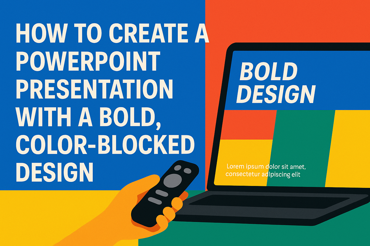
Creating a PowerPoint presentation with a bold, color-blocked design can make a lasting impression.
This eye-catching style emphasizes key points and keeps the audience engaged.
Whether for a business meeting or a school project, mastering this design technique will set any presentation apart from the rest.
To start, one should focus on choosing a strong color palette that reflects the message.
Using contrasting colors helps to define sections and guides the viewer’s attention effectively.
It is important to combine these colors with a clean layout to maintain clarity and professionalism.
Incorporating bold fonts and images also adds to the overall impact of the presentation.
By strategically placing text and visuals, an engaging flow is created that captures interest.
Embracing creativity in this way not only enhances the presentation but also makes it more enjoyable for the audience.
Understanding Color-Blocking in Design
Color-blocking is a design technique that uses large areas of color to create a striking visual impact. This method helps draw attention to key information in a presentation.
By using contrasting colors, creators can highlight important points and make them stand out. For example, a bright background can pair well with darker text.
Benefits of Color-Blocking:
- Clarity: It helps organize information and guides the audience’s eye.
- Engagement: Bold colors can keep the audience interested and focused.
- Hierarchy: Important details become more prominent.
To use color-blocking effectively, it’s important to choose colors that complement each other.
Complementary colors, like blue and orange, can work well together.
Consider using a color wheel to find combinations that look good. This can help create a visually pleasing presentation.
In PowerPoint, color-blocking can be easily applied using slide backgrounds. A bright, flat color can serve as a backdrop, while text or other design elements can be in contrasting shades.
Ultimately, color-blocking is about creating a balanced and effective design that communicates messages clearly and attractively.
Getting Started with PowerPoint
Starting with PowerPoint can be simple and fun. It’s essential to know how to navigate the interface and set up slides properly for creating a bold and colorful design.
Navigating the Interface
When opening PowerPoint, the Start Screen appears first. Here, users can choose to create a new presentation or access recent projects.
The interface is divided into key areas: the Ribbon, which contains tools for text, design, and animations; the Slide Pane, which shows thumbnail views of current slides; and the Workspace, where the selected slide is displayed.
Users can easily switch between slides and select a specific one to edit. Familiarizing oneself with these sections will help streamline the presentation creation process.
Setting Up Your Slide Layout
To set up a slide layout, users can click on the “New Slide” button in the Ribbon. Here, they can choose from various templates, including blank options and pre-designed layouts.
For a bold, color-blocked design, selecting a blank slide is a good start. Users can then add shapes and text boxes to create the desired layout.
It’s important to consider the arrangement of colors and shapes. Keeping a balanced composition will make the design eye-catching. Users should experiment with different layouts until they find one that fits their vision.
Design Principles for Bold Presentations
Creating a bold presentation requires careful selection of colors, clarity in text, and thoughtful typography. A well-structured design captures attention and enhances communication. Here are essential principles to keep in mind.
Choosing a Bold Color Scheme
A bold color scheme can make a huge impact. Start by selecting two to four main colors that complement each other. Bright colors can energize a slide, while darker tones can add sophistication. Tools like Adobe Color can help in picking harmonious palettes.
When choosing colors, consider their meanings. For example, red can signify urgency or passion, while blue often conveys trust. Make sure to use color consistently across slides to maintain a cohesive look.
Contrast and Readability
Contrast is crucial for readability. High contrast between text and background colors makes information easy to consume. For instance, black text on a white background is classic and effective.
Avoid busy backgrounds that can distract from the main message. Solid colors or simple patterns allow text to stand out. When in doubt, test the readability by viewing slides at a distance. This ensures everyone can read the key points, even in large rooms.
Typography Tips for Clarity
Typography also plays a significant role in bold presentations.
Choose fonts that are clear and easy to read, such as sans-serif fonts like Arial or Calibri. These fonts work well for both titles and body text.
Limit the number of fonts used to two or three to prevent visual clutter. Use larger font sizes for headings to draw attention. Keep body text at around 24 points for optimal readability.
Additionally, using bold or italic styles can emphasize important points. Make sure to maintain consistent font styles across all slides for a professional appearance.
Crafting Your Color-Blocked Slides
Creating effective color-blocked slides involves a few important steps. The right color choices, balanced with visuals and text, can enhance the presentation’s impact. Here’s how to get started.
Selecting Colours for Impact
When selecting colors, keep the audience in mind. Aim for a palette that creates emotion and engagement. A good rule of thumb is to stick to 3-4 colors to avoid overwhelming viewers.
Choosing a dominant color is key, as it sets the mood. Paired with a secondary color, it creates a pleasing contrast. Finally, an accent color adds vibrancy.
For example, a warm tone like orange can energize the audience. This can be complemented with a cooler shade like blue for balance. Tools like Adobe Color can help in creating harmonious palettes.
Working with Color Blocks
Color blocking involves using large areas of color effectively. Each block should serve a purpose, like highlighting important points.
To create a strong design, use the 60/30/10 rule. This means using 60% of the dominant color, 30% for the secondary color, and 10% for accents. This balance keeps the design visually appealing.
Place text and images strategically within these color blocks. Ensure there’s enough contrast so that everything is easy to read. Using light text on darker backgrounds or vice versa can enhance visibility.
Incorporating Visuals and Text
Visuals and text must work together seamlessly. When using color blocks, choose images that complement the color scheme.
Text should be clear and concise. Use bold headings to grab attention, and keep bullet points short. This approach makes key information easy to digest.
Consider adding icons or illustrations that align with the message. These elements can break up text and add interest. Ensure that visuals are high quality and fit well within the color blocks, maintaining the overall theme and flow of the slides.
Effective Use of Templates
Using templates in PowerPoint can save time and enhance creativity. Effective templates help create a bold, color-blocked design that stands out. Here are two ways to make the most of them.
Customizing a Template
Customizing a template is a great way to match a presentation to a specific theme or brand. First, select a template that has a bold, color-blocked layout. Then, navigate to the “Design” tab. From there, choose a style that resonates with the message.
Adjust colors by selecting the “Variants” or “Colors” options. This allows for a personal touch. Modify the fonts to ensure readability and consistency. Limit the number of different fonts to two or three for a clean look. Using shapes to create distinct sections can help convey information clearly.
Creating a Custom Template
Creating a custom template allows for complete control over the presentation’s look. Start by opening a blank PowerPoint presentation. Set a color palette that reflects the desired theme. This can involve selecting two or three main colors for a bold effect.
Next, design a slide master by clicking “View” then “Slide Master.” Here, users can add backgrounds, logos, or other design elements. These will apply to all slides. Saving this slide master as a template ensures it can be reused easily. Remember to test the template with sample content to ensure it maintains its visual appeal.
Adding Multimedia Elements
Incorporating multimedia elements can enhance a PowerPoint presentation’s impact and engagement. Videos, audio clips, animations, and transitions can make a presentation lively and memorable. Below are key methods to effectively add these elements.
Embedding Videos and Audio
To embed videos in a PowerPoint slide, click on the “Insert” tab, and select “Video.” Choose “This Device” to upload a file from your computer. Ensure the video file format is compatible, such as MP4.
For audio, choose the “Audio” button in the same “Insert” tab. Users can select audio files from their device. Once embedded, the audio icon appears on the slide. They can adjust playback options, such as setting it to start automatically or when clicked.
Adding multimedia like videos and audio can enrich the storytelling aspect of a presentation.
Using Animations and Transitions
Animations and transitions are effective for guiding attention and emphasizing key points. To add animations, select an object and go to the “Animations” tab. Choose an effect like “Fade” or “Zoom.” Adjust the order and timing of animations for a smoother flow.
Transitions help to switch from one slide to another. In the “Transitions” tab, users can select effects such as “Slide” or “Wipe.” Preview transitions to see how they will look.
Using these features increases interest and keeps the audience engaged without overwhelming them.
Presenting Your Color-Blocked PowerPoint
Presenting a color-blocked PowerPoint requires attention to both visuals and audience engagement. Using clear techniques can help make the presentation stand out, while effectively managing questions ensures a smooth flow.
Tips for a Memorable Presentation
To create a lasting impression, a presenter should start strong. They can capture attention with a bold opening statement or a striking visual. Utilizing the color-blocked design strategically will enhance key points.
Visual consistency is crucial; transitions should be smooth between slides. Using high-contrast colors can help emphasize important information. Keeping text minimal on each slide allows the audience to focus on the speaker’s words.
Practicing the timing enhances delivery. A presenter should rehearse to ensure they aren’t rushed and can maintain eye contact. This engagement keeps the audience interested and enhances the overall experience.
Handling Q&A Sessions
During a Q&A session, handling questions with confidence is key.
Acknowledging each question shows appreciation for audience involvement. They can restate or summarize the question to ensure clarity before answering.
Preparation is vital.
Anticipating common questions allows a presenter to respond thoughtfully. They should keep answers concise, focusing on the question’s main points.
If a presenter doesn’t know the answer, it’s best to be honest.
Offering to follow up later demonstrates professionalism. This approach helps maintain credibility and keeps the interaction positive.