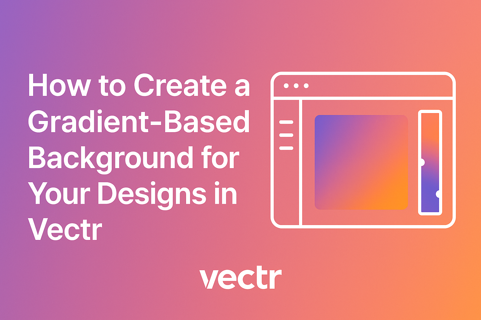
Creating eye-catching designs can be easier with the right tools. Gradients add depth and interest to background elements, making projects stand out. Learning how to create a gradient-based background in Vectr can elevate any design.
Vectr offers simple options for both linear and radial gradients, allowing users to choose from various styles to match their vision. Each gradient adds a unique touch, which can transform a basic design into something truly special.
By exploring these features, designers can enhance their creativity and produce stunning visuals.
Whether it’s for a website, poster, or social media, mastering gradient backgrounds can be a game changer. With just a few steps in Vectr, anyone can achieve professional-looking results. This article will guide readers through the process and help them make beautiful designs with ease.
Getting Started with Vectr
To begin using Vectr, it is essential to set up an account and become familiar with the user interface. This will help users efficiently navigate the design process and create stunning backgrounds.
Setting Up Your Vectr Account
Creating an account in Vectr is straightforward. First, visit the Vectr website and click on the “Sign Up” button. Users can sign up using their email, Google account, or Facebook. After entering the necessary information, they will receive a confirmation email.
Once the email is verified, users can log in and access their design workspace. The account allows saving projects online, enabling easy access from any device.
Additionally, Vectr offers free and paid plans, each providing different features and benefits. Users should explore these options to choose the best plan for their design needs.
Navigating the User Interface
Vectr’s user interface is designed to be user-friendly. Upon logging in, users will see a clean workspace with essential tools readily available. The main menu is located at the top, providing easy access to file management, editing options, and help resources.
On the left side, a toolbar offers basic design tools such as selection, shapes, and text. Users can click on each tool to reveal options specific to that feature.
The right panel displays properties and settings, allowing adjustments to colors, gradients, and more.
Getting familiar with these areas will help users create designs efficiently. It will also make the process of applying gradients to backgrounds easier and more enjoyable.
Fundamentals of Gradient Backgrounds
Understanding gradients is essential for creating visually appealing designs. Gradients blend colors and can add depth and interest to backgrounds. Different types of gradients serve various purposes, making them versatile tools for designers.
Understanding Gradients
A gradient is a smooth transition between two or more colors. This creates a visually harmonious effect that can evoke different feelings. For instance, warm, bright colors can convey energy, while cool, soft colors may promote calmness.
Designers often use gradients in backgrounds to draw attention or to create contrast. The key to using gradients effectively is ensuring they complement the elements on top of them.
It’s important to balance color intensity and ensure readability.
To create a gradient, designers can use linear or radial techniques. Linear gradients transition colors in a straight line, while radial gradients spread out from a center point. Understanding these types can enhance a design’s composition.
Types of Gradients
There are several types of gradients to consider when designing backgrounds. The most common types include linear, radial, and mesh gradients.
-
Linear Gradients: These progress smoothly along a straight line. They can be applied vertically, horizontally, or diagonally. Linear gradients are popular for backgrounds and buttons.
-
Radial Gradients: These transition colors outward from a central point. They create a circular effect and can bring focus to the center of a design element.
-
Mesh Gradients: These involve a grid of colors that blend to create shapes and complex designs. Mesh gradients provide a more sophisticated look but can be harder to implement.
By understanding these types, designers can choose the right gradient for their project, ensuring it enhances the overall design.
Creating a Gradient Background
Creating a beautiful gradient background can enhance the visual appeal of a design. By carefully selecting colors, adjusting the gradient direction, and applying it effectively, the design can stand out.
Selecting Colors
Choosing the right colors is essential when creating a gradient background. He can start by considering the mood or message of the design. For example, warm colors like reds and oranges create energy, while cool colors like blues and greens give a calming effect.
Using a color wheel can help to find complementary colors. It’s generally best to stick to two or three colors for a smooth gradient.
Once the colors are chosen, he might want to test them in the design software to see how they blend together. A tool like CSS Gradient can provide some inspiration and examples.
Adjusting the Gradient Direction
The direction of the gradient can significantly impact the design’s appearance. He can decide on the flow—whether it’s horizontal, vertical, or diagonal—based on the overall layout.
For instance, a vertical gradient might draw the eye from top to bottom, which can be perfect for banners or backgrounds. Meanwhile, a diagonal gradient adds a sense of movement.
Most design tools allow users to enter specific angles for precise direction. Experimenting with different angles can yield surprising and delightful results.
Applying the Gradient to Your Design
After selecting colors and direction, it’s time to apply the gradient. He can do this by accessing the background settings in Vectr.
Using the gradient tool, he should first choose the gradient type: linear or radial. A linear gradient transitions colors in a straight line, while a radial gradient radiates from a central point.
Once he selects the appropriate style, he can enter the chosen colors and adjust the blending as needed.
Finally, pasting the gradient into the desired area will give life to the design. Testing it with different elements, such as text or images, can enhance the overall look.
Enhancing Your Design
To make a gradient-based background truly stand out, adding textures and effects can create depth and interest. Incorporating text and logos effectively ensures that the design communicates its message clearly. Both elements work together to elevate the overall visual appeal.
Adding Textures and Effects
Textures can bring a unique touch to gradient backgrounds. By overlaying textures, designers can add a layer of sophistication.
For instance, a subtle grain effect can reduce the slick digital feel of gradients. This effect can soften hard edges and create a more inviting atmosphere.
Steps to Add Texture:
- Choose a Texture: Look for textures that complement the gradient colors.
- Layering: Place the texture layer above the gradient.
- Adjust Transparency: Reduce the opacity to blend the texture seamlessly.
Using brushes or images that mimic natural elements can also enhance the design. This approach makes backgrounds more engaging and visually pleasing.
Incorporating Text and Logos
Text and logos are essential for branding. They should contrast well with the gradient background to ensure readability.
When placing text, designers should consider these key points:
- Font Choice: Select bold and clear fonts that stand out.
- Spacing: Use adequate padding around the text for legibility.
- Color Selection: Pick colors that either pop against the background or harmonize well.
For logos, scaling them appropriately is crucial. They should be prominent but not overpower the gradient.
Using a white or light-colored logo on darker gradients can create a striking look. Remember to test different placements to find the most effective arrangement.