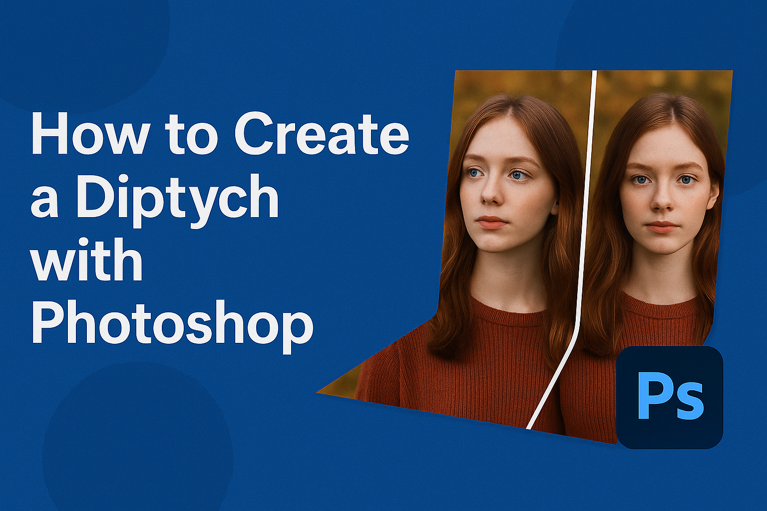
Creating a diptych in Photoshop is a great way to showcase two related photos in a single, eye-catching presentation. This format lets photographers or designers tell a story or highlight contrasts and similarities between images.
By blending two photos side by side, anyone can create a dynamic piece that captures more attention than a single image might.
Photoshop makes it simple to align images in a diptych layout with its vast tools and features. Even those new to the software can easily follow simple tutorials that guide them step by step.
Techniques like using layers and alignment tools make the process smooth and fun for everyone.
Many tutorials and resources are available online, offering insights into different methods that suit various needs. Whether you want to learn how to create a diptych from a single photo or combine multiple images, platforms like YouTube offer detailed guides to help enhance your skills.
Understanding a Diptych
A diptych is an art form that involves two pieces displayed together to create a single cohesive work. This technique has roots in ancient art and remains relevant in contemporary settings. Exploring its definition and history, along with its modern applications, reveals the versatility and timeless appeal of diptychs.
Definition and History
A diptych consists of two panels placed side by side. Historically, they originated in ancient times, often serving a religious purpose. They were frequently crafted as hinged tablets used for religious iconography, allowing people to carry and display religious scenes or icons.
In the Middle Ages, diptychs gained popularity as altarpieces. Artists would depict complementary scenes, often religious, to engage viewers emotionally and intellectually.
Today, the term “diptych” is not limited to physical panels. It includes a broader range of media, as artists employ various techniques to connect images or objects. The essential element is the relationship between the two parts, designed to create a unified visual or thematic experience. This historical context helps appreciate their enduring appeal.
Uses in Contemporary Art
Contemporary artists use diptychs to explore and communicate themes through paired imagery. By placing two pieces together, they encourage viewers to compare and draw connections.
In photography, artists like to create diptychs that highlight contrasts or similarities in scenes, moods, or colors. This creates a dialogue between the images, enhancing their impact.
Painters and digital artists also use this format. They play with contrast, symmetry, or conceptual links, sometimes challenging traditional narratives. Diptychs can engage viewers by prompting them to interpret the linked pieces. This approach brings dynamic interactions and deeper insights into the work’s meaning.
Fundamentals of Photoshop
Photoshop is a powerful tool for editing and creating images. Understanding how to navigate its interface, use key editing tools, and work with layers is crucial for getting the most out of the software. Each of these areas offers specific features that enhance an editor’s ability to manipulate and create stunning images.
Navigating the Interface
Photoshop’s interface can seem daunting at first, but it’s organized in a way that becomes intuitive with practice. The main window includes a toolbar on the left, a menu bar at the top, and panels on the right.
Toolbars provide easy access to frequently used functions, while panels like Layers and History help track changes.
He can customize the workspace by choosing different layouts to fit various tasks. For example, photographers might choose the Photography Workspace, which highlights the most relevant tools for photo edits.
Docking panels helps manage space efficiently, and they can be expanded or collapsed according to preference. As a tip, users should take advantage of Photoshop’s search feature to quickly locate tools or functions.
Key Tools for Image Editing
Photoshop offers a range of tools that are essential for image editing. The Move Tool lets users position elements within the canvas, while the Brush Tool allows for creative detailing.
Selection tools like the Lasso or Magic Wand help in isolating specific areas of an image for precise editing.
Understanding these tools enhances editing techniques. For instance, the Clone Stamp Tool is perfect for removing blemishes, and the Crop Tool is vital for resizing images to fit specific dimensions.
Adjustment layers, available in the Layers panel, can change image aspects such as brightness, contrast, and hue without permanently altering the original image.
Layers and Their Functions
Layers are one of Photoshop’s most powerful features, allowing artists to build images constructively. Layers function like transparent sheets stacked on top of each other, with each sheet holding different elements of a project. This structure lets users edit parts of an image without affecting others below.
Each layer can have its own blending mode, which changes how it interacts with the layers beneath it. This is useful for creating effects like shadows or highlights.
He can also use layer masks to apply edits non-destructively, painting over areas to hide or reveal parts of a layer without deleting any content. This flexibility is key to complex editing tasks.
Preparing Your Images
Creating a diptych requires attention to detail before you even open Photoshop. The process involves choosing suitable photos, adjusting their dimensions, and aligning them correctly for the best effect.
Selecting the Right Images
Choosing the right pictures is crucial for a successful diptych. It’s important to select photos that complement each other visually and thematically. Look for images that either tell a story together or share common colors, tones, or subjects.
Images that are too similar might lack interest, while those too different could create a jarring effect. Think about how the images will appear side by side and how viewers will interpret the relationship between them.
A cohesive diptych often highlights contrasts or harmonies, making selection a vital step.
Size and Resolution Adjustments
Proper size and resolution are key to ensuring that your photos look great in a diptych. This uniformity helps in visual consistency and prevents unwanted distortion.
Images should typically be in high resolution (300 DPI is standard) to maintain clarity and detail.
Resize the images if necessary to ensure they fit well when placed side by side. Use Photoshop’s resizing tools to adjust dimensions without losing quality, making sure each piece of the diptych stands out.
Cropping and Alignment Techniques
Cropping and aligning your images properly is the last step in preparation. Begin by cropping each image to highlight the most interesting parts, keeping the composition balanced.
Alignment is vital for a neat appearance. It often helps to use grids or guides in Photoshop to maintain straight lines and equal spacing.
Depending on the effect you’re aiming for, you can either align them edge-to-edge or leave a small space between them. Proper alignment enhances the overall presentation and ensures that both images work together in harmony.
Creating a Diptych
Creating a diptych in Photoshop involves arranging your images, blending them seamlessly, and using adjustment layers for a cohesive look. This process uses Photoshop’s tools to ensure the images work well together as a single piece of art.
Opening and Arranging Files
Open Photoshop and select the images you want to use. It’s best to start with high-resolution images so that the final result is clear.
Open both images in separate layers or side-by-side within one canvas.
Use the Move Tool to place the images next to each other. If you need more space, expand the canvas by going to Image > Canvas Size. Make sure there’s enough room for both images to sit comfortably without overlapping.
Align the images carefully so that they create a balanced visual. If needed, use Rulers and Guides to help with perfect alignment. This step is crucial for achieving harmony between the two images, ensuring that they complement each other well.
Blending Images Together
Blending the images can enhance the diptych’s overall appearance. Use the Eraser Tool with a soft brush to gently blend the edges where the images meet. This technique can make the transition between the two images smoother.
Try the Layer Mask option for a non-destructive blending approach. Add a layer mask to one of the image layers, and then use a black brush to paint over areas you want to blend.
It’s a great way to adjust the blending without altering the original images.
Experiment with different opacity levels for each layer. Reducing the opacity can create a subtle effect, allowing elements from each image to interact more naturally. This helps in creating a unified look without one image dominating the other.
Using Adjustment Layers for Cohesion
Adjustment layers can be used to enhance the mood and ensure color consistency between the two images. These layers affect all the layers beneath them, making them perfect for overall adjustments.
Start with a Brightness/Contrast or Levels adjustment layer. This makes sure both images have similar lighting conditions.
Balance the shadows, highlights, and mid-tones so the images appear as one.
Next, add a Color Balance layer to adjust the color tones. This is important if the images have different color casts.
Use the sliders to tweak the colors until they complement each other. Make sure the colors work in harmony, giving the diptych a cohesive feel.
Styling Your Diptych
Creating a diptych isn’t just about placing two images side by side. It’s also about adding elements that enhance its visual appeal. This involves using filters, adding text or graphics, and ensuring color consistency.
Applying Filters for Visual Interest
Adding filters can make a diptych more engaging. Filters can adjust the contrast, brightness, and colors to create mood and tone.
For a vintage look, try applying a sepia filter. This can give a nostalgic feel to your images.
Experiment with black and white or a minimal pastel hue for a contemporary touch. Filters help unify the two photos, making them feel like parts of a cohesive whole.
It’s important to not overdo it, as too many effects can overwhelm the viewer.
Adding Text and Graphics
Including text and graphics can add an extra layer of meaning to a diptych. Text can be used to title the images or provide context.
When adding text, choose a font that complements the images. Serif fonts often offer a classic look, while sans-serif fonts can feel modern.
Graphics like lines or shapes can guide the viewer’s eye or separate the images subtly. Using simple icons or symbols can emphasize elements in each photo without being distracting.
Ensure the text and graphics are well-positioned so they don’t overpower the images.
Color Correction for Consistency
Color correction is vital for maintaining harmony between the two photos. Small adjustments can make a big difference.
Use Photoshop’s color adjustment tools to match the tones. Adjust the white balance if one image appears warmer or cooler than the other.
Pay attention to shadows and highlights. Balance these elements to avoid one image looking significantly darker or lighter.
Consistent color enhances the connection between the images and ensures the diptych feels like a unified piece. This step is crucial for a polished and professional result.
Final Touches
After creating a diptych in Photoshop, there are a few important steps to ensure the images look their best. This involves refining details such as sharpening, reducing noise, and appropriately saving and exporting your project for different purposes.
Sharpening and Noise Reduction
Sharpening helps to enhance details in your images. It is crucial to do this carefully to avoid any artificial appearance.
In Photoshop, use the Smart Sharpen filter for controlled adjustments. Adjust the amount and radius to achieve the desired effect.
Noise reduction is equally important as it smooths out any grainy aspects, especially in low-light images.
Use the Reduce Noise filter to minimize unwanted noise while maintaining image quality. Always balance sharpening and noise reduction to avoid over-processing.
Saving Your Project
When saving your diptych project, it’s important to keep an editable version for any future changes. Use the PSD format to preserve layers, allowing easy edits and adjustments later.
This format ensures that all your work, including any adjustments, layers, and text, is saved without loss.
Additionally, create backups by saving periodically. This is handy in case of accidental changes or deletions. Organizing these files in clearly labeled folders will help in locating them easily later.
Exporting for Print and Web
Exporting for different platforms requires specific settings.
For prints, ensure the resolution is set to 300 dpi. This resolution helps maintain clarity in printed materials.
Make sure colors are in CMYK mode, which is standard for print.
For web use, export images in JPEG or PNG format.
Set the resolution to 72 dpi for quicker loading times online.
Use the Export As option to select the right format and quality, ensuring images are optimized for their intended purpose.