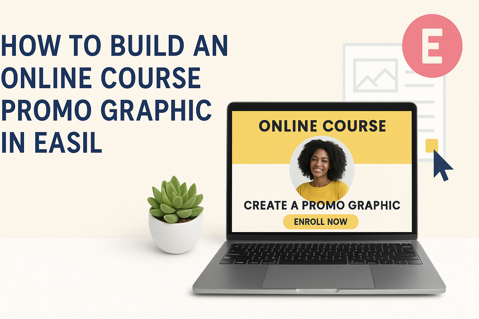
Creating an eye-catching promo graphic for an online course is easier than many think. With Easil’s user-friendly templates, anyone can craft a professional-looking design in just a few minutes. This not only grabs attention but also conveys important information about the course effectively.
In today’s digital age, visual content plays a vital role in marketing. A well-designed graphic can make a significant difference in attracting students and increasing enrollment.
By following simple steps in Easil, creators can ensure their course stands out in a crowded online marketplace.
This article will guide the reader through the process of building an engaging online course promo graphic using Easil. With practical tips and easy-to-follow instructions, anyone can learn to create a graphic that speaks volumes about their course.
Getting Started with Easil
Easil is a user-friendly platform that helps create stunning graphics quickly.
Knowing how to sign up, explore the interface, and understand basic design principles can make the process smooth and enjoyable.
Signing Up for Easil
To begin using Easil, the first step is signing up for an account.
Users can visit the Easil website and click on the “Sign Up” button. They will need to provide their email address and create a password.
After this, an email verification may be necessary to ensure security. Once verified, users can log in and access the Easil dashboard. It allows users to start creating right away.
Those who want extra features can consider Easil’s subscription plans, which offer enhanced tools for design.
Familiarizing Yourself with the Interface
Once logged in, new users should take some time to explore the Easil interface.
The dashboard displays different sections, such as templates, designs, and resources. Clicking on the “Templates” tab provides options for various graphic types like social media posts, flyers, and more.
Users can easily navigate through the platform by using the toolbar. It consists of options for uploading images, selecting text styles, and managing layers.
Getting comfortable with this layout allows users to create with confidence and efficiency.
Understanding Design Principles
A basic understanding of design principles can elevate the quality of graphics created in Easil.
One important principle is alignment. Proper alignment creates a clean and organized look.
Another key aspect is contrast, which helps important elements stand out.
Using complementary colors is also vital. They create harmony and appeal in designs.
Finally, keeping text readable is essential. Users should ensure fonts are legible and not too small.
Following these simple guidelines can make a significant difference in the effectiveness of promotional graphics.
Designing Your Course Promo Graphic
Creating an engaging promo graphic for an online course is essential for attracting students. It’s important to choose the right template, customize colors and fonts, and effectively add text and visual elements to convey the course’s message.
Selecting a Template
Choosing the right template sets the foundation for a successful graphic.
Easil offers a variety of professionally designed templates tailored for online courses. Users should look for templates that match their course theme and target audience.
Consider templates that allow for easy customization. The template should have sections for images, text, and branding.
It’s also helpful to pick something visually appealing that captures attention without being cluttered.
Once a template is selected, users can adjust layouts to fit their content needs. This step is crucial for ensuring the final product looks polished and professional.
Customizing Colors and Fonts
Color and font choices are vital elements in graphic design.
When customizing a promo graphic, users should select colors that align with their branding. This can create a cohesive look that resonates with potential students.
Using contrasting colors helps important elements stand out. For example, a bright background with dark text can enhance readability.
Fonts, too, play a significant role. It’s best to pick fonts that are easy to read at a glance. Pairing one bold font for headings with a simpler font for body text often works well.
Adding Text and Visual Elements
Adding text and visual elements is where the promo graphic comes to life.
Users should include clear, concise text that communicates the course title, benefits, and a call to action. A strong title can grab attention and encourage clicks.
Visual elements like icons or images help convey messages quickly. It’s best to use high-quality images that resonate with the course content. Including logos can also boost credibility.
Be careful not to overcrowd the graphic. White space is important as it gives elements room to breathe. This balance helps to ensure the message is communicated effectively, drawing viewers in.
Fine-Tuning Your Graphic
When creating an online course promo graphic, small adjustments can make a big difference. Fine-tuning the layout and utilizing advanced features will help enhance the overall look and effectiveness of the graphic.
Adjusting Layout and Composition
The layout of the graphic is crucial for catching attention.
Start by ensuring that elements are balanced. Use guidelines to align text and images properly.
Key tips for layout:
- Margin: Leave enough space around your text and images to avoid a cluttered look.
- Hierarchy: Use different font sizes to highlight important information.
Experiment with the placement of each element. For instance, move the call-to-action button to a more prominent position to increase visibility.
A consistent color scheme helps unify the design. Stick to 2-3 main colors that reflect the course theme. This makes the graphic more appealing.
Using Advanced Features
Easil offers various advanced features that can elevate a graphic.
One useful option is layering, where images and text can be stacked for depth. This adds interest and helps important elements stand out.
Another feature is transparency. Adjusting the opacity of backgrounds makes text easier to read. Use overlays to create a more polished look.
Text effects can also enhance visibility. Experiment with drop shadows or outlines to make text pop against a busy background.
Incorporate icons for quick visual communication. For example, a play button can signal a video course, making it easier for viewers to understand the content at a glance.
Exporting and Sharing Your Creation
Once the promo graphic is ready, it’s time to share it with the world. Easil makes this process simple and straightforward.
To export the graphic, users can follow these steps:
- Click on the Export Button: This button is generally found in the top right corner of the screen.
- Choose the File Type: Options like JPEG or PNG are usually available. Selecting the right format is important for quality.
- Adjust Settings: Users can set the resolution or dimensions if needed before downloading.
After exporting, sharing can be done through various channels. Here are some popular options:
- Social Media: Upload the graphic to platforms like Facebook, Instagram, or Twitter to grab attention.
- Email: Attach the file to newsletters or program announcements.
- Website: Add the graphic to course landing pages for promotion.
Using a combination of these methods can help reach a wider audience.
When sharing, it’s also good to utilize engaging captions. This can draw more interest and encourage clicks.
It’s always helpful to remind viewers where they can sign up for the course after seeing the promo.
By efficiently exporting and sharing the graphic, users can maximize exposure for their online course.