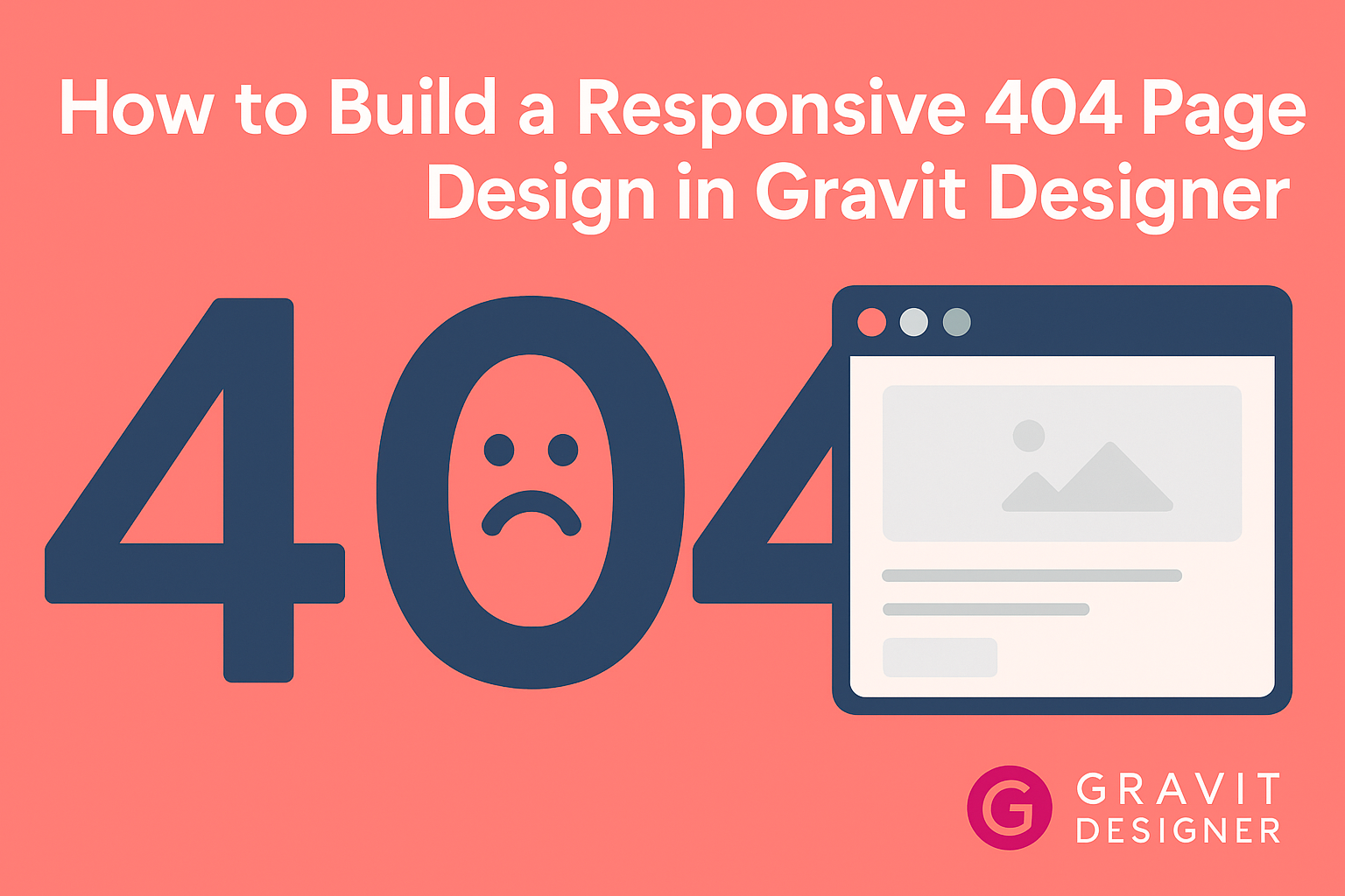
Creating a 404 page may seem unimportant, but it plays a crucial role in user experience.
A well-designed 404 page not only helps users navigate smoothly but also maintains a brand’s unique style. By using Gravit Designer, individuals can build an engaging and responsive page that reflects their website’s identity.
In this article, readers will discover practical steps to design a 404 page that is both functional and visually appealing.
They will learn how to use Gravit Designer’s tools effectively to create a page that guides users back to the main content. This tutorial will make the process easy and enjoyable, ensuring that anyone can create a professional-looking 404 page.
Getting Started with Gravit Designer
Gravit Designer is a powerful design tool suitable for creating various graphics and web elements.
Knowing how to navigate its features and setting up a comfortable workspace can greatly enhance the design process.
Overview of Gravit Designer
Gravit Designer is a free, feature-rich design application that works on multiple operating systems. It allows users to design vector graphics, web layouts, and icons easily. The user interface is clean and intuitive, making it accessible for beginners and experts alike.
Key features include:
- Vector Editing: Create scalable graphics without losing quality.
- Cloud Integration: Save designs online for easy access.
- Symbols: Reuse design elements throughout projects.
These features help streamline the design process, allowing for efficient creation of stunning graphics.
Setting Up Your Workspace
Setting up your workspace is the first step toward a smooth design experience in Gravit Designer.
Upon launching the application, users can choose between various templates or start from scratch.
To customize the workspace:
- Arrange Panels: Move design panels and toolbars to a comfortable position.
- Choose Shortcuts: Familiarize with keyboard shortcuts to improve speed.
The right setup helps in focusing on the creative process without distractions.
Remember, a well-organized workspace can lead to better productivity and creativity while working on projects like a 404 page design.
Design Fundamentals for 404 Pages
A well-designed 404 page serves a purpose beyond just displaying an error message. It helps guide users back to relevant content while maintaining a consistent brand experience.
This section addresses the key aspects of purpose and user experience that make 404 pages effective.
Purpose of a 404 Page
The primary goal of a 404 page is to inform users that the requested content is unavailable. This is important as it prevents confusion and frustration.
A good 404 page should provide a friendly message that acknowledges the error.
In addition, it should include options for the user to navigate the site. Common elements include links to the home page, popular articles, and a search bar.
For example, using 3-4 links can help users find what they need quickly. This saves the user from feeling lost or abandoned.
User Experience Considerations
User experience is crucial when designing a 404 page. Visitors should feel reassured, rather than frustrated.
Using a supportive tone and friendly visuals can create a positive impression.
Including a search box is a great strategy. This gives users control to search for specific content.
Additionally, relevant imagery can tie the page into the broader brand narrative. This ensures that even an error page still feels like part of the website.
A simple layout is also beneficial. Avoid clutter to keep the page focused and easy to navigate.
Overall, a responsive design ensures the 404 page looks good on all devices. This adaptability contributes to a better user experience.
Creating a Responsive 404 Page
Creating a responsive 404 page is essential for a good user experience. This page is shown when a user tries to access a non-existent link.
A well-designed 404 page can guide users back to your website.
First, focus on the layout. Using a grid system helps organize content. This ensures that the page looks good on all devices.
Next, using bold colors and clear fonts is important. This keeps the page visually appealing. Including a friendly message can also help soften the disappointment.
A simple list of options is helpful. For example:
- Home Page: Directs users back to the main section.
- Search Bar: Allows them to find what they were looking for.
- Contact Information: Provides a way to reach support.
Adding a unique graphic can make the page memorable. A fun illustration or animation can lighten the mood. This creative touch can improve user engagement.
Lastly, testing the page on different devices ensures it is truly responsive. Checking mobile, tablet, and desktop views is vital. This step helps catch any design issues before going live.