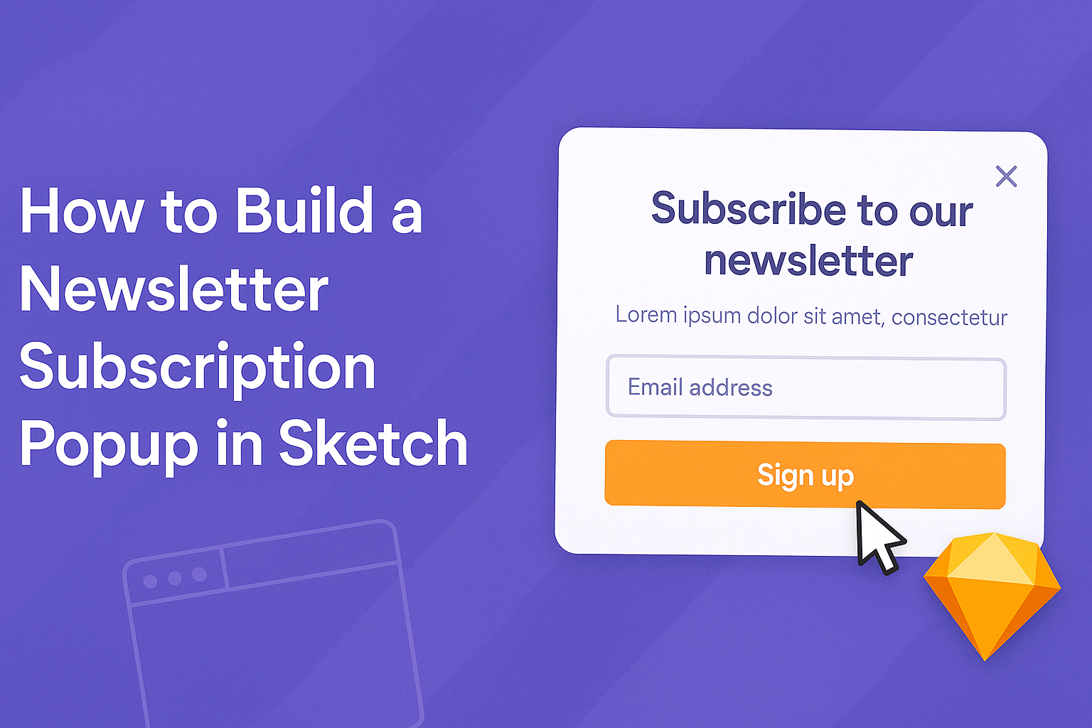
A well-designed newsletter subscription popup can significantly increase user engagement and grow an audience.
To build a newsletter subscription popup in Sketch, one can follow a clear set of steps involving design creation and user interaction elements. By using Sketch’s intuitive tools, designers can create appealing popups that draw attention without being intrusive.
This tutorial will guide readers through the process of crafting a functional and attractive newsletter popup.
From selecting the right colors and fonts to adding essential elements like call-to-action buttons, each step is essential for capturing potential subscribers’ interest. Readers will discover tips that enhance both the visual appeal and effectiveness of their popups.
Creating an effective newsletter subscription popup is not just about design; it also focuses on delivering a seamless user experience. With the right strategies in place, anyone can design a popup that boosts their newsletter sign-ups and keeps visitors coming back for more.
Designing Your Popup
Creating an effective newsletter subscription popup involves careful planning and design. The following sections will explore key aspects like concept sketching, layout dimensions, and the selection of colors and fonts.
Sketching Your Concept
Before jumping into digital design, it’s important to sketch out the concept for the popup. This early stage allows the designer to visualize elements like the header, text fields, and call-to-action buttons.
Using paper or a digital sketching tool, they should focus on the arrangement of each component. Consider how the popup will engage users—simple messages or eye-catching graphics can enhance interest.
Additionally, testing different concepts with friends or colleagues can provide valuable feedback. Early input helps in refining the design and ensures user-friendly flow when finalized.
Defining Dimensions and Layout
Optimal dimensions are key for a successful popup. It should be large enough to capture attention but not so big that it overwhelms users.
Common dimensions range from 400 to 600 pixels wide, but this can vary based on design needs.
The layout should balance space between text and visual elements. Designers can use grids to help position items neatly.
Make sure to leave adequate margins and padding. This creates breathing room and improves readability. A well-structured layout ultimately guides the user’s eye toward the call-to-action.
Choosing Colors and Fonts
Selecting the right colors and fonts is crucial for conveying the brand’s message. Bright colors can attract attention, while softer shades may evoke calmness. It’s best to pick a color palette that aligns with the brand identity.
When it comes to fonts, legibility should be the priority. Sans-serif fonts tend to work well for popups due to their clean lines.
Using bold typefaces for headers can create emphasis, while lighter styles may denote secondary information. Always ensure that text contrasts well with the background for easy reading.
Implementing Popup Mechanics
Creating an effective newsletter subscription popup involves several key mechanics. Two important parts are adding interaction layers and animating transitions. These elements enhance user experience and encourage users to subscribe.
Adding Interaction Layers
Interaction layers are essential for making the popup user-friendly. They should include clear call-to-action buttons, such as “Subscribe Now” or “Get Updates.” Each button must be visually distinct to grab attention.
In addition to buttons, including an optional close icon is crucial. This allows users to dismiss the popup easily. He or she can use a simple X symbol, placed at the top corner, to maintain an uncluttered design.
It’s also useful to add a background overlay that dims the rest of the page. This draws focus to the popup and minimizes distractions. Ensure that the overlay is subtle yet effective in guiding the user’s attention.
Animating Transitions
Animations can make a popup feel more dynamic and engaging. A smooth fade-in effect can create a welcoming appearance. He or she can set the popup to fade in within 300 milliseconds to keep it swift yet noticeable.
Additionally, consider using slide-up animations for a more dynamic entrance. As the popup slides up from the bottom, it creates an inviting feel. This movement can capture attention while keeping the design professional.
Lastly, apply a bounce effect when the popup appears. This slight, playful movement can make the interaction feel more organic. Together, these animations provide an inviting experience that encourages users to subscribe.
Integrating With Email Marketing Services
Integrating a newsletter subscription popup with email marketing services is essential for effective data collection and communication. This section focuses on two important aspects: setting up data capture and configuring submission triggers.
Setting Up Data Capture
Setting up data capture involves creating fields for users to input their information. The most common fields include name and email address. These fields are crucial for building a subscriber list.
In Sketch, designers can create input boxes using rectangles and text layers. Once the design is ready, the user can export the popup and integrate it with an email marketing service. Most services, like Mailchimp or Constant Contact, offer easy integration options.
It’s also important to ensure that the data captured is secure. Enabling SSL encryption provides an added layer of protection for user information.
Configuring Submission Triggers
Configuring submission triggers determines when the popup appears to users. Common triggers include exit intent, time spent on the page, or scrolling behavior.
For example, a popup can be set to appear after a user scrolls down 50% of the page. This method captures attention when a visitor shows interest.
In Sketch, designers can outline the desired triggers in the prototype. Once the design is finalized, it can be linked to scripts in the email marketing service settings. This way, the popup behaves as intended, increasing the likelihood of user subscriptions.
Testing and Iteration
Testing and iteration are essential parts of creating a successful newsletter subscription popup. These steps help to ensure that the popup is user-friendly and effective in engaging potential subscribers.
Conducting Usability Tests
Usability tests allow designers to see how real users interact with the popup. It’s important to choose a diverse group of testers to gather various perspectives.
To conduct a usability test, follow these steps:
- Prepare the Popup: Ensure the design is final before testing.
- Select Participants: Choose users who fit the target audience.
- Observe Interactions: Watch testers as they navigate the popup. Note their reactions, hesitations, or confusion.
- Ask Questions: After the test, ask participants what they thought about the popup. Their insights can reveal important usability issues.
By gathering this information, designers can adjust the popup to improve user experience.
Collecting and Applying Feedback
Feedback is critical for refining the popup design.
After usability tests, it’s time to analyze the data collected from users.
Key aspects to focus on include:
- Clarity: Is the message clear? Do users understand what is expected?
- Aesthetics: How do users feel about the design elements?
- Functionality: Are there any technical issues?
Designers should categorize the feedback into actionable items.
Prioritize changes that will enhance usability and address critical concerns.
Implement these changes, then retest the popup to measure improvements.
This cycle of testing and revising helps ensure a more effective and appealing newsletter subscription popup.