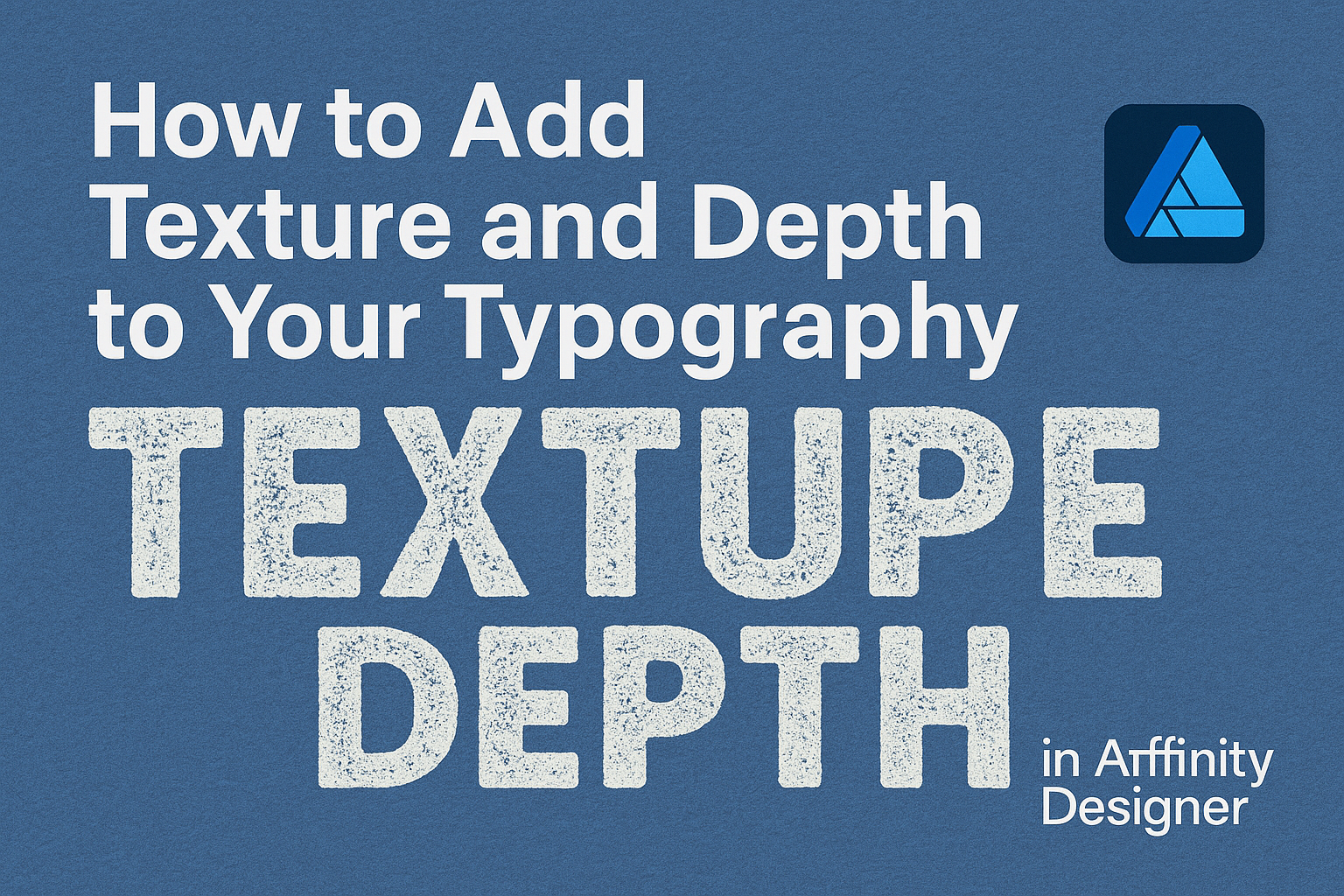
Adding texture and depth to typography can elevate design work and make it stand out. By using tools and features in Affinity Designer, one can easily create striking text effects that grab attention and enhance visual appeal. This process allows designers to transform simple text into captivating elements that add character and style to any project.
Many designers struggle with making their typography pop.
Fortunately, Affinity Designer offers straightforward methods to incorporate textures, patterns, and depth. With just a few techniques, it is possible to turn ordinary type into extraordinary focal points.
Whether working on a graphic design project, branding, or digital artwork, understanding how to add texture to text is valuable. Many techniques can be mastered, providing exciting opportunities for creativity and expression in design.
Readers can look forward to exploring these methods and unlocking the potential in their typography.
Getting Started with Affinity Designer
Affinity Designer provides a user-friendly platform for creating stunning designs. Understanding the workspace and selecting the right fonts are essential first steps for anyone looking to add texture and depth to typography.
Understanding the Affinity Designer Workspace
The workspace in Affinity Designer is intuitive and customizable.
At the top, users find the Menu Bar, which includes all the essential tools. The Toolbar on the left holds options for selection, shapes, and the pen tool.
On the right side, the Layers Panel is crucial for organizing projects. Grouping layers helps manage complex designs. Additionally, the Color Panel allows for precise color adjustments.
Familiarizing oneself with the Studio Panel will enhance workflow. It holds various tools like the Text Tool for typography editing. Always explore the workspace to tailor it to personal preferences.
Choosing the Right Fonts for Texture Addition
Selecting the right font is vital for effective texture addition.
Sans-serif fonts often work well for clean designs, while serif fonts can add elegance. Styles like bold or italic can also create visual interest.
When adding texture, consider the mood of the project. A playful design might benefit from whimsical fonts, while a formal piece may require more traditional choices.
It’s essential to test fonts on the canvas. This helps visualize how textures interact with text. Taking time to explore a variety of fonts will lead to stronger design choices.
Techniques for Adding Texture
Adding texture to typography can enhance visual interest and depth. Here are some techniques to create unique effects in Affinity Designer.
Using the Grain Effect
The Grain Effect is a simple way to add texture. It creates a subtle noise that mimics natural surfaces. This effect is perfect for delivering a vintage or rustic feel.
To apply it, go to the Effects Panel. Select Grain and adjust the settings.
Users can control the intensity and scale to match their desired look. A lower intensity provides a soft texture, while a higher setting offers a more pronounced effect. Experimenting with these settings reveals the best combination for specific designs. This method is user-friendly and often produces great results with minimal effort.
Incorporating Bitmap Textures
Using bitmap textures is another effective method.
Users can find many bitmap textures online or create their own. These textures can represent materials like wood, paper, or fabric.
To use a bitmap texture, import it into your project. Then, place it over the typography and set the layer to Clipping Mask. This technique ensures the texture takes the shape of the text beneath.
Adjust the opacity to control how prominent the texture appears. Blending modes can also enhance the integration of the texture with the typography. These textures add character and visual appeal.
Applying Brushes for a Hand-Crafted Look
Applying brushes can give typography a unique hand-crafted feel.
Affinity Designer offers a variety of brush options, from splatters to strokes. These brushes allow for creative freedom and personalization.
To begin, select a brush and choose a color that complements the design. Then, paint over the text lightly to create depth. Layering different brush strokes can add complexity to the design.
It’s easy to adjust the size and opacity of the brushes for desired effects. This technique allows for a mix of styles, resulting in distinctive typographic artwork.
Creating Depth in Typography
Adding depth to typography can transform flat text into engaging visuals. Using layering techniques and adjusting shadows and highlights are effective methods to achieve this.
Layering Techniques
Layering involves placing multiple text elements on top of each other to create a sense of dimension. Designers can experiment with different fonts, sizes, and colors.
For instance, a bold font can serve as the base, while a skinnier font in a lighter color may be layered on top.
To apply this, he or she can duplicate the text layer and adjust the offset slightly. This approach adds thickness and creates visual interest. Designers often use different opacities to enhance separation between layers.
In Affinity Designer, this is straightforward. Select the text layer, duplicate it, and reposition it. Adjust the opacity to achieve the desired effect, making sure not to overdo it so the text remains legible.
Adjusting Shadows and Highlights
Shadows and highlights give text a lifted appearance. Adding drop shadows is a popular method. This technique allows text to stand out against the background.
To create a drop shadow in Affinity Designer, designers should select the text layer and navigate to the effects panel. Adjust the shadow’s color, distance, and blur.
A soft gray shadow can create an elegant look, while a more pronounced black shadow adds drama.
Highlights can be created by adding a lighter shade around the text edges. This effect simulates light reflecting off the surface. For best results, contrasting colors work well, drawing attention to the typography.
Both techniques are essential for making typography more visually appealing and dynamic.
Final Touches and Exporting
When finalizing a project in Affinity Designer, it’s important to refine the textured typography and choose the right export settings. This ensures that the design looks great in its intended use, whether for print or digital platforms.
Refining Your Textured Typography
To achieve a polished look, he should take time to adjust the layering and blending of textures applied to the text.
Start by selecting the text and reviewing the Layers panel. This allows for easy modifications.
Consider using the Opacity slider to create a more subtle effect. Ensuring that textures don’t overpower the text can enhance readability.
Employ the Move Tool to reposition any textures for a better alignment. If necessary, apply a Gaussian Blur to softening edges, making the overall design feel cohesive.
Lastly, zoom in to inspect details closely. Small adjustments can have a big impact on the final appearance of the typography.
Export Settings for Various Media
Choosing the right export settings is key for presenting the typography effectively.
For digital use, saving as a PNG or JPEG works well. PNGs preserve transparency, making them ideal for layered designs.
When exporting, select the File menu and choose Export. Then, pick the format based on the intended use.
For print, the PDF format is often best. This format retains quality and color accuracy. Set the resolution to at least 300 DPI to ensure clarity.
Before finalizing the export, check the Color Space. RGB is suitable for screens, while CMYK is necessary for print. Proper settings make a significant difference in the final output’s quality.