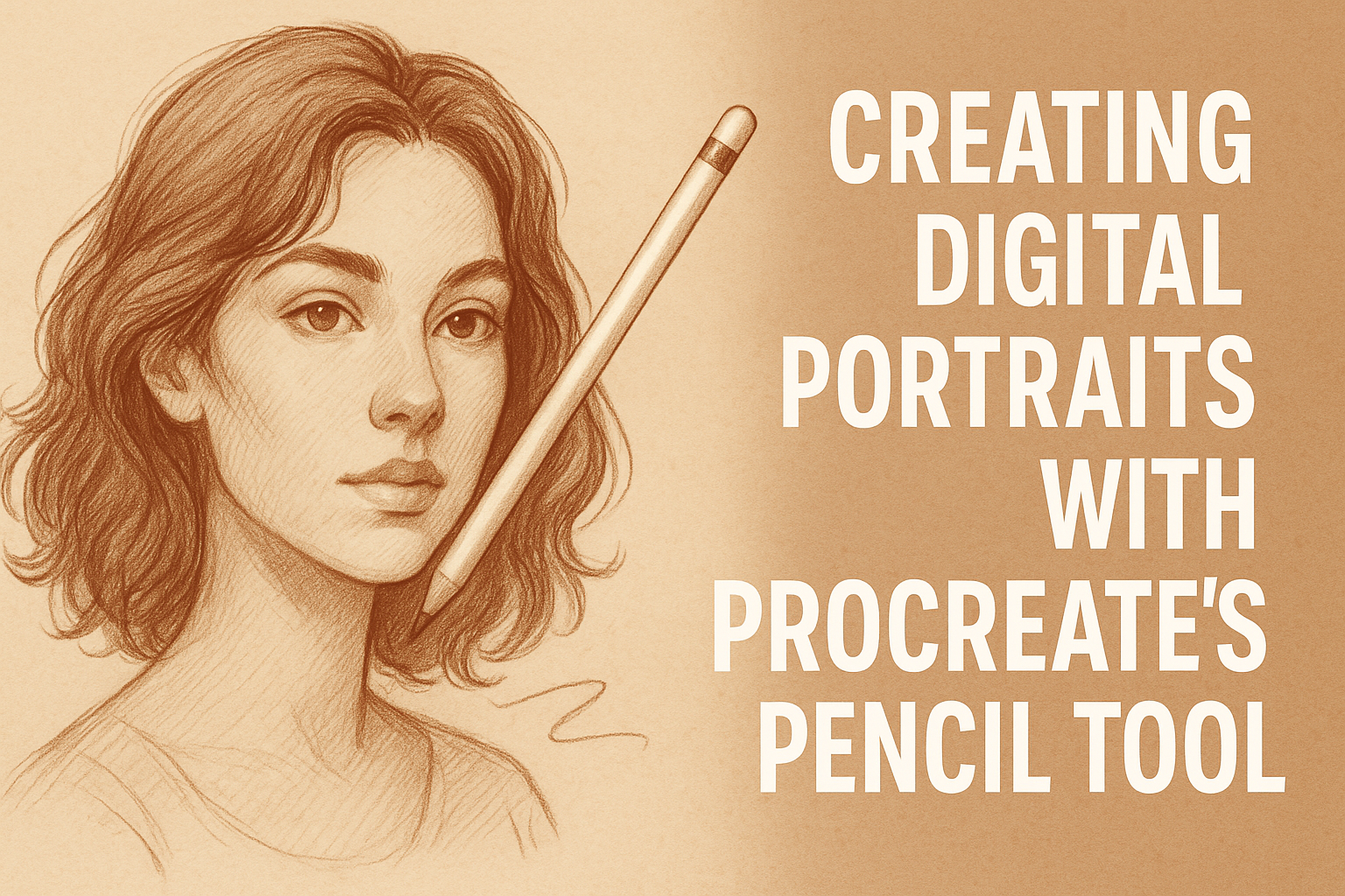
Creating digital portraits with Procreate’s Pencil tool can be an exciting experience for artists of all skill levels. This tool offers a combination of traditional pencil texture with the flexibility of digital art, making it a favorite for many users. By using Procreate’s versatile features, artists can achieve detailed and lifelike portraits.
The Pencil tool in Procreate is perfect for sketching and adding fine details. It allows artists to explore shading techniques that bring a portrait to life. The tactile feel of drawing with a pencil is preserved in the digital format, offering a comfortable transition for those used to traditional art materials.
Experimenting with different brushes and techniques in Procreate can lead to discovering new styles. Artists are encouraged to explore and find what works best for them. For tips and techniques on using the Pencil tool effectively, you can visit this guide on creating digital portraits.
Getting Started with Procreate
Getting started with Procreate involves familiarizing yourself with the app’s interface, setting up your canvas properly, and selecting the right pencil tool for your digital portraits.
Understanding the Interface
Procreate’s interface is designed to be intuitive yet powerful. The app opens with the Gallery, where users can view their artworks. At the top, the Options Bar includes tools like Add, Actions, and Brushes.
On the left, the Sidebar houses the Brush, Smudge, Eraser, Layers, and Color panels. The color wheel helps select hues efficiently, while the Brush panel offers an array of tools, including the Procreate Pencil. Understanding these basics helps in navigating the app seamlessly.
Users can customize the brush settings and modify pressure sensitivity to suit their drawing style.
Setting Up Your Canvas
Setting up your canvas is a crucial step in creating digital portraits. When starting a new project, tap the “+” icon in the Gallery. This allows users to choose from preset sizes or customize their own.
The resolution and dimensions should match the intended use, whether for print or digital display. For detailed portraits, a higher DPI (dots per inch) is recommended. Artists can adjust the canvas size to ensure they have enough space to capture all details of their artwork.
Layers can be added or adjusted, offering flexibility in editing and blending.
Choosing Your Pencil Tool
Choosing the right pencil tool is essential for achieving the desired art style. The Procreate Pencil is a versatile tool for sketching and refining details. Artists can adjust its size and opacity using the Brush Slider on the sidebar.
The pencil tool gives a natural feel, mimicking real pencil strokes, which helps in rendering intricate lines. Various brushes are available within the pencil category to suit different strokes and textures.
Exploring these settings can greatly enhance the depth and quality of digital portraits. Users are encouraged to experiment with different pencil settings and techniques to find the best fit for their artistic vision.
Basic Techniques for Digital Portraits
Creating digital portraits with Procreate involves mastering a few core techniques. These techniques include sketching the outline, adding details and textures, and effectively using layers. Each step builds on the previous one, allowing for a smooth process in bringing portraits to life.
Sketching the Basic Outline
Begin with a clean canvas and select the pencil tool in Procreate. To lay down the basic structure of the portrait, use gentle strokes to outline facial features like the eyes, nose, and mouth.
It’s important to focus on proportions. Using reference points, such as eyes aligned with the ears, helps create a more realistic look. Artists might use grid lines to maintain consistency and symmetry throughout the sketch.
A light touch allows for easy adjustments. This flexibility makes it easier to modify any parts of the sketch until the composition is just right.
Adding Details and Textures
Once the outline is finalized, it’s time to add details. Focus on elements like hair strands and eye reflections. Use smaller brush sizes for fine lines and textures.
Experimenting with different brush settings, such as opacity and pressure, can greatly enhance the texture. This is especially useful for skin details where subtle shading is needed.
Textures add depth and realism to the portrait. Utilize a textured brush for areas like hair or clothing to give them a more lifelike appearance. This step sets the tone for the final portrait and helps it stand out.
Working with Layers
Layers are an essential part of digital painting in Procreate. Begin with the outline on one layer and add subsequent elements like colors and shading on new layers.
Each layer can be manipulated independently. This allows for better control over various elements without affecting the whole image. Artists often lock layers to prevent accidental changes.
Using layers for shadows and highlights can add depth. By adjusting the layer opacity, one can achieve the desired intensity in lighting and shade. It’s a flexible method that offers room for experimentation and refinement.
Advanced Pencil Shading Tips
When shading in Procreate with the pencil tool, artists can enhance their work by focusing on light, shadow, and depth. Understanding these elements helps in creating more realistic and engaging digital portraits.
Understanding Light and Shadow
Light and shadow play a crucial role in portrait shading. Artists need to identify the position of their light source. This determines where shadows fall and highlights appear. By choosing a consistent light source, they ensure that the portrait has a believable and three-dimensional look.
Shadows in a drawing provide depth and texture. Softer shadows make surfaces look smooth, while sharper shadows suggest harder textures. By varying shadow edges, artists can create the illusion of different materials. For instance, using a dark shadow under the chin gives the face more dimension.
Being mindful of contrast is also important. Lighter areas should stand out clearly against darker ones. This technique not only enhances realism but also guides the viewer’s eye across the art piece.
Creating Depth with Strokes
Varying pencil strokes can greatly affect the perception of depth. Short, overlapping strokes can illustrate rough textures, while long, smooth lines might suggest a sleek surface. The direction of strokes can also guide the viewer’s eye and suggest motion within the portrait.
Layering strokes can build volume and form. Starting with light strokes and gradually darkening them allows for nuanced shading. This method is especially useful when drawing rounded forms, like cheeks or foreheads. Artists can use cross-hatching to add complexity and dimension.
Using intentional gaps between strokes suggests light reflecting off a surface. This technique is helpful when portraying gleaming hair or glossy eyes. Employing varying pressure on the pencil can add further depth, as heavier strokes result in more saturated areas of the drawing.
Blending for Realism
Blending smooths strokes and creates a seamless transition between different tonal values. This is crucial for achieving a lifelike appearance. Artists can use blending tools in Procreate, like the smudge tool, to soften pencil lines without losing detail.
Different blend levels can indicate unique materials and lighting. For softer features, such as skin, applying more blending can highlight a gentle texture. Conversely, leaving some areas unblended adds interest by providing visual contrast.
Identifying key areas where blending is needed enhances the overall portrait. For example, blending near the eyes and lips keeps these features soft and natural-looking. Balancing blending with defined pencil strokes ensures that the portrait maintains its dynamic and lively appearance.
Coloring Techniques with the Pencil Tool
When coloring with Procreate’s Pencil Tool, it’s important to focus on getting the base colors right, effectively mixing shades on the palette, and using layers to create depth and vibrancy. These techniques will help artists bring their digital portraits to life.
Applying Base Colors
Start by selecting appropriate base colors for your portrait. Choose tones that match the skin, hair, and attire of your subject. Using the Pencil Tool ensures a soft and natural application, similar to using traditional colored pencils on paper.
Experiment with different opacity levels to achieve a smooth base. A low opacity setting allows for gradual color buildup. This approach is forgiving and perfect for beginners.
Next, apply the chosen base color in light strokes, following the natural contours of the face. Short and gentle movements help maintain the subtle textures often seen in pencil work, providing a more realistic effect in the portrait.
Mixing Colors on Palette
Procreate’s color palette offers a variety of options for mixing colors. Use the color wheel to find the right shades and maintain consistency throughout the artwork. To achieve a realistic look, combine multiple shades of the same color.
Experimenting with color tones can make a significant difference. For instance, blend lighter tones with darker ones to add dimension and structure.
Procreate allows users to create custom palettes. Tap the “+” icon to add a new color, and use existing colors as a guide. By having your customized palette ready, it becomes easier to switch seamlessly between shades, giving your portrait a polished feel.
Layering for Vibrant Results
To create vibrant portraits, consider using multiple layers. Each layer can hold different elements like shadows, highlights, and midtones. By keeping these elements separate, you have greater control over adjustments.
Set the base layer first, then add new layers for additional details. This step-by-step approach ensures the portrait maintains harmony. Adjust the opacity of each layer to blend them smoothly.
Using layers effectively can enhance depth and make your artwork stand out. Consider using blending modes to further tweak how layers interact, which can create remarkable highlights or nuanced shadow effects.
Finishing Touches to Enhance Your Portrait
Adding final touches can transform a digital portrait, lending it depth and realism. Paying attention to lighting, sharpness, and blending can make a big difference.
Adding Highlights and Shadows
Incorporating highlights and shadows helps shape the features and gives volume to your portrait. Begin by identifying the light source to understand where the brightest highlights and deepest shadows should go. Use a soft brush with low opacity to build these up gradually.
To enhance the portrait, concentrate on areas like the forehead, cheekbones, and nose for highlights. Darken areas like the under-chin and hairline for shadows. This technique can bring a flat image to life, creating a dynamic impression.
Refining Edges and Details
Refining edges ensures that the portrait doesn’t look too soft or unfinished. Use a small, hard brush to clean up areas where details are needed, like around the eyes, lips, and hair. Pay close attention to the texture and direction of hair strands, which often define a portrait’s detail level.
Avoid making every edge sharp. Softer edges help some parts recede into the background, adding depth. Switching between hard and soft brushes can control the focus and flow of the portrait, guiding the viewer’s eye to the central features.
Using the Smudge and Eraser Tools Effectively
The smudge tool is perfect for blending colors smoothly, especially in transition areas like cheeks or the edges of shadows. Light, short strokes work best to maintain texture without losing detail. Be careful not to over-smudge, or the portrait may appear blurry.
The eraser tool aids in fine-tuning mistakes or refining edges. A small, hard eraser is ideal for crisp lines, while a soft eraser helps create subtle highlights. By using these tools precisely, digital artists can polish their portrait, showcasing their skill and attention to detail.
Exporting and Sharing Your Digital Portrait
When you finish your digital portrait, exporting it with the right formatting and sharing options can ensure it looks great wherever you view it. This section offers practical advice on resolution and sharing tools to make the process smooth.
Formatting and Resolution Tips
When exporting your digital portrait, aim for the best resolution to retain detail and color. A resolution of at least 300 DPI is recommended for print-quality images. This ensures your art is crisp and clear, even on larger prints.
For digital sharing, such as on social media or email, you can use a resolution between 72 and 150 DPI. This keeps the file size manageable while maintaining quality. JPEG and PNG formats are ideal for web use, balancing quality and file size.
Keep your original file in a layered format like PSD or Procreate. This allows easy edits later. It’s useful for making adjustments without starting over.
Export Options
Procreate offers several ways to export your final artwork. Choose JPEG for high compression and small file size. It’s perfect for quick online sharing. PNG is best if you need transparency in your image.
For those who want high-quality prints, exporting as a TIFF file is the way to go. This file type preserves details without compression loss.
Sharing your art via platforms like Instagram is easy. Procreate lets you share directly from the app. Simply select “Share” and choose your platform. Additionally, email is another quick option for sharing, especially for private exchanges.