Choosing between free and Pro fonts in Canva depends on your design needs and budget. Free fonts offer plenty of variety and are great for everyday projects, while Pro fonts add a polished, professional touch when quality matters most. Someone creating simple social media posts or personal designs might find free fonts more than enough. …
Font Tutorials
Choosing the right font can make or break an infographic. It helps people quickly understand the information and keeps the design clean and professional. The best Canva fonts for infographics are simple, easy to read, and help highlight key data clearly. Many designers prefer sans-serif fonts for their clarity and modern look. Combining different fonts …
Choosing the right fonts in Canva can be tricky, especially when aiming for designs that work well in multiple languages and are easy for everyone to read. The best multilingual and accessible Canva fonts are those that combine clear letter shapes, good spacing, and support for various scripts, making content readable for all audiences. These …
Choosing the right fonts for different design contexts like web, print, and social media is key to making any project look professional and clear. For example, sans serif fonts often work best online for easy reading, while classic serifs can add elegance to printed materials. Designers know that pairing fonts carefully can boost a brand’s …
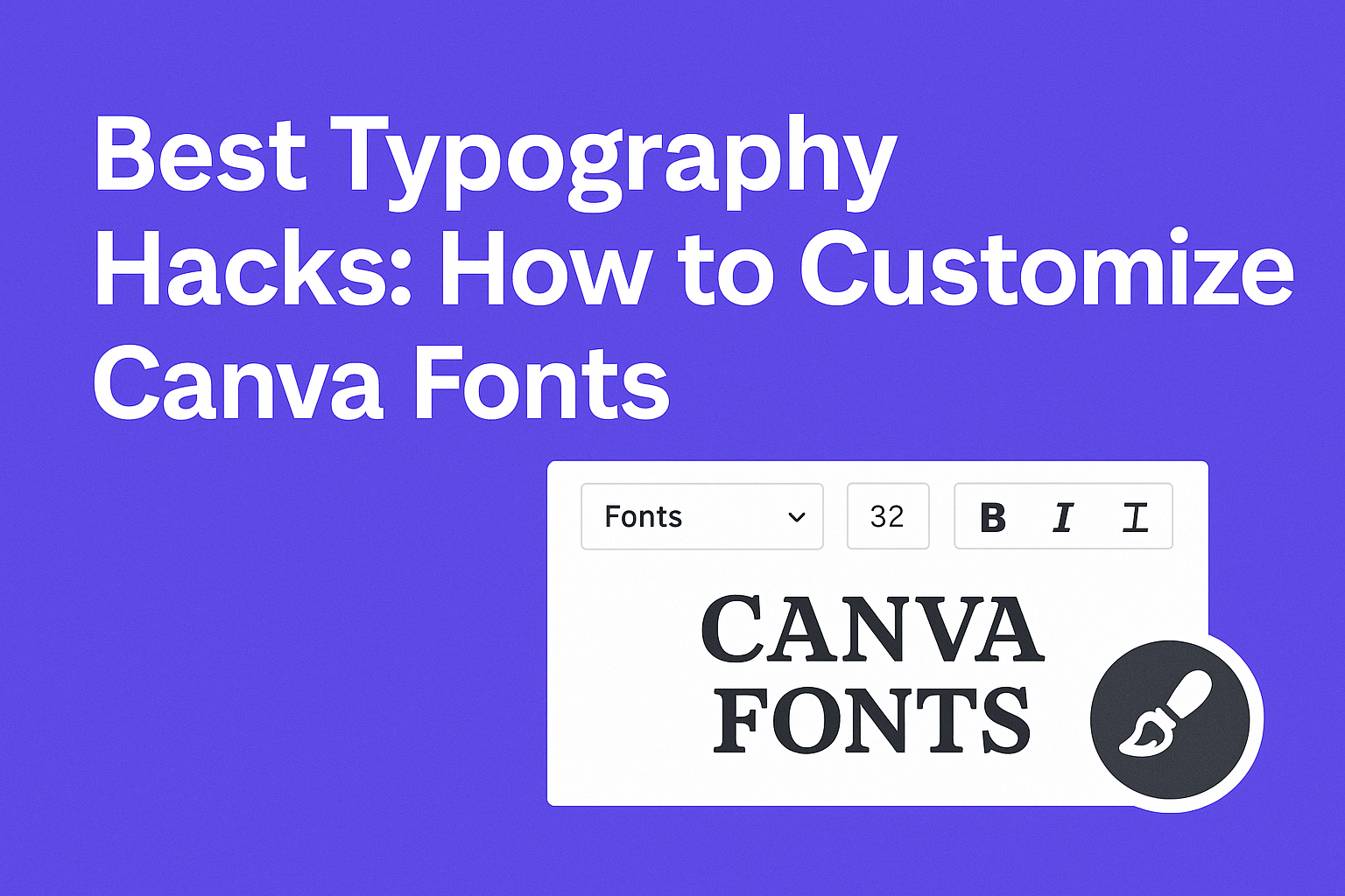
Choosing the right font and customizing it in Canva can completely change the look of a design. The best typography hacks focus on pairing fonts, adjusting spacing, and using size to create clear and eye-catching text. These simple tricks help users make their projects look professional without needing advanced skills. Many people struggle to make …
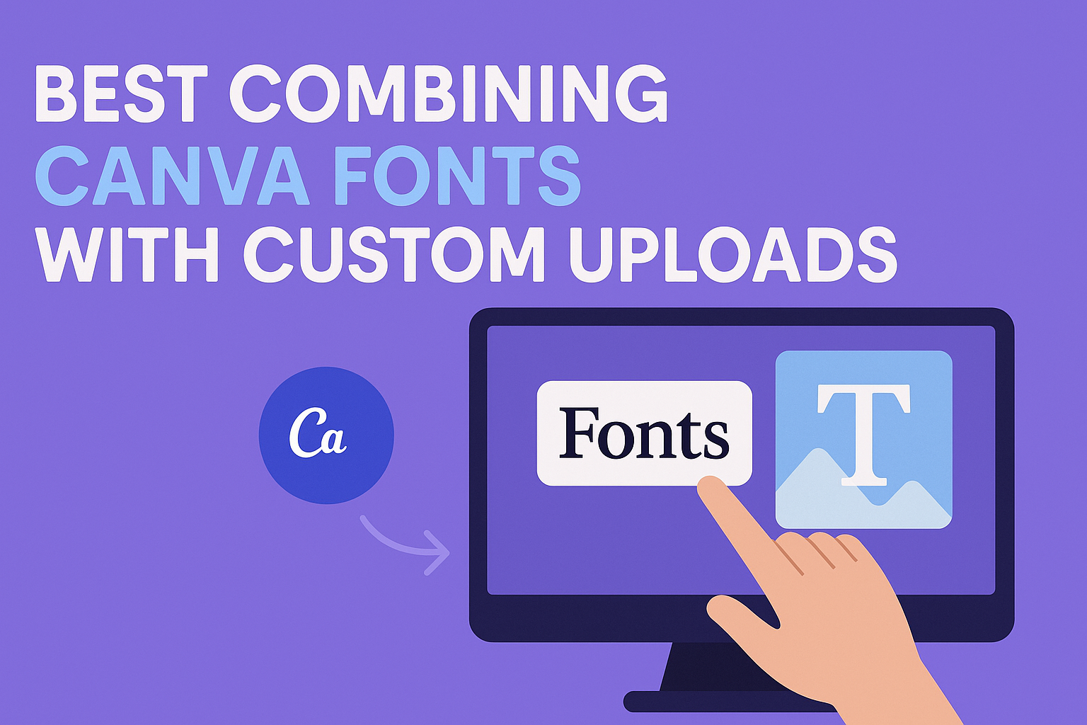
Combining Canva’s built-in fonts with custom uploads allows designers to create unique, balanced designs that stand out. The best way to combine these fonts is to pair contrasting styles, like a clean sans-serif from Canva with an elegant script uploaded as a custom font. This mix improves readability and adds personality, making any project look …
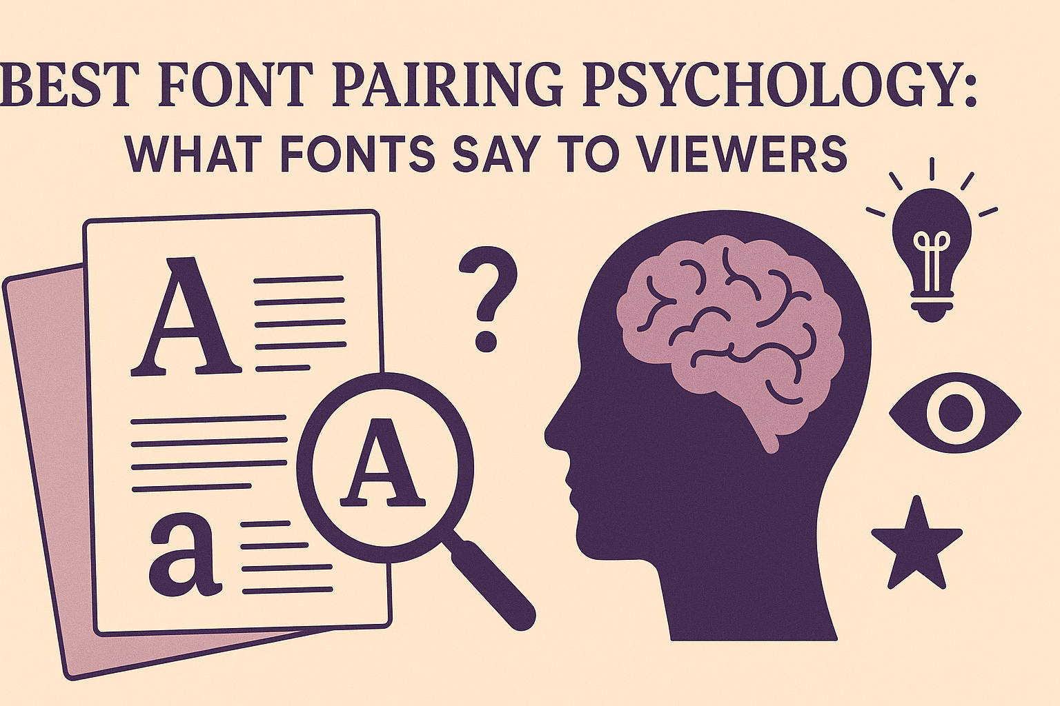
Choosing the right font pairs is more than just picking what looks nice together. Fonts send subtle messages to viewers, shaping how they feel about the content and the brand behind it. The best font pairing psychology helps designers create clear, trustworthy, and engaging messages by matching fonts that work well emotionally and visually. When …
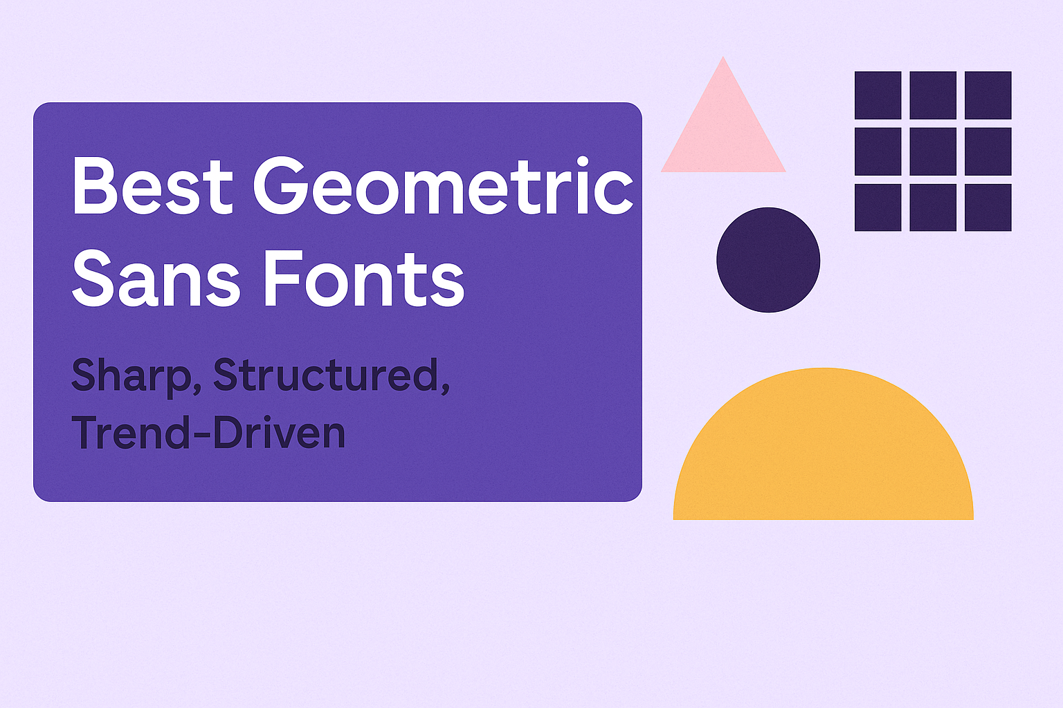
Geometric sans fonts stand out for their clean lines and sharp angles, making them perfect for projects that need a modern, structured look. The best geometric sans fonts combine simple shapes like circles and squares with balanced proportions to create a bold yet minimal style that fits today’s design trends. These fonts are popular in …
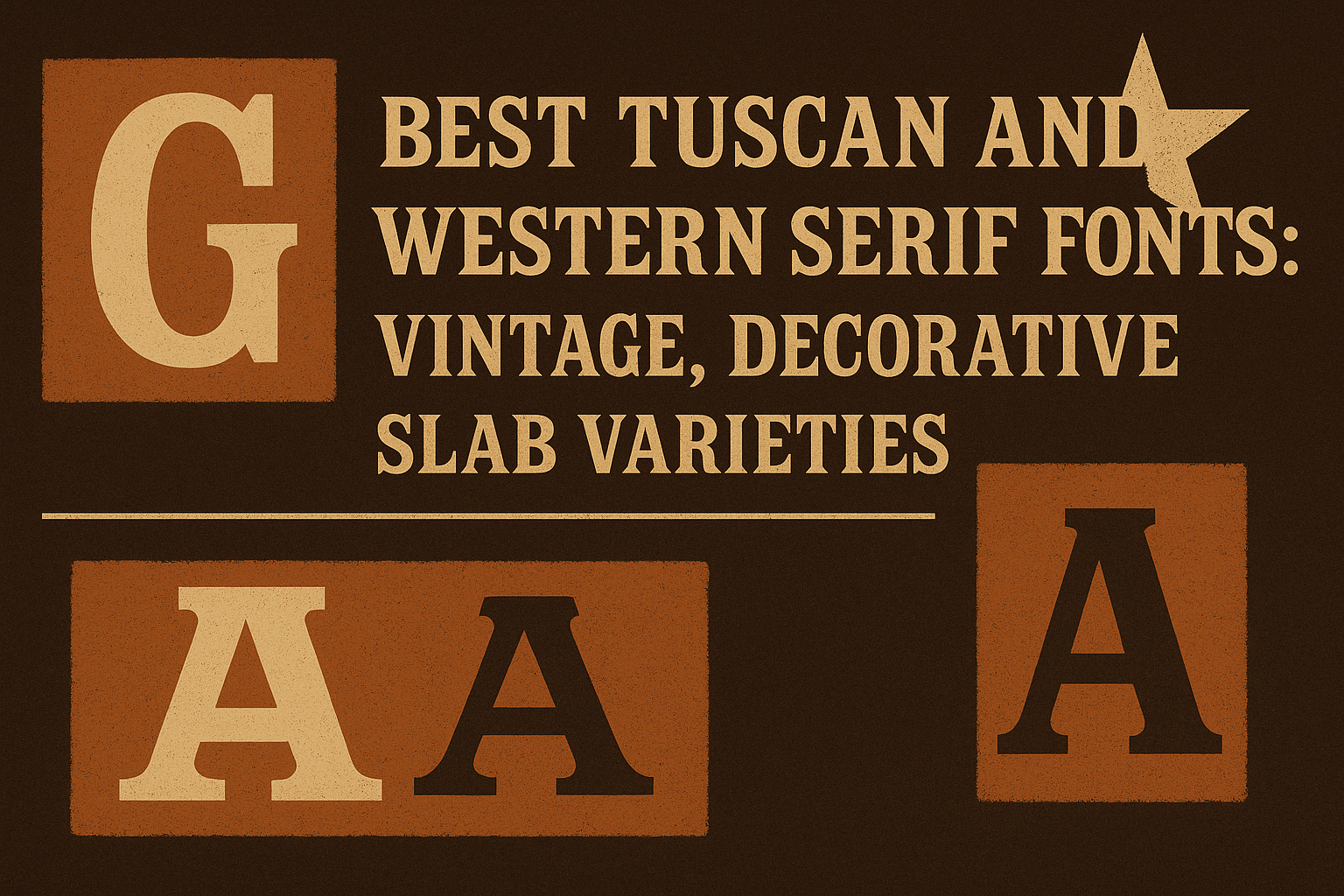
Tuscan and Western serif fonts bring a unique charm to any design, blending vintage appeal with decorative details. These fonts stand out because of their slab serifs and bold, block-like shapes that capture the spirit of old Western signage and classic typography. Designers often choose these fonts for their readability and powerful visual impact, which …
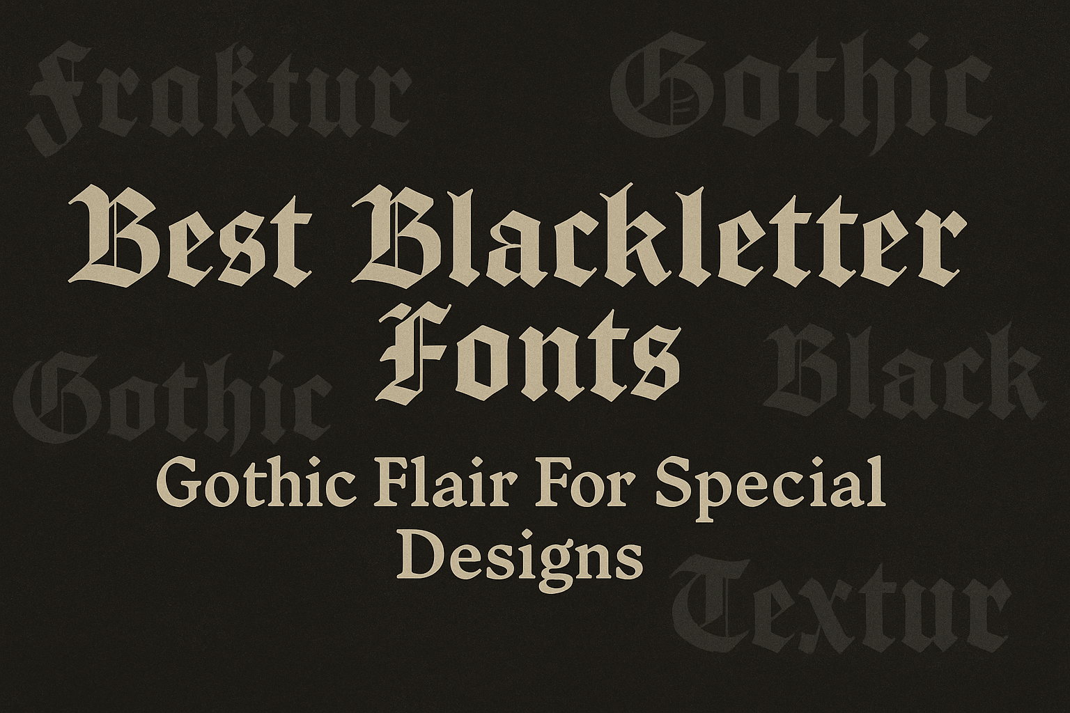
Blackletter fonts bring a striking gothic flair that can make any design stand out with a vintage, medieval touch. They work well for logos, posters, invitations, and branding, adding a sense of drama and style that simpler fonts can’t offer. Designers often choose fonts like Cambridge, Darkgone, and Cattedrale for their mix of traditional and …