
Choosing the right fonts is key to creating a strong brand identity in Canva. A well-selected font can make a brand kit and style guide look professional and memorable. The best Canva fonts for brand kits balance readability, style, and personality to represent the brand clearly and attract the right audience. Fonts in a brand …
Font Tutorials
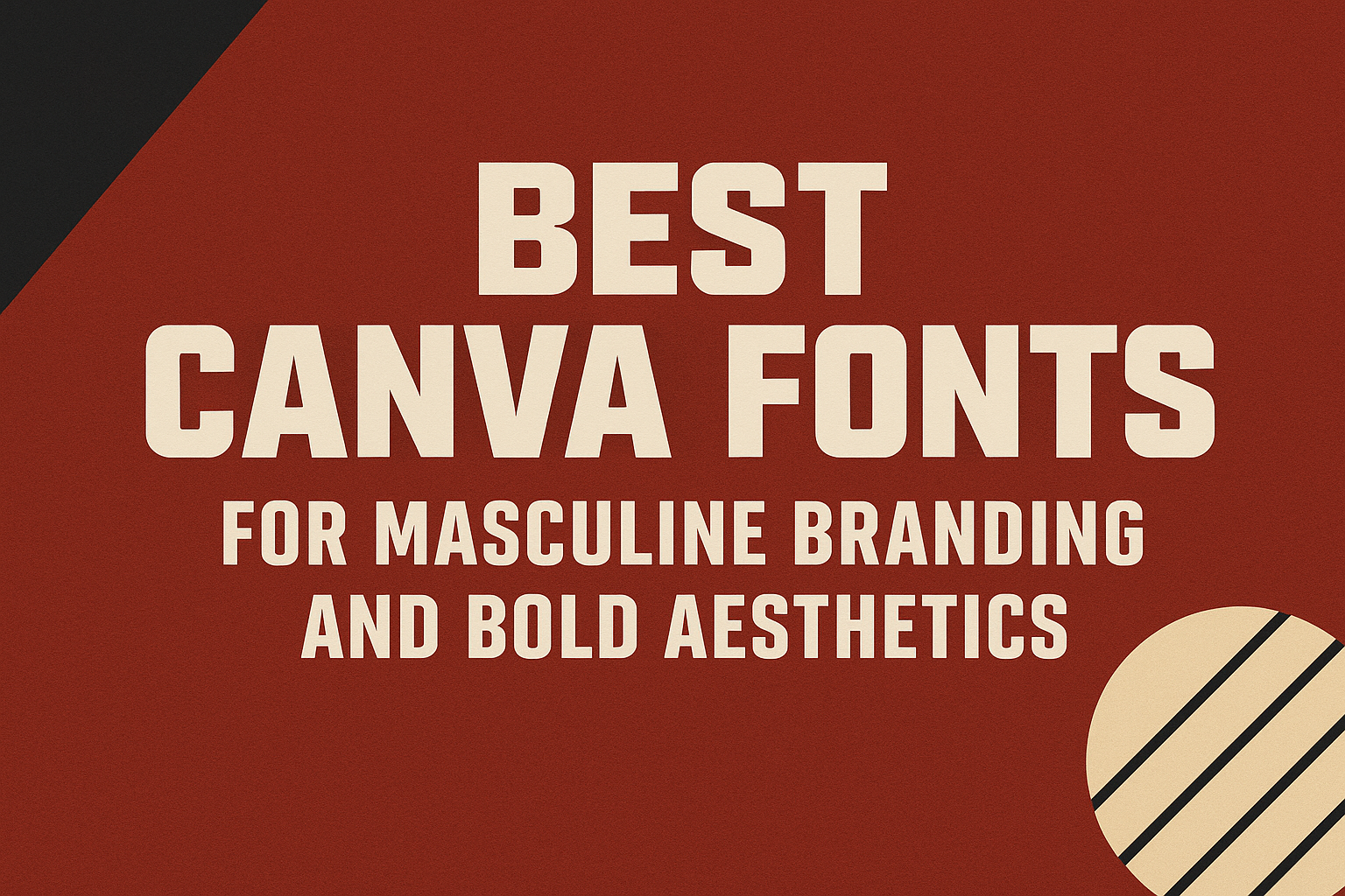
When creating a strong, masculine brand, choosing the right font plays a huge role. The best Canva fonts for masculine branding combine boldness, clarity, and style to give designs a confident and powerful look. These fonts stand out without overwhelming the message, making them perfect for logos, headlines, and marketing materials. Masculine fonts often feature …
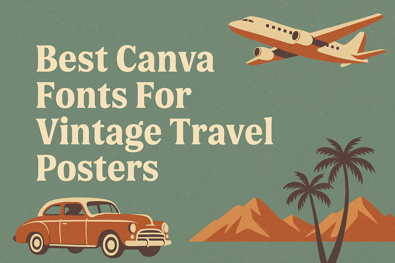
Creating the perfect vintage travel poster starts with choosing the right fonts that capture the spirit of adventure and nostalgia. The best Canva fonts for vintage travel posters combine classic styles with a touch of retro charm, making your design stand out while evoking feelings of past explorations. These fonts help bring old travel ads …
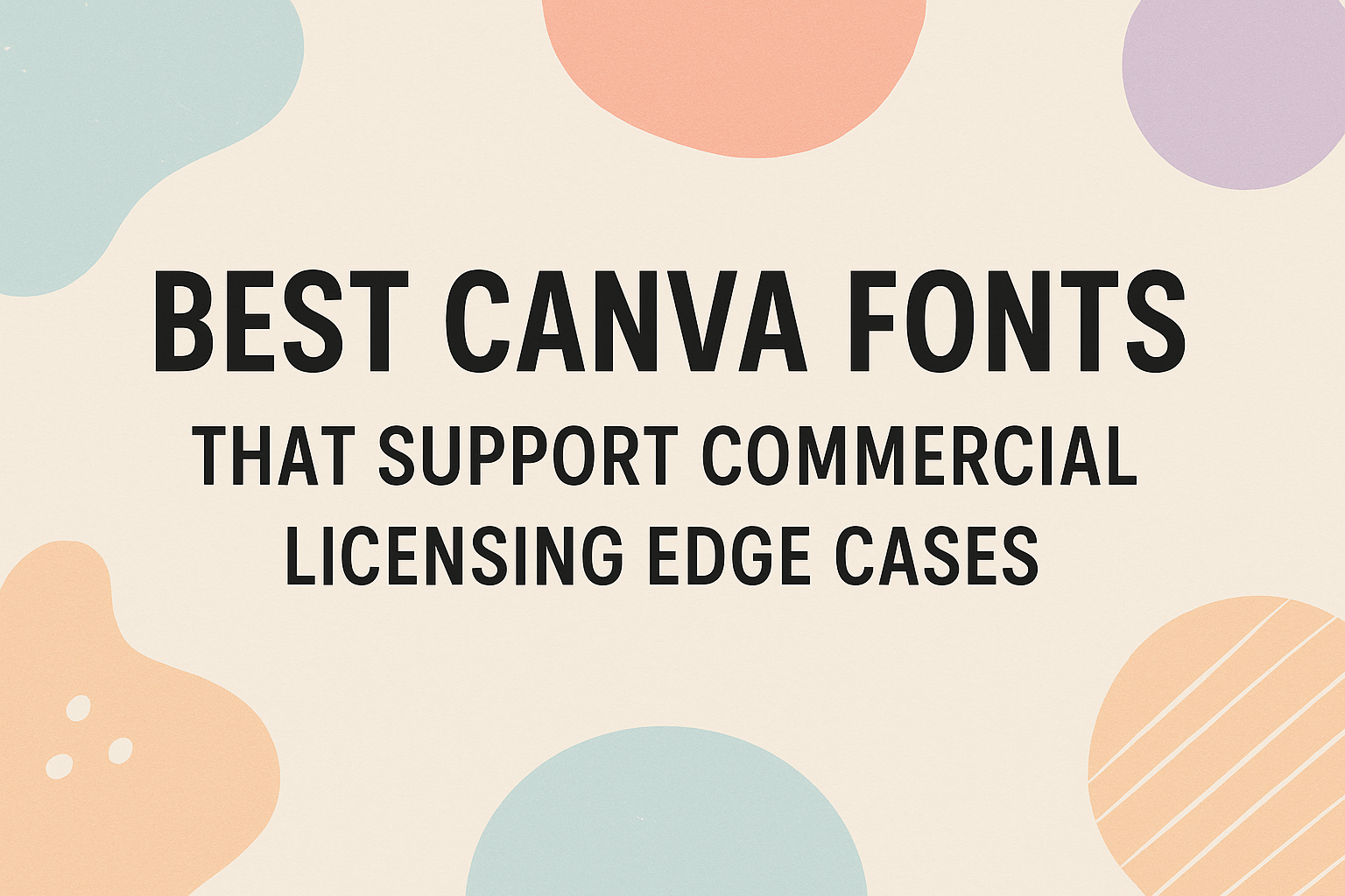
Many Canva fonts can be used in commercial projects, but some come with tricky licensing rules that can confuse users. The best Canva fonts for commercial use are those that clearly support licensing edge cases, making it safe to use them without legal worries. Knowing which fonts fit this category helps designers avoid costly mistakes. …
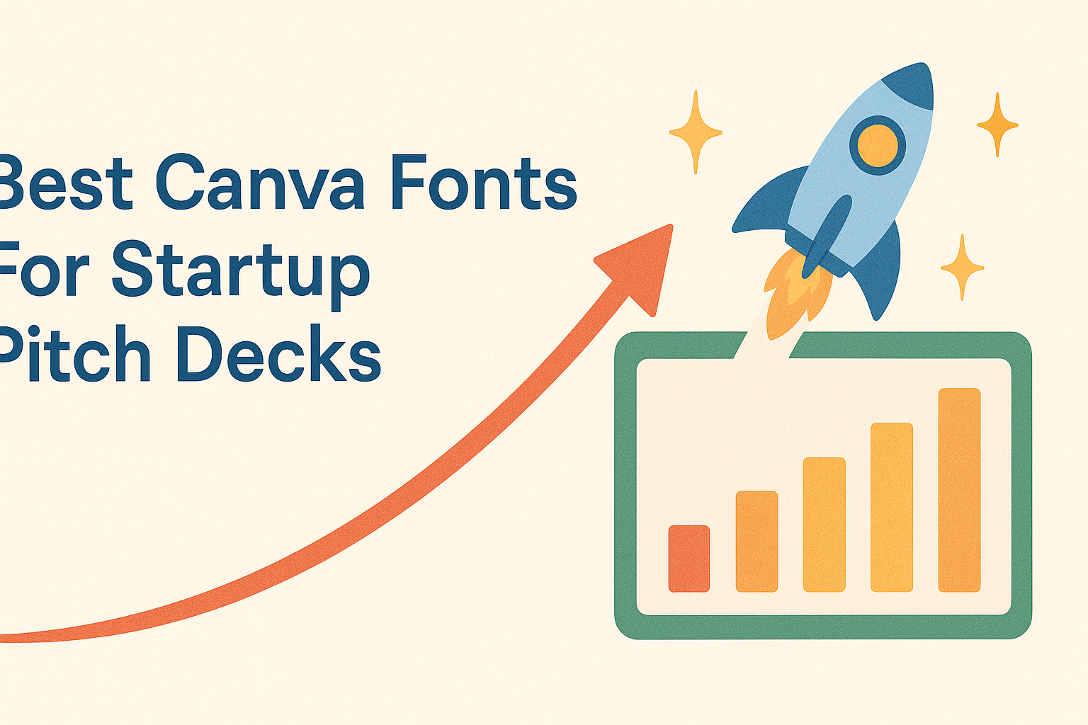
Choosing the right fonts for a startup pitch deck is key to making a clear, professional impression. The best Canva fonts combine readability with style to help startups communicate their ideas confidently. Fonts like Aileron, Canva Sans, and Work Sans are top choices because they balance modern design with easy reading, making them perfect for …
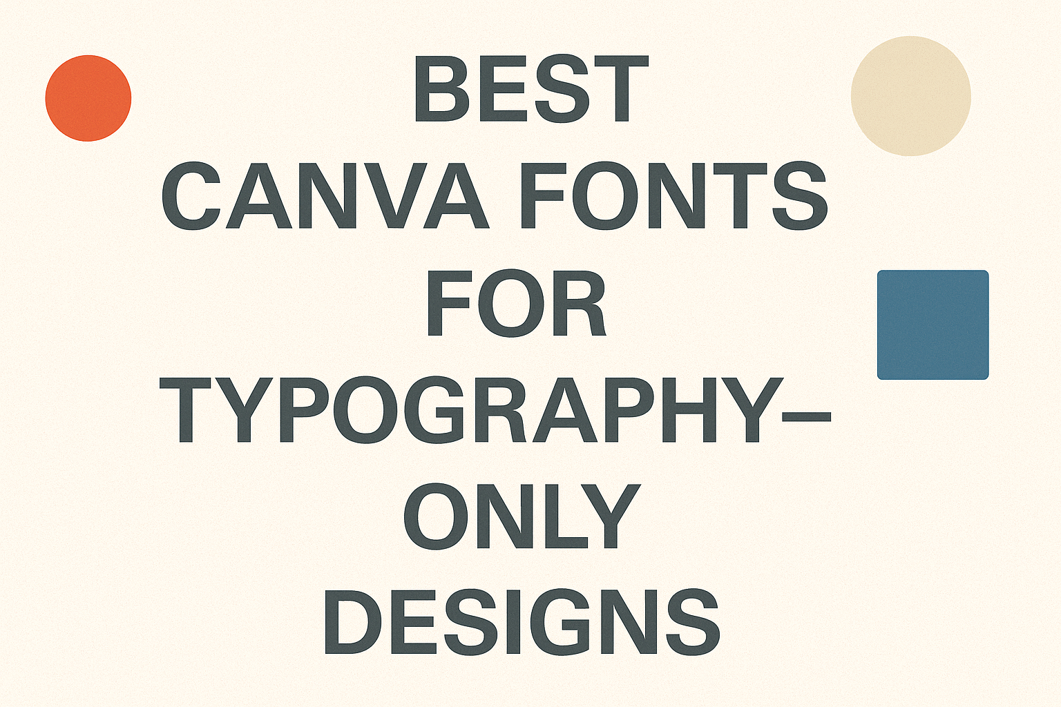
Choosing the best fonts for typography-only designs in Canva can make all the difference in creating clear and striking visuals. Fonts like Josefin Sans, Lilita One, and Brittany are popular choices because they balance personality with easy reading. Typography-only designs rely on font choice to communicate tone, mood, and message effectively. Mixing bold and delicate …
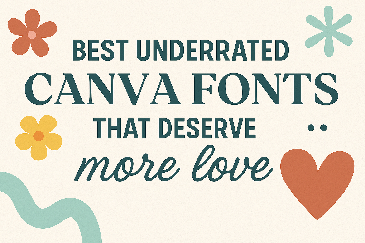
Many Canva users tend to stick with popular fonts, but there are plenty of great underrated options that can make designs stand out in a unique way. These fonts offer fresh styles that add personality without being overused. These lesser-known fonts often combine well with popular styles, offering new font pairings that feel both modern …
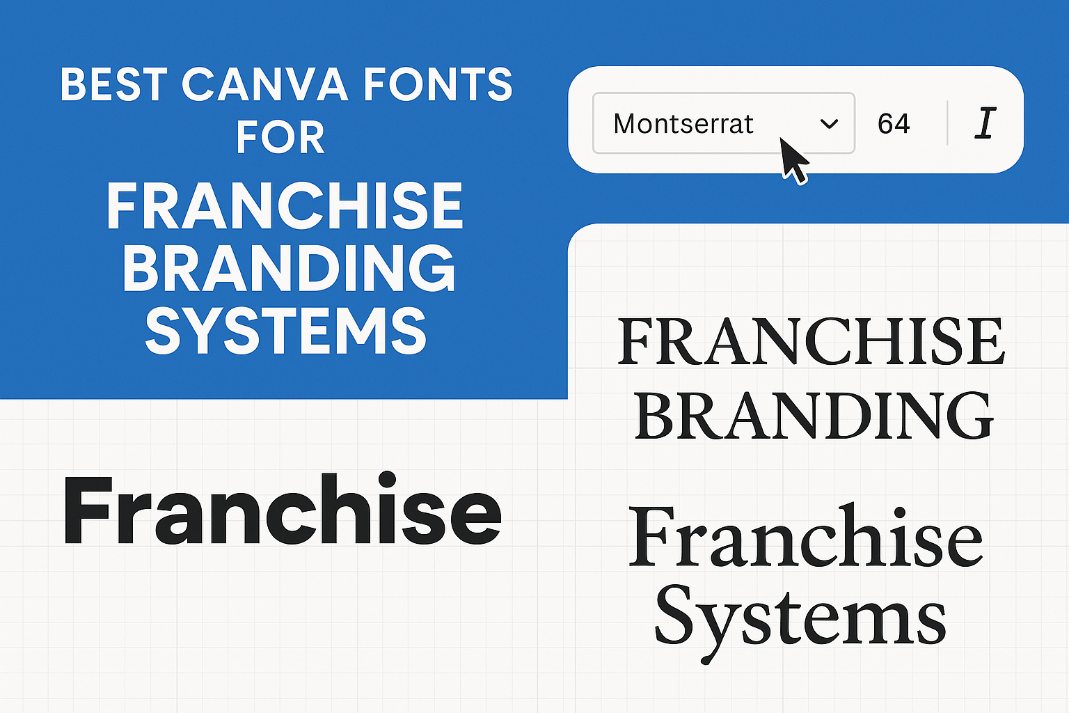
Choosing the right font is key to making a franchise brand stand out and feel consistent across all locations. The best Canva fonts for franchise branding systems combine readability, personality, and versatility to create a strong visual identity. This helps customers recognize the brand instantly, whether it’s online or in-store. A good font not only …
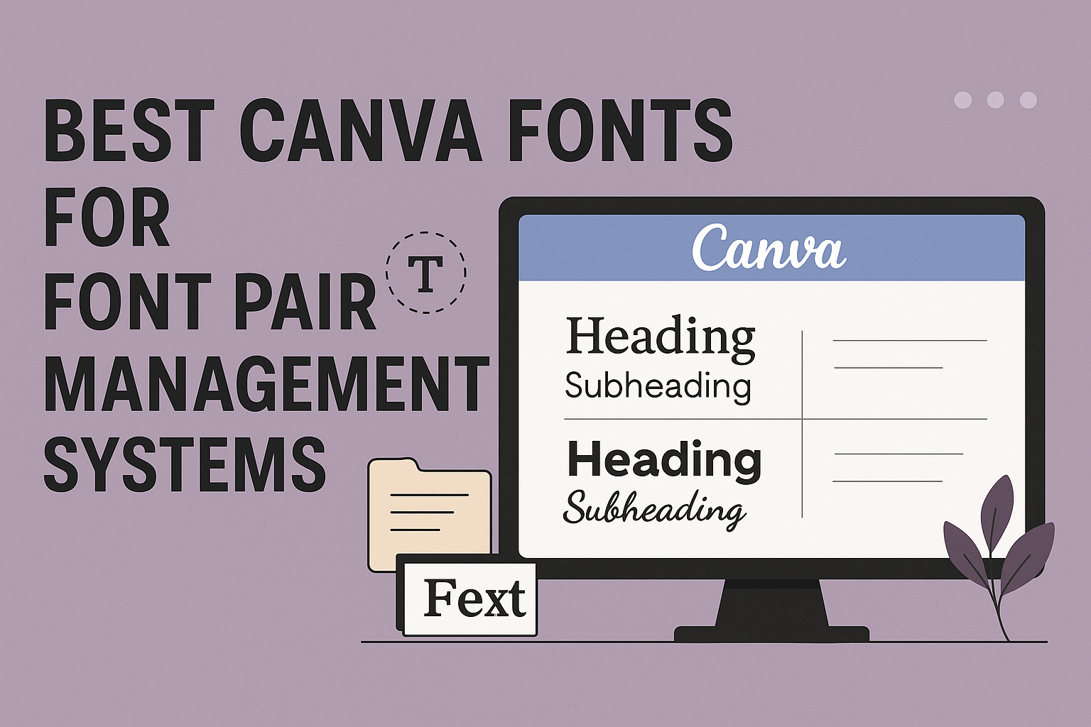
Choosing the right fonts for font pair management systems can make managing brand identity easier and more effective. The best Canva fonts for these systems combine clear readability with versatile pairing options to keep designs consistent and professional. This balance helps users create sharp, attractive visuals without confusion or clutter. Many font pairings mix bold …
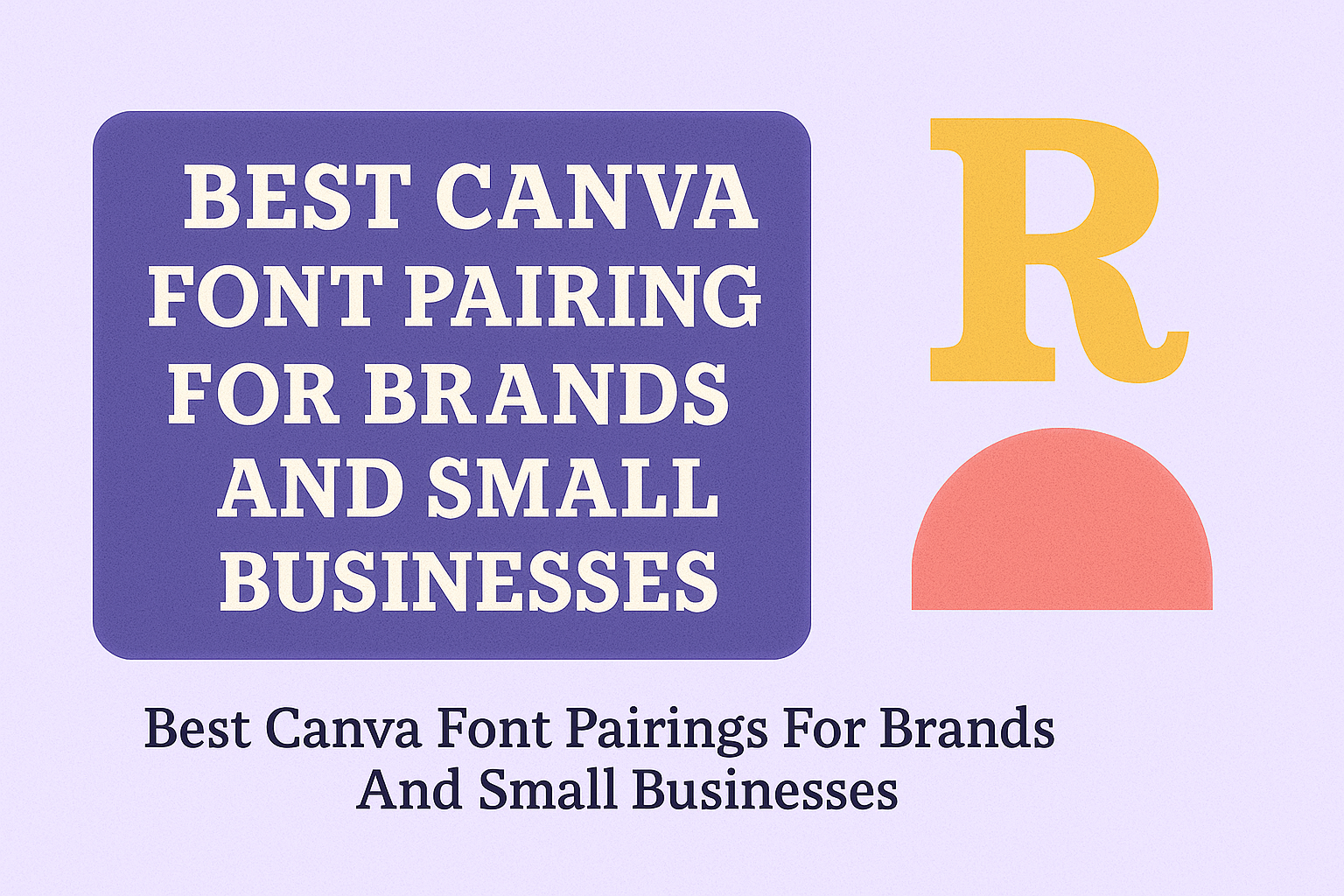
Choosing the right fonts can make a big difference for brands and small businesses. It helps create a clear and memorable look that connects with customers. The best Canva font pairings combine styles that balance readability with personality, making designs stand out without feeling cluttered or confusing. Many successful brands use font pairs that mix …