Designing for everyone can be a challenge, especially when it comes to accessibility.
One tool making this easier is Canva’s Vision Simulator.
This tool lets designers see how their creations look to people with different types of color blindness. It’s a game-changer for ensuring that designs reach a wider audience without misunderstanding or confusion.
Color blindness affects a significant portion of the population, impacting about 4.5% around the world.
Tools like the Vision Simulator, integrated with Adee, help bridge the gap in visual design.
Using this tool enables designers to create content that is visually accessible to all, enhancing usability and inclusivity.
By simulating how designs appear to people with conditions such as deuteranopia or tritanopia, designers can make informed adjustments to their work.
These adjustments help in crafting a more inclusive experience for everyone, making the design world just a little bit friendlier.
What Is Canva’s Vision Simulator Tool
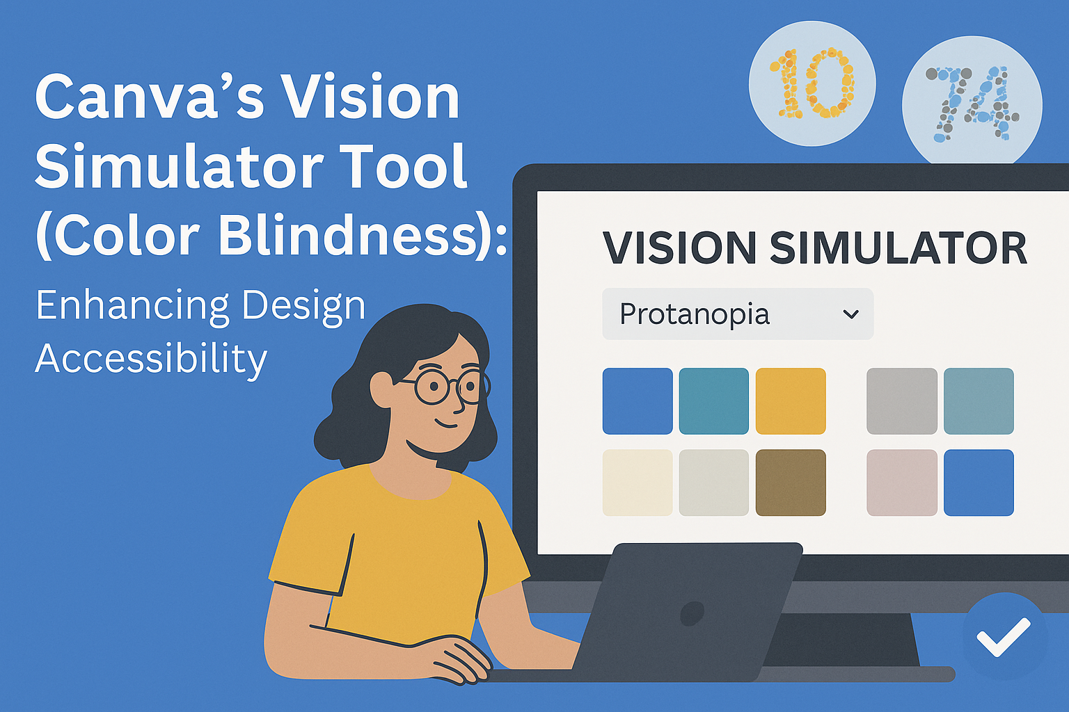
Canva’s Vision Simulator Tool is designed to help users see how their designs appear to people with color blindness.
This tool is especially useful for designers who want to create more accessible content for everyone. It allows creators to check how different types of color blindness might affect the visibility of their designs.
Color blindness affects about 4.5% of the population. Common types include red-green color blindness, which is the most widespread, affecting around 8% of men.
Canva offers a variety of filters to simulate these conditions, including Deuteranopia, Protanopia, and Tritanopia.
Users can access the Vision Simulator via Canva’s interface.
By selecting the design they want to test and choosing the appropriate color blindness filter, designers can easily adjust their work to ensure better accessibility. These adjustments help make designs more inclusive for all viewers.
The Vision Simulator is part of Canva’s commitment to accessibility. It is integrated with Adee, a free accessibility testing tool, to further support designers in their mission to create content that considers different visual capabilities.
This tool does more than just simulate; it empowers designers to make changes that ensure everyone can enjoy the content equally. By adopting these practices, designers demonstrate a commitment to audience inclusivity and awareness.
Understanding Color Blindness
Color blindness affects millions of people around the world, impacting the way they perceive colors in their daily lives. It’s important to know the different types of color blindness and how they change visual perception.
Types of Color Blindness
There are several types of color blindness, each affecting vision in unique ways.
The most common type is red-green color blindness, which involves difficulties distinguishing between red and green hues. This type is more prevalent in men because the gene responsible is located on the X-chromosome, and men have only one X-chromosome.
Another form is blue-yellow color blindness, where individuals struggle with distinguishing between blue and yellow shades. This type is less common and affects both men and women equally.
Complete color blindness, known as achromatopsia, is rare. People with this condition see all colors as shades of gray. Understanding the differences in these types helps tailor tools like color-blindness filters to assist users better.
Impact on Visual Perception
Color blindness can significantly alter how someone perceives the world.
Everyday activities like choosing ripe fruits, reading color-coded charts, or stopping at a red light can be challenging.
Those with red-green color blindness may see reds and greens appear as similar shades, making traffic lights more difficult to interpret. People with blue-yellow color blindness might struggle to distinguish between the sky and clouds.
These visual challenges require solutions such as adaptive technology or design considerations to improve accessibility.
Tools like Canva’s Vision Simulator help designers see how people with color blindness experience their work, promoting more inclusive and accessible designs.
How the Vision Simulator Works
Canva’s Vision Simulator helps people design with inclusivity in mind by showing how images look for those with color blindness. It uses specialized technology to mimic various vision impairments, offering a useful tool for designers aiming to craft more accessible visuals.
Technology Behind the Simulation
The Vision Simulator by Canva employs digital filters that adjust image colors to simulate the visual limitations of color blindness. This happens in real-time, allowing users to see immediate changes.
It uses algorithms to replicate how different color wavelengths are perceived, ensuring accuracy.
These digital filters are integrated with Adee, a free accessibility testing tool. This seamless connection means users can apply the simulator easily to any design project within Canva without needing additional software or tools.
Simulating Different Types of Color Blindness
The Vision Simulator supports eight types of color blindness, including Deuteranomaly, Protanomaly, and Tritanopia, among others. Each type affects color perception differently, such as distinguishing reds and greens or blues and yellows.
Users can switch between these filters to see how their work appears to those with specific vision challenges. This function empowers designers to make informed choices about their color schemes, ensuring their work is inclusive for all viewers.
This way, visuals remain effective and accessible, regardless of the viewer’s visual abilities.
Designing for Accessibility
Designing for accessibility ensures that visual content is inclusive and usable by a broader audience, including those with disabilities. Key aspects include careful use of color and thoughtful creation of visual elements.
Best Practices in Color Usage
Using color thoughtfully is essential in accessible design.
Designers should choose color combinations that are easily distinguishable by those with color blindness. For example, avoiding using red and green together can help since these colors are often confused by people with red-green color blindness.
It’s also important to use high-contrast color schemes. This makes text and images easier to see and read, especially for individuals with vision impairments.
Using texture and patterns alongside color can also provide visual cues that do not rely solely on color.
Moreover, designers can utilize tools like Canva’s Vision Simulator to preview how designs appear to individuals with color vision deficiency. This helps ensure the accessibility of the content being created.
Creating Inclusive Visual Content
Creating inclusive visuals involves more than just color. Using clear labels and descriptions ensures that content is understandable to all users, including those relying on screen readers. Adding alt text for images boosts accessibility by providing descriptions for people who cannot see the images.
Visual hierarchies can help users navigate information more easily. Organizing content with headings and bulleted lists can aid comprehension.
Consistent layout structures and clear fonts make information more digestible, catering to diverse user needs.
Incorporating media that includes captions or transcripts allows individuals with hearing impairments to engage with audio content.
Designers should aim for designs that empower all users, fostering inclusiveness and equal access to information.
Using Canva’s Tool in Design Projects
Canva’s Vision Simulator Tool is a helpful feature for designers aiming to create accessible designs. By providing real-time visual feedback, it allows users to integrate accessibility checks seamlessly into their design process.
Integration with Canva’s Platform
Canva’s Vision Simulator Tool is smoothly built into the existing Canva platform.
Users can easily access this feature by selecting a design and then navigating to the accessibility options. This tool is part of a suite of features in Canva, aimed at promoting inclusive design.
The integration ensures that designers do not need to use external software, simplifying the design workflow. Designers find it convenient as it offers compatibility across various types of design projects like social media posts, presentations, and more.
This integration supports different types of color blindness, such as achromatopsia and deuteranopia, helping cater to a wide audience.
By using the inbuilt tools, designers can ensure their content reaches and is understood by everyone, including those with color vision deficiencies. They can experiment with design elements within the tool itself, allowing for a more fluid design process.
Real-time Feedback and Adjustments
The tool offers real-time feedback, enabling designers to see how their choices affect accessibility instantly.
Once a design is open in Canva, the Vision Simulator provides options to simulate how people with different types of color blindness perceive colors.
This immediate feedback helps designers make quick adjustments, ensuring the color combinations they use are clear and effective.
With this capability, designers can tweak colors, contrasts, and other elements on the spot to accommodate the needs of viewers with different visual perceptions. The straightforward feedback reduces the time needed for revisions and helps in delivering final designs that communicate clearly to everyone.
By utilizing this tool, their creative process becomes more inclusive, ultimately broadening their potential audience reach.
Educational Applications
Canva’s Vision Simulator tool is a valuable resource in educational settings. It can help teachers and students understand color blindness by providing visual examples. This can be particularly beneficial during biology or health classes to explain how different types of color blindness affect vision.
Using the tool, students can compare how people with varying types of color blindness perceive the same image. This fosters empathy and awareness, promoting discussions around inclusivity and designing materials for diverse audiences.
Teachers can use the Vision Simulator to enhance lesson plans.
For example, art teachers may teach students how to create more accessible artwork. By experimenting with color palettes using the simulator, students learn to design with everyone in mind.
Here are a few ways this tool can be integrated into the classroom:
- Science Projects: Students showcase the science behind human vision and color perception.
- Art Assignments: Experiment with different color combinations for accessible design.
- Awareness Programs: Conduct workshops on inclusivity and accessibility in digital designs.
The tool provides an interactive experience, encouraging students to think critically about the impact of design and color choices. With this hands-on approach, learners can develop skills to create inclusive designs that accommodate everyone.
Educators looking to implement the Vision Simulator in their curriculum can learn more about this tool and its features. Integrating such innovative tools into education can enhance learning experiences and prepare students to be more considerate creators in a diverse world.
Case Studies
Canva’s Vision Simulator Tool helps designers make their work accessible to people with color blindness. This section focuses on stories of success and improvements in user experience, showing the importance of this tool in design.
Success Stories
Many companies and individual designers have found great success by using Canva’s Vision Simulator Tool.
A small business owner redesigned their logo with this tool and expanded their customer base after realizing the original colors were not accessible to everyone. By making their design more inclusive, they saw a 20% increase in customer engagement.
Educators also benefit, ensuring their educational materials are accessible to students with color blindness. A teacher reported more student participation and fewer misunderstandings in class after adjusting colors in presentations.
These success stories highlight the real-life impact of making designs visible to all.
User Experience Improvements
User feedback is crucial for improving any tool.
According to the feedback for Canva’s Vision Simulator, users appreciate its simplicity and effectiveness. They find it easy to see how their designs look to people with color blindness using different filters such as deuteranopia and protanopia filters.
Another welcome change is how Canva helps users address accessibility challenges more confidently.
Designers feel empowered to create inclusive designs without needing advanced technical knowledge. This results in better design practices and greater awareness of accessibility needs.
Overall, user experience enhancements through this tool make it easier for everyone to participate and enjoy visual content.