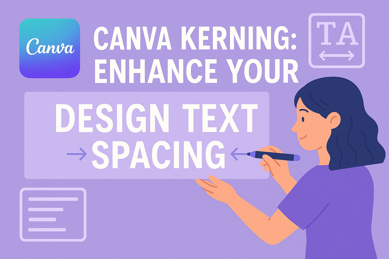
Kerning is a skill that can take your design work to the next level.
In the world of typography, kerning refers to adjusting the space between characters. The right amount of space can improve the readability and look of your text, creating a more professional and polished appearance.
In Canva, learning how to kern properly can set your design apart and make it stand out.
Many people are curious about how to use kerning in Canva. While Canva’s design platform offers plenty of tools, adjusting kerning isn’t as straightforward as some might hope.
To adjust kerning in Canva, users often need to break text into individual letters to tweak the spacing, giving them more control over their design.
For those wanting to master this, there are helpful guides like this step-by-step tutorial on kerning and letter spacing.
Mastering kerning is important for anyone interested in design. It could have a big impact, especially when working with headings or logos where space is limited.
Kerning can help bring text to life, making it easier to read and more visually appealing.
For those who are keen to dive deeper, guides to kerning in Canva provide a straightforward approach to mastering this important design technique.
Understanding Kerning in Canva
Kerning is an essential design skill used to ensure that text appears visually appealing and balanced.
Canva provides simple tools to adjust kerning, allowing users to fine-tune the spacing between letters for a polished look.
The Basics of Kerning
Kerning in Canva involves adjusting the space between individual letters. This helps improve the text’s appearance and makes it more legible.
When letters are too close or too far apart, it can create visual distractions. Proper kerning prevents awkward spacing, ensuring text looks clean.
In Canva, users can manually change kerning by selecting the text and modifying the kerning settings. This feature is accessed through the Text panel.
By adjusting the kerning value, designers can achieve the ideal spacing for their projects. This ability is crucial for creating professional designs, especially in logos and headlines where precise letter spacing is vital.
Kerning vs. Tracking vs. Leading
It’s important to understand the differences between kerning, tracking, and leading.
Kerning deals with spacing between individual characters, while tracking refers to uniform spacing across a block of text. Leading is the space between lines of text. These three elements work together to enhance readability and design aesthetics.
In Canva, users primarily focus on kerning and tracking. While kerning is about individual letter adjustment, tracking adjusts the spacing throughout a whole word or sentence.
Canva’s design tools simplify the process with easy-to-use interfaces for both features. Though leading isn’t as prominently featured in Canva, understanding its role helps in comprehensive design planning, ensuring text is both beautiful and easy to read.
How To Adjust Kerning in Canva
Adjusting kerning in Canva is a simple way to make text look more polished and professional. This section will guide readers through the steps to manually adjust kerning and provide handy keyboard shortcuts for efficiency.
Step-by-Step Guide
To adjust kerning in Canva, start by selecting the text box you want to alter. Double-click on the text to highlight it. This makes the editing tools appear.
Look for the Text panel, usually on the toolbar above the canvas. In some versions, a button labeled Spacing appears once text is selected.
Click on the Spacing or Text options, and a dropdown or side menu will open. Here, you can adjust both Letter Spacing and Line Height.
For kerning, focus on the Letter Spacing slider. Move it right to increase spacing or left to decrease it. It’s best to make small adjustments, so the text remains readable and aesthetically pleasing.
Remember to preview your changes to see how text aligns with other elements. Experimentation is key to achieving the best visual balance.
For more detailed guides, they can explore tutorials such as Kerning in Canva: Straightforward Guide.
Keyboard Shortcuts for Efficiency
Using keyboard shortcuts can speed up the kerning process. Canva incorporates some universal text editing shortcuts.
While not all keyboard shortcuts will affect kerning directly, managing text selection efficiently does. For instance, Ctrl + A (or Cmd + A on Mac) highlights all text, allowing quick access to the formatting toolbar.
Unfortunately, Canva doesn’t have specific keyboard shortcuts solely for kerning, unlike some professional design tools.
Users can still make quick changes by mastering general text shortcuts, improving their workflow significantly when paired with manual adjustments. Keeping an eye out for possible updates or user-created solutions might help improve efficiency even further.
Best Practices for Kerning
Effective kerning enhances text readability and visual appeal. Attention to font specifics and making adjustments based on design context are key to achieving well-kerned text.
Font Considerations
Fonts can impact kerning dramatically. Different fonts come with unique kerning settings.
It’s essential to understand whether the font uses metrics or optical kerning. Metrics rely on the typeface designer’s specifications, while optical uses an algorithm to adjust spacing.
When working with Canva, exploring these settings is important for enhancing design quality.
For example, a more decorative font might benefit from optical kerning due to its varied shapes. Regular practice with different fonts helps designers see how slight adjustments in kerning can lead to noticeable differences in text appearance. This understanding contributes to creating designs that are both visually appealing and easy to read.
Contextual Adjustments
Context is crucial for kerning adjustments. The purpose and setting of the text should influence spacing decisions.
For instance, titles often need tighter kerning because larger text can exaggerate spacing mismatches. In contrast, body text might need looser kerning for improved readability.
Designers using Canva can experiment with different kerning settings for various types of projects. A wedding invitation might demand tighter, elegant spacing, while an online article’s text should prioritize clarity and legibility.
Paying attention to these contextual details allows the design to better suit its specific purpose, ensuring the text looks as intended across different formats and sizes.
Common Mistakes to Avoid
Many designers make errors with kerning that can affect their projects. Here are some common mistakes to watch out for:
-
Inconsistent Spacing:
Spacing that isn’t even between letters can lead to a messy design. A consistent approach is key to professional-looking typography. -
Ignoring Font Differences:
Not all fonts require the same amount of kerning. Different fonts have different default settings, so designers should adjust according to each font’s needs. -
Over-Kerning:
Ideally, spacing should enhance readability, not disrupt it. -
Under-Kerning:
Tight spacing can create confusion between letters. It’s important to maintain clarity by ensuring letters don’t blend. -
Reliance on Default Settings:
Sometimes, a font’s default kerning isn’t suitable. Designers should regularly check and adjust to ensure the best fit for their text. -
Overlooking Small Text:
Kerning adjustments are often ignored in small text or subheadings. Proper spacing in subtext can significantly enhance its appearance. -
Misuse of Color and Spacing:
Using colors like red and green together can distract from kerning issues by focusing attention elsewhere. Designers should be cautious with color schemes.
By paying attention to these potential pitfalls, designers can improve their kerning skills and create more balanced designs. Staying aware and making adjustments as needed will help avoid these common issues.
For more tips on kerning, Canva offers plenty of helpful guides to improve design skills.
Advanced Kerning Techniques
Advanced kerning techniques involve pairing fonts to create harmony and adjusting kerning for various devices. These skills can improve the appearance of text across different platforms.
Pairing Fonts
A vital aspect of advanced kerning is pairing fonts harmoniously. The key is to find fonts that complement each other to keep the design balanced. This often involves choosing a more decorative font paired with a simple, clean one.
For instance, a bold serif can be well-matched with a light sans-serif.
Consider the visual weight of letters and how they interact when paired. Use kerning adjustments to ensure even spacing between different font styles. This improves the readability and aesthetic of the design.
Checking the typeface sizes can also make a big difference. Using tools like Canva’s kerning settings, users can refine their text designs.
Adjusting for Different Devices
Different devices display text differently, making adjustments necessary. Text that looks great on a desktop might not work well on a smartphone.
It’s important to test designs on multiple devices to ensure they look consistent. This means tweaking kerning values to maintain readability and visual appeal.
Some devices might need a tighter kerning to ensure readability on small screens. On larger screens, more spacious kerning can make text look more elegant.
Using the kerning features in Canva, designers can efficiently adjust their work for different formats.
Keeping these considerations in mind helps create designs that look professional everywhere.
Design Principles Related to Kerning
Kerning plays a critical role in design, impacting the visual hierarchy and enhancing both readability and accessibility.
Attention to kerning can effectively guide the reader’s eye, making text legible and easy to digest.
Visual Hierarchy
Visual hierarchy is essential in organizing information clearly and effectively. Kerning contributes significantly to this by creating a pleasing balance between letters and words.
When designers get kerning right, it helps to emphasize important text elements.
Larger headings often benefit from tighter kerning, making them stand out more. Conversely, smaller text like body copy might need looser spacing to improve readability.
Kerning affects line spacing, which draws attention to headlines or subheadings. Uniform character spacing can make text blocks more cohesive.
Properly kerned text ensures that important information catches the reader’s attention first. Inconsistent kerning can distract and confuse, while thoughtful adjustments provide a clear path through content.
Readability and Accessibility
Effective kerning enhances readability across different platforms. They ensure that text is not only visually appealing but also easy to comprehend.
Poor kerning can lead to letters that are too close or too far apart, making words difficult to read. This makes it challenging for everyone, including those with visual impairments, to consume the content easily.
For digital text, kerning adjustments must also consider how words appear on various screens.
Accessibility is improved when kerning accommodates different font sizes and styles.
Designers can utilize tools, like the built-in kerning features in Canva, to refine text and maintain its legibility, ensuring content is accessible to all readers.
Real-World Examples of Kerning in Canva
Kerning is all about adjusting space between characters. It helps text look more balanced. In real life, good kerning can make a big difference in design projects. Canva makes it easy for users to tweak spacing for better results.
One great example is designing a business card. Proper kerning ensures names and contact info are easy to read. Adjusting character spacing helps avoid clutter.
For social media graphics, attention to kerning can create eye-catching and readable text. Canva’s tools allow users to control this spacing, making posts more professional.
In presentations, titles and bullet points benefit from well-kerned text. With Canva, adjusting kerning means that each slide looks polished and clear, making information more accessible.
Kerning is also important in designing logos. Proper spacing between letters ensures logos are legible at any size, maintaining brand integrity across different formats. Canva’s intuitive interface simplifies this process.
Event invitations are another area where Canva can shine. Using kerning to create a pleasing layout ensures that invitations are attractive and easy to read, setting the right tone for any event.
Resources for Learning More About Typography in Canva
Exploring typography in Canva can be a fun journey for beginners. There are several helpful resources available online.
Canva offers insightful articles to guide users. Their page on typography tips and tricks provides a great starting point.
Here, readers can discover key elements like font selection and letter spacing.
For visual learners, video tutorials can be a great asset. YouTube is home to many videos explaining techniques.
One such video on kerning and letter spacing demonstrates essential actions with step-by-step guidance.
Interactive Web Games
Games can make learning both engaging and practical. The game Kerntype allows users to practice kerning in a playful manner.
It’s an excellent way to test skills and receive instant feedback.
Step-by-step Guides
For straightforward instructions, look at the kerning guide on Superside. This guide lays out simple steps for adjusting kerning values within Canva.
Each resource offers something unique, catering to different learning preferences. Whether you prefer reading, watching, or doing, these options can enhance anyone’s typography skills in Canva.