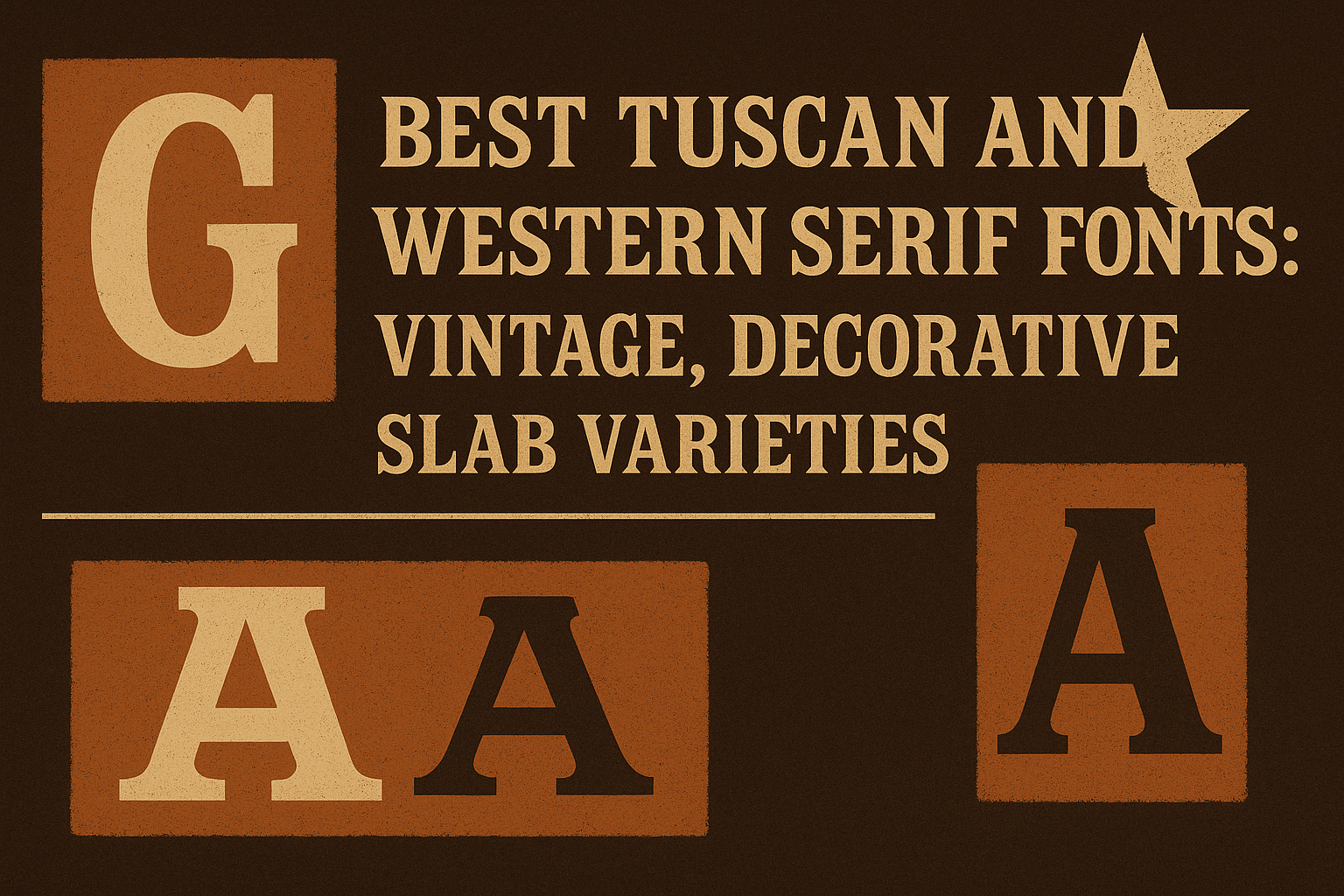
Tuscan and Western serif fonts bring a unique charm to any design, blending vintage appeal with decorative details. These fonts stand out because of their slab serifs and bold, block-like shapes that capture the spirit of old Western signage and classic typography.
Designers often choose these fonts for their readability and powerful visual impact, which can add personality without sacrificing clarity. Whether for modern use or classic-themed work, these fonts provide a versatile way to make text feel both historic and fresh.
Defining Tuscan and Western Serif Fonts
Tuscan and Western serif fonts stand out for their decorative and vintage styles. They often display unique shapes and details that combine ornamentation with bold, solid letterforms. These fonts are linked by their use in specific design themes, especially those that evoke an old-fashioned or frontier feel.
What Makes a Serif Font Tuscan or Western
Tuscan serif fonts are known for their unusual vertical terminals, which often split or branch into two points. This bifurcation gives them a decorative and somewhat intricate look. Western serif fonts share a similar boldness but lean toward blocky, solid shapes with rugged or ornamental touches.
Both types are commonly used in designs that want to recall the American West or 19th-century print styles. This includes signs, posters, and logos seeking a retro or wild west vibe. They stand apart from more traditional serif fonts by mixing strong serifs with extra flourishes or unusual shapes.
Key Features and Characteristics
Tuscan fonts often feature decorative bifurcated serifs, meaning the ends of the strokes split into two. Their shapes can be sharp or rounded but always draw attention with their complexity. These fonts usually have medium to high contrast between thick and thin strokes.
Western serif fonts have heavy slab serifs that are thick and rectangular. They often include ornamentation such as spikes or scalloped edges. Their letterforms tend to be wider and blockier than standard serifs, making them very bold and eye-catching in headline uses.
Both font styles can include extra decorative elements like swirls and dots, especially in display settings. They are less suited for body text but shine in titles and signage where style and impact matter.
Origins and Historical Development
Tuscan and Western serif fonts emerged in the 19th century, especially in the United States. They were popular in wood type printing used for posters, advertisements, and posters, often related to saloons, circuses, or Wild West themes.
Tuscan fonts grew from the desire to add flourish to the simple serif style. Designers created split or forked serifs to stand out and show craftsmanship. Western fonts developed as bold, rugged letterforms to grab attention in noisy, crowded public spaces.
These fonts have seen digital revivals that preserve their vintage feel while adapting them for modern use. Many original Tuscan or Western designs were crafted by historic type foundries and remain sources of inspiration for today’s decorative typography.
For a wide selection of these styles, people can explore collections of free and commercial Tuscan fonts or browse vintage Western fonts.
Top Vintage Slab Serif Fonts
Vintage slab serif fonts are known for their strong, bold shapes and classic style. They combine thick serifs with old-school charm, making them popular for logos, posters, and headlines that want to stand out with a retro feel.
Timeless Classic Slab Serifs
Timeless slab serif fonts like Rockwell and Clarendon have been favorites for decades. They offer thick, square serifs and consistent stroke widths, creating a sturdy, balanced look. These fonts work well in print and digital designs that need clear, readable text with a bit of vintage flair.
These classics are easy to pair with simpler sans-serif fonts. They maintain their appeal because they remind people of old newspapers, posters, and signs, adding an authentic historical touch without looking outdated.
Designer Favorites and Popular Picks
Designers often choose fonts like Museo Slab and Archer for their unique style combined with versatility. Museo Slab is known for its smooth curves and strong presence, making it great for both body text and headlines. Archer adds friendly, rounded edges that soften the heavy slab structure, making designs feel inviting and approachable.
These fonts encourage creativity, fitting a wide range of projects from branding to editorial layouts. Many are available in free and premium versions, letting users find the right fit without stretching budgets. You can explore some of the best slab vintage serif fonts to see which suits your next project.
Modern Takes on Vintage Slab Serifs
Modern slab serif fonts often mix vintage looks with contemporary twists. These fonts may include geometric shapes, more varied line weights, or slimmer profiles for a cleaner, updated feel. Examples include Sentinel and Neutraface Slab, both offering a fresh take while keeping the classic slab serif spirit.
These updated fonts work well in digital media and branding, where a vintage feel is needed but with a sleek, modern edge. They often support large character sets and web use, ensuring designers can create polished, versatile designs for today’s needs. More on modern slab serif styles is available at Vandelay Design.
Decorative and Ornamental Serif Styles
Decorative and ornamental serif fonts add strong personality to designs. They often feature unique shapes and extra details that make the letters stand out. These fonts work well for vintage or Western themes where style and flair matter.
Intricate Tuscan Letterforms
Tuscan serif fonts are known for their sharply detailed and often split or bracketed serifs. The ends of the letters usually have added curves, spikes, or flares. This detail gives Tuscan fonts a vintage feel that works great on signs, posters, and logos.
The style often uses thick and thin strokes to make the letters look bold but elegant. Using Tuscan fonts can help capture the classic look of 19th-century Western typography. They are great for creating decorative designs without losing readability.
Elaborate Western Display Fonts
Western display fonts often incorporate slab serifs that are chunkier and more solid. These fonts tend to have strong geometric shapes and ornamental lines to give a rugged, frontier-style look.
Many include extra decorations like stars, dots, or borders that make each letter look like it belongs on an old wanted poster or saloon sign. They are perfect for headlines or branding that needs to feel bold, vintage, and adventurous.
Both Tuscan and Western styles emphasize decoration while still being usable for titles and display text in many types of projects. For more decorative serif options, browsing Decorative Serif Fonts offers a wide range to explore.
Best Uses for Tuscan and Western Serif Fonts
Tuscan and Western serif fonts bring a strong vintage feel with their decorative and bold shapes. They work well where the design needs a clear connection to Old West themes or historic styles. These fonts add personality through unique serifs and textured details.
Branding and Logo Design
Tuscan and Western serif fonts stand out in branding due to their unique, eye-catching styles. They give logos a sense of history and authenticity, especially for businesses related to ranches, saloons, or vintage products.
Their bold serifs and decorative elements make logos memorable. The fonts often have rugged or distressed textures that add character without losing readability. This helps brands express a rustic or frontier vibe clearly and confidently.
Using these fonts in logos also enhances the brand’s story. It can evoke feelings of toughness, tradition, or even playfulness depending on the font style. For example, bold slab serifs might suggest stability, while fancy Tuscan fonts add an artistic twist.
Posters, Headlines, and Signage
Tuscan and Western serif fonts are perfect for creating attention-grabbing posters and headlines. Their strong letter shapes and ornate details make words pop, especially in larger sizes. This is ideal for event posters, bar signs, or festival banners wanting that Old West look.
These fonts work best in short bursts of text where their decorative charm shines without losing clarity. Their textures and bold serifs help with visibility from a distance.
In signage, they create an authentic atmosphere by visually tying the design to Western culture. Whether it’s a rustic steakhouse or a country fair, these fonts communicate a clear theme that audiences recognize instantly.
For quick reference:
- Use bold weights for maximum impact.
- Pair with simpler fonts for contrast in body text.
- Choose fonts with clean yet decorative serifs to keep balance between charm and legibility.
More tips for applying these fonts in designs can be found in detailed guides on Western fonts.
Selecting the Perfect Font for Your Project
Choosing the right font involves balancing style with readability. Different fonts bring unique personalities to a design, and matching them well can make the project stand out. Attention to detail in pairing and mood helps create a clear, strong message.
Tips for Pairing Fonts
When pairing Tuscan or Western serif fonts, limit the design to two fonts at most. Using one decorative slab or vintage serif font with a simpler sans serif or clean serif balances uniqueness with clarity.
Contrast is key. For example, pairing a bold, decorative slab font for headings with a light, readable body font creates visual interest without overwhelming the reader.
She or he should also check how fonts look together in the actual layout. Testing font sizes, weights, and spacing makes sure the typography feels cohesive and clear.
Choosing Based on Mood and Message
The font should match the tone of the project. A vintage Tuscan font works well for rustic or historic themes, while a clean slab serif may suit modern western designs.
If the goal is to convey strength or ruggedness, bold, blocky letterforms fit. For elegance or nostalgia, softer serif curves work better.
Typography sets the emotional tone. Selecting a font that fits the message helps the audience quickly understand the style and intent behind the design. This alignment between feel and function is essential in font choice.
For more guidance on pairing and choosing, a practical font guide offers useful insights.
Where to Find and Download Unique Tuscan & Slab Serif Fonts
Finding high-quality Tuscan and slab serif fonts means knowing which websites offer a mix of free and commercial options. It’s also important to understand how licensing works to avoid issues when using these fonts in projects.
Free and Commercial Font Resources
Many websites offer a wide variety of Tuscan and slab serif fonts. For free fonts, places like FontSpace and 1001 Fonts provide quality options that can be downloaded easily. These sites often include fonts with vintage decorative styles perfect for creative projects.
For commercial fonts, platforms like TypeType’s Tuscan collection offer fonts you can buy for professional use. Adobe Fonts also has options like HWT Tuscan Extended, which are great for unique design needs. Checking font previews and styles helps to pick the right one for branding, logos, or headlines.
Licensing Tips and Best Practices
Always check the license before downloading a font. Free fonts might be free only for personal use, while commercial projects usually require a paid license.
Licenses can include restrictions on how many devices can use the font or if it can be embedded in apps or websites. It’s safest to download fonts from reputable sources that provide clear license information. This protects against legal issues and ensures the font creator gets proper credit or payment.