When it comes to creating eye-catching designs, the choice of font plays a crucial role in capturing attention.
Canva offers some of the best royal fonts that can elevate any project, giving it a touch of elegance and sophistication. Whether designing invitations, posters, or branding materials, these fonts can make a significant impact.
From bold and dramatic styles to clean and modern looks, the variety of royal fonts available allows for creative expression.
These fonts not only enhance the visual appeal but also convey a sense of luxury and professionalism.
Exploring the top choices in Canva can inspire anyone to take their designs to the next level.
Finding the perfect font can transform ordinary designs into extraordinary creations. With the right royal font, designers can ensure their work stands out and leaves a lasting impression.
This article will guide readers in discovering the best royal fonts that Canva has to offer.
Understanding Royal Fonts
Royal fonts often convey a sense of elegance and tradition. These typefaces are designed to reflect nobility and grandeur, making them perfect for high-end designs.
History of Royal Typography
The roots of royal typography date back to ancient times when typefaces often reflected status and power.
Early royal documents featured ornate lettering that symbolized authority and prestige.
In the 14th and 15th centuries, the rise of the printing press allowed elegant type styles to flourish. Notable examples include the use of Blackletter and Italic fonts that adorned regal manuscripts.
Fonts like Garamond and Bodoni emerged during the Renaissance, emphasizing balance and refinement. They were favored by both aristocrats and notable institutions to convey sophistication.
Characteristics of Royal Fonts
Royal fonts are characterized by their artistic flair and classic forms. They typically showcase features like:
- Serif Elements: Often, royal fonts include fine serifs that add a touch of elegance.
- Ornate Details: Decorative elements and swirls are common, enhancing the visual appeal.
- Contrast: Many royal fonts highlight a contrast between thick and thin strokes.
These features together create a sense of luxury. They are ideal for invitations, branding for high-end products, or anything aiming to exude class.
Using royal fonts effectively can elevate a design and capture the essence of nobility.
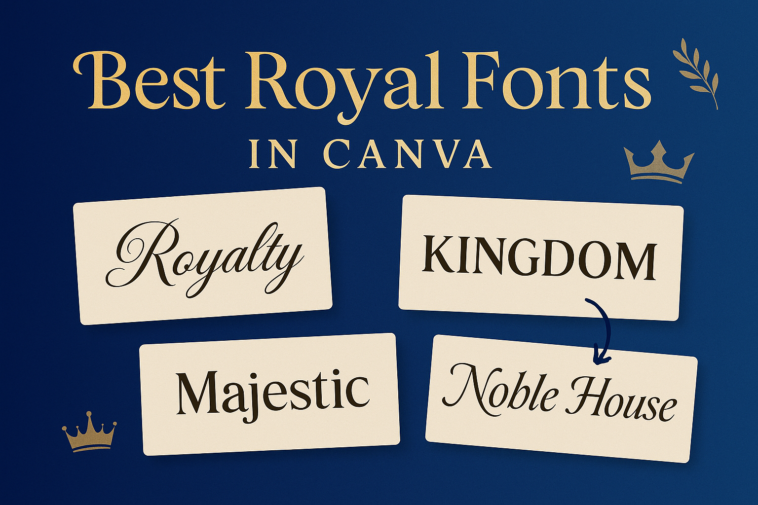
Top Royal Fonts in Canva
When creating designs that evoke a sense of royalty, choosing the right font is essential. Here are some fantastic options that bring elegance and sophistication to any project.
Majesty
Majesty is a font that commands attention. With its bold, classic letters, it adds a touch of elegance to designs.
This typeface combines traditional serifs with modern flair, making it versatile for various themes.
Whether used for invitations, logos, or any regal project, Majesty stands out beautifully. The font’s crisp lines and intricate details give it a timeless appeal.
It works well in both large headlines and smaller text, making it a great choice for any royal-themed design.
Crown Sans
Crown Sans offers a modern twist on royal aesthetics. This sans-serif font is sleek and stylish, featuring clean lines and geometric shapes.
Its simplicity makes it perfect for creating an upscale look without being overly ornate.
Crown Sans is ideal for branding, social media graphics, and elegant presentations. The font balances sophistication with approachability, ensuring that it can complement various design elements.
Its adaptability makes it a reliable choice for anyone looking to achieve a luxe feel while keeping things contemporary.
Regal Script
Regal Script is a charming, handwritten font that exudes elegance. With its flowing letters and artistic flair, it brings a whimsical touch to any project.
This font is particularly well-suited for invitations, greeting cards, and decorative pieces.
The delicate curves of Regal Script add a touch of intimacy, making it perfect for special occasions. It’s best used in headings or short phrases to maintain readability.
This font captures a sense of celebration and joy while still keeping a royal vibe.
Using Royal Fonts in Designs
Royal fonts add an elegant touch to various design projects. Knowing how to use them effectively can elevate the overall look and feel of any piece.
Pairing Fonts
When pairing royal fonts with other typefaces, it’s important to create a balanced and cohesive design.
A royal script font can pair beautifully with a clean sans-serif font for a modern twist. For example, using a font like Dream Avenue alongside a simple sans-serif can create a stunning contrast.
Tips for pairing:
- Contrast Style: Use one ornate font with a simpler one.
- Matching Categories: Select fonts from the same family for harmony.
- Limit Choices: Stick to two or three fonts to avoid clutter.
These combinations ensure readability while still delivering that royal feel.
Visual Hierarchy
Establishing a clear visual hierarchy is essential when using royal fonts. This means guiding the viewer’s eye through different elements of the design.
Larger, bolder fonts can serve as headings, while smaller sizes are suitable for body text.
Strategies for visual hierarchy:
- Size Variation: Use varying font sizes for emphasis.
- Color Contrast: Incorporate colors that stand out against the background.
- Spacing: Adequate spacing between text can improve clarity.
By focusing on these elements, designs can appear organized and inviting while showcasing the elegance of royal fonts.
Tips for Choosing the Right Royal Font
Choosing the right royal font can enhance any design. Here are some tips to help select the perfect one.
1. Match the Mood
Consider the feeling you want to convey. A delicate font, like Dream Avenue, offers elegance, while a bold font, like Jerin, adds a modern touch.
2. Keep It Simple
Pair royal fonts with straightforward backgrounds. This creates contrast and allows the font to stand out better.
3. Use for Headlines
Royal fonts work best for titles and headlines. They grab attention and add a luxurious feel to the design.
4. Experiment
Try mixing two royal fonts. Combining them can create a unique and eye-catching design.
5. Check Readability
Ensure that the font is easy to read. Overly decorative fonts can be hard to understand, especially in longer texts.
6. Consider Your Audience
Think about who will see the design. Choose a font style that resonates with your target audience for better engagement.