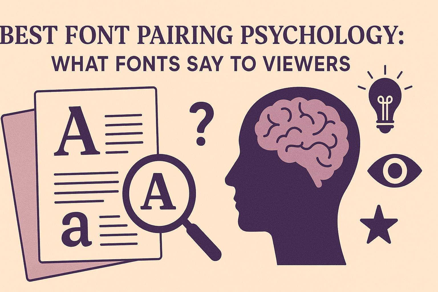
Choosing the right font pairs is more than just picking what looks nice together. Fonts send subtle messages to viewers, shaping how they feel about the content and the brand behind it. The best font pairing psychology helps designers create clear, trustworthy, and engaging messages by matching fonts that work well emotionally and visually.
When fonts complement each other, they guide the reader’s eye and build a mood that fits the message. For example, pairing a formal serif with a clean sans serif can balance elegance with readability, making the text more inviting and easier to understand. Each font tells its own story, so pairing them thoughtfully can influence how people react without them even realizing it.
People often skim text quickly, but the font styles can affect how much time they spend reading and how they feel about the brand. Fonts can show personality, create trust, or even encourage action by supporting the message’s tone. Understanding what fonts say to viewers can turn simple words into powerful communication that connects. For more about how fonts shape perception, check out this guide on font psychology.
Font Psychology: How Fonts Influence Perception
Fonts do much more than just display words. They shape how people feel and understand the message, affecting trust, clarity, and even decisions. Choosing the right font can guide attention, set the tone, and improve how easily content is read.
Emotional Impact of Different Font Styles
Different font styles trigger different emotions. Serif fonts like Times New Roman feel traditional and trustworthy, often used in formal settings. Sans-serif fonts such as Helvetica give a clean, modern, and straightforward vibe.
Script fonts add elegance and creativity but may feel personal or emotional. Decorative fonts are fun and unique but can also feel casual or playful. The emotional feel of a font influences how viewers connect with the message without even reading it fully.
Font Personality and Human Associations
Fonts often carry human-like traits, making them seem like characters with their own personalities. Serif fonts are seen as reliable, respectable, and serious, while sans-serif fonts come across as friendly, clear, and efficient.
Fonts can suggest speed or heaviness, influencing how fast or slow readers process information. For example, bold fonts feel strong, while light fonts seem delicate. Understanding these associations helps in building a brand’s identity and connecting with the right audience.
Legibility and Readability Effects
A font’s style also affects how easy it is to read. Fonts with clear letters and proper spacing improve comprehension and reduce eye strain. Sans-serif fonts tend to be easier to read on screens, especially at smaller sizes.
Visual hierarchy created by font size, weight, and color helps guide the viewer’s focus across a page. Bold or larger fonts highlight important points, improving user experience by making information easier to scan and digest.
Core Font Categories and Their Psychological Meanings
Fonts shape how viewers feel and interpret a message. They can signal trust, modern style, or creativity just by their shape and style. Choosing the right font types helps brands connect clearly and quickly with their audience.
Serif Fonts: Tradition and Reliability
Serif fonts have small lines or strokes at the ends of their letters. This feature gives them a classic, formal look. Fonts like Times New Roman, Garamond, and Georgia often feel trustworthy and stable.
These fonts work well for law firms, newspapers, and financial institutions because they suggest reliability and seriousness. They also make readers feel comfortable due to their familiar design.
Using serif fonts can create a sense of authority and heritage. They are a good choice when the goal is to build trust and confidence in a brand or message.
Sans-Serif Fonts: Modernity and Clarity
Sans-serif fonts do not have decorative strokes. This clean, simple style makes fonts like Arial, Helvetica, and other sans serif fonts feel fresh and easy to read.
These fonts are popular in tech, healthcare, and education. They suggest innovation, transparency, and straightforwardness. Sans-serif fonts are ideal when clear and fast communication is needed.
Their minimalist form makes a brand appear modern and user-friendly. For digital content, sans serif fonts improve readability across screens and devices.
Script Fonts: Elegance and Creativity
Script fonts resemble cursive handwriting and often have flowing, connected letters. Fonts like Lobster and Pacifico express sophistication, creativity, or romance.
These fonts evoke a personal, artistic feel. They’re a great fit for wedding invitations, luxury brands, or any design that wants an emotional, stylish touch.
Script fonts bring a sense of elegance and warmth but should be used carefully. Overuse can reduce readability, so they work best in headlines or short phrases that need to stand out.
The Art of Font Pairing and Combinations
Combining fonts well takes skill to balance contrast, harmony, and readability. Effective font pairings enhance a design’s impact by guiding the viewer’s eye and setting the right tone. Choosing the right font styles and knowing which ones work together is key to making a design feel polished and clear.
Basic Principles of Mixing Fonts
When mixing fonts, it’s important to aim for contrast and balance. Pairing a serif font with a sans-serif font often works because their differences create visual interest while keeping clarity.
One font should be more dominant, like a bold display font for headings. The other should be simpler, used for body text to maintain readability. Usually, limit your design to two or three fonts to avoid clutter.
Fonts with similar x-heights or letter spacing pair better. Avoid using fonts with competing personalities, like two heavy display fonts, as they can clash and confuse viewers.
Classic Font Pairing Examples
Some proven font combinations have stood the test of time. For example:
- Georgia (serif) with Arial (sans-serif) offers a classic, easy-to-read look.
- Montserrat (modern sans-serif) paired with Merriweather (serif) balances fresh with traditional style.
- Playfair Display (elegant serif) with Open Sans (neutral sans-serif) creates a refined and approachable feel.
These combinations work because one font grabs attention while the other supports content. Knowing a few reliable pairs helps designers quickly build effective layouts with clear visual impact.
Avoiding Common Font Pairing Mistakes
One common error is choosing fonts that are too similar, which makes the design look boring and lacks hierarchy. Fonts that are too different, especially in style or weight, can feel chaotic and distract viewers.
Another mistake is ignoring font purpose. A fancy display font might be eye-catching but hard to read in paragraphs. Always prioritize readability over style, especially for body text.
Also, avoid using too many fonts in one design. Sticking to a limited number prevents confusion and keeps the message clear. Proper font selection enhances impact, not hinders it.
For practical tips on creating balanced font pairs, see this guide on the art of font pairing.
Choosing Fonts for Branding and User Experience
Font choices affect how viewers see a brand and interact with its content. Selecting the right fonts can express a company’s personality clearly while making the text easy to read across different platforms.
Font Choice for Brand Identity
Fonts are a key part of a brand’s voice. Serif fonts like Times New Roman suggest tradition and reliability, fitting for law firms or academic institutions. Sans-serif fonts like Helvetica convey modernity and cleanliness, popular among tech companies and startups.
Brands use font styles to match their image. A luxury brand might pick elegant serif fonts to feel sophisticated, while a playful brand may go with decorative or script fonts. The wrong font can confuse the audience or weaken the brand’s message.
It is important that the font matches the brand’s goals and audience. Consistency in font use across marketing materials strengthens recognition and trust.
User-Centric Font Selection Strategies
Fonts must be readable and clear to keep user attention. Simple, clean fonts work best for long content. Overly decorative or script fonts can look nice but may tire readers if used too much.
Designers often use font size, weight, and spacing to make text easy to scan. Bold fonts help highlight important ideas or calls to action. Good contrast between font and background enhances visibility on screens.
Testing fonts on different devices is crucial. What looks great on desktop might be hard to read on smaller screens. User comfort is always a priority in font selection.
Font Psychology in Digital Design
Font psychology studies how fonts influence feelings and decisions. Bold fonts can make a brand feel strong and confident. Rounded fonts often seem friendly and approachable.
Colors combined with fonts add another layer. Blue fonts may suggest calm and trust, while red can create excitement or urgency. Designers use these effects to guide user behavior.
Web fonts need to load fast and work across browsers. Using popular web-safe fonts or reliable libraries like Google Fonts ensures consistent user experience without surprises. Balancing style with function leads to better engagement.
Explore more on font psychology to understand these choices in detail.
Font Size, Weight, and Visual Hierarchy
Using different font sizes and weights helps guide the reader’s attention to what matters most. By adjusting these elements, designs can clearly show what is important, what supports the main idea, and how the content should be read.
Impact of Font Size on Clarity
Font size makes a big difference in how easy text is to read. Larger fonts usually grab attention first, making them perfect for titles or headlines. Smaller fonts work well for details or supporting text.
If the font is too small, readers may struggle to read it, especially on screens. If it’s too large, it can overwhelm the page or disrupt the flow. Balancing font sizes helps create clear divisions between sections and guides the reader through the content.
Effective use of font size can improve comprehension by helping the reader focus on the key points quickly. Designers often use larger fonts for headings and smaller for body text to organize the information clearly.
Role of Bold Fonts in Communication
Bold fonts add weight to words, making them stand out. This is useful to highlight important ideas or calls to action in a piece of text. Readers naturally pay more attention to bold text because it signals emphasis.
Using bold too often can reduce its impact, so it’s best reserved for key phrases or headings. Bold fonts can also improve scan-ability, allowing readers to find main points without reading every word.
By combining bold with size, designers create a stronger hierarchy. Bold can also convey tone, making text feel more serious or energetic depending on context.
Visual Hierarchy Through Typography
Visual hierarchy is the arrangement of text to show what to look at first, second, and so on. This is done by mixing font size, weight, and sometimes style. Good hierarchy makes content easier to follow.
For example, a heading might be large and bold, a subheading smaller and light, and body text regular size. This order guides the reader’s eye smoothly through the information.
Creating a clear visual hierarchy prevents confusion by showing which text is primary or secondary. It helps break content into digestible parts, making it easier to understand and remember. Designers use hierarchy to improve how messages are delivered through typography.
Learn how to use font size and weight effectively to build strong visual paths in your designs at this font psychology guide.
Iconic Fonts and Their Psychological Signals
Fonts carry hidden messages that shape how people see a design. Some popular fonts like Helvetica, Times New Roman, Comic Sans, and Impact have clear psychological effects. These effects help designers choose fonts that match the feeling or message they want to send.
Helvetica: Minimalism and Trust
Helvetica is known for its clean lines and simple look. It feels modern, neutral, and easy to read. People often associate Helvetica with honesty and trust because it doesn’t try to distract or add extra personality.
Many brands use Helvetica for logos and signs to appear straightforward and professional. Its minimalism can make designs feel calm and balanced.
Helvetica works well in places where clarity and neutrality matter. For example, it fits perfectly in corporate settings or healthcare, where trust is key.
Times New Roman: Authority and Tradition
Times New Roman suggests seriousness and history. It is a classic serif font, meaning it has small strokes on the ends of letters. This detail brings a sense of formality and tradition.
People often trust Times New Roman because it reminds them of books, newspapers, and official documents. It is a great choice for academic papers, legal work, and other contexts needing authority.
This font contrasts with modern, casual fonts like Pacifico or Lobster, which feel more playful. Times New Roman helps projects feel stable and respected.
Comic Sans and Impact: When to Use or Avoid
Comic Sans is playful and casual but is often seen as unprofessional. It’s best for informal messages aimed at children or lighthearted content.
Impact is bold and strong. It grabs attention quickly and works well for headlines or warnings. Because it’s so heavy, Impact is not ideal for long text, where it can tire the eyes.