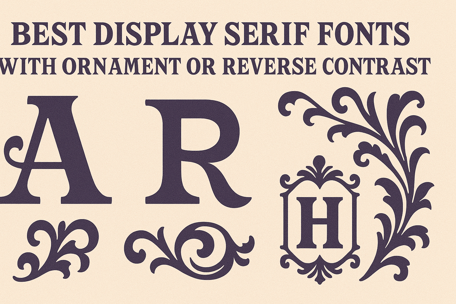
Display serif fonts with ornament or reverse contrast bring a unique style to design projects. These fonts stand out because they add visual interest through unusual shapes or decorative details. They are especially great for titles, logos, posters, and branding when someone wants to catch attention while keeping a classy look.
Unlike regular serif fonts, these designs play with the thickness of strokes or add flourishes that give text a bold, artistic feel. They can add personality without overwhelming the message. Designers often use them to create memorable, eye-catching work that feels both modern and timeless.
Choosing the right display serif font can change how people feel about a brand or project. Fonts like these often mix classic elegance with a twist, making them perfect for creative, fashion, or editorial projects. For ideas and examples, exploring popular choices can inspire fresh looks that really pop.
Learn more about the best display serif fonts with ornament or reverse contrast at Creative Market’s blog on brutalist and reverse contrast typefaces.
What Are Display Serif Fonts With Ornament or Reverse Contrast?
Display serif fonts with ornament or reverse contrast are special types of serif fonts designed to catch attention. They often have decorative details or unusual shapes that make text look unique and stylish. These fonts balance style with readability, making them great for headlines and logos.
Defining Display Serif Fonts
Display serif fonts are designed primarily for large text like titles or headlines, not for long paragraphs. They have small lines or strokes called “serifs” at the ends of letters, which improve the shape and give a classic feel.
Unlike regular serif fonts that focus on readability for body text, display serifs are often more artistic and bold. They use strong shapes, thick and thin strokes, and sometimes bigger serifs to stand out. These fonts add personality without losing the clear structure that makes text easy to read.
Understanding Ornaments and Decorative Details
Ornaments in display serif fonts are extra touches like swirls, dots, or fancy lines added to letters. These decorations make the letters look elegant or playful, adding flair to designs.
Decorative details can be simple or intricate. Examples include small leaves in the serifs or floral patterns inside letter forms. These elements create visual interest and help communicate a brand’s style or mood.
While ornaments enhance looks, designers must check that the font remains readable, especially in larger sizes. Good ornamental fonts balance decoration and clarity.
Explaining Reverse Contrast Typography
Reverse contrast in serif fonts means the usual thick and thin parts of letters are swapped. Normally, vertical strokes are thick and horizontal ones are thin. In reverse contrast, horizontal strokes become thicker than vertical ones.
This switch creates a dramatic, eye-catching effect that looks modern and unusual. It gives letters a bold, defined shape that works well in headlines and logo design.
Because reverse contrast changes the usual flow of serif fonts, it grabs attention quickly. However, it is best used sparingly, as it can reduce readability in smaller text. Designers often pair it with simple fonts for balance.
For more details on display serif fonts and their styles, explore the best display serif fonts and reverse contrast fonts.
Top Picks: Best Display Serif Fonts With Ornament or Reverse Contrast
Display serif fonts with ornament or reverse contrast add unique visual interest to any design. They can bring elegance, playfulness, or bold style depending on how they are used. These fonts often come with multiple weights and OpenType features, making them versatile for headlines, logos, and branding.
Popular Modern Display Serif Fonts
Modern display serif fonts like DM Serif Display are well-loved for their clean but decorative look. DM Serif Display offers sharp, elegant strokes and works well in bold or italic styles. It balances readability with flair, making it a favorite for contemporary editorial layouts and websites.
Lora is another popular choice, famous for its moderate contrast and readable design. It has several weights and styles that offer flexibility across projects. Both fonts come with useful OpenType features for advanced typographic control, helping designers create polished and sophisticated designs.
Unique Ornamental Serif Fonts
Ornamental serif fonts often feature extra flourishes or decorative elements that give text an artistic touch. These fonts make headlines feel special and eye-catching. They’re perfect for invitations, vintage branding, or packaging where a handcrafted feel is needed.
These fonts usually include swashes or catches that can be toggled on or off with OpenType features. This helps customize the look without cluttering the design. Some ornamental serifs blend classical charm with modern touches, making them suitable for a wide range of creative projects.
Notable Reverse Contrast Serif Fonts
Reverse contrast serif fonts have thick serifs and thin main strokes, the opposite of traditional styles. This design choice creates dramatic, bold text that stands out in logos and big titles. Their unusual look grabs attention and adds personality.
Reverse contrast fonts often come with multiple font weights so designers can pick a style from subtle to extreme. They may include alternate characters or stylistic sets in OpenType to enhance their decorative impact. These fonts work best where a strong impression is needed without losing legibility.
Font Pairing Ideas for Ornamental and Reverse Contrast Serif Fonts
Ornamental and reverse contrast serif fonts have unique shapes that draw attention. Pairing them well means choosing fonts that balance their strong style without clashing. The right combinations often play with contrast, weight, and form to keep designs clear and interesting.
Display Serif and Sans Serif Combinations
Ornamental serifs work well paired with clean, simple sans serif fonts like Inter, Open Sans, or Roboto. These sans serifs offer a smooth, modern feel that tones down the decorative nature of the serif.
For example, use an ornamental serif for headings and Inter for body text. The simplicity of Inter makes the text readable and grounds the dramatic serif.
When pairing, match the x-height or letter proportions to keep harmony. Using sans serif fonts with different weights, like Open Sans Regular for text and Bold for subheadings, can add subtle variety and keep the design balanced.
Pairing With Transitional Serifs
Transitional serifs have moderate contrast between thick and thin strokes. They work well with reverse contrast fonts because they can soften the bold style while keeping the classic feel.
A good pair might be a reverse contrast serif for large text and a transitional serif like Georgia or Times New Roman for body copy. This mix keeps things elegant but not overwhelming.
To avoid visual confusion, make sure the fonts don’t compete in style. Keep the transitional serif lighter or less ornate. This ensures the ornamental font remains the focal point while the transitional serif fills out the rest smoothly.
Balancing Contrast in Typography
Balancing contrast means carefully pairing fonts with differences that create clear hierarchy without clashing. Combining an ornamental serif’s heavy, decorative shape with a light, neutral sans serif can work well.
It’s helpful to limit font choices to two or three. For example:
| Font Role | Font Example | Style Characteristic |
|---|---|---|
| Heading | Reverse serif | Bold, decorative strokes |
| Subheading | Sans serif | Clean, geometric, light |
| Body | Sans serif | Simple, easy to read |
Fonts like Roboto and Open Sans offer multiple weights, which help keep the contrast interesting but readable. This kind of balance lets the ornamental fonts stand out while the supporting fonts guide readers smoothly through the content.
Best Uses in Branding and Graphic Design
Display serif fonts with ornament or reverse contrast add flair and uniqueness to various design projects. Their strong and decorative features work well to create memorable visuals that stand out. These fonts show personality and style, making them valuable tools for brands and designers.
Branding Materials
Such fonts bring character and sophistication to branding materials like logos, business cards, and letterheads. Their distinct shapes help brands express identity clearly and leave a lasting impression.
Using an ornamental serif font can convey luxury or heritage, making it ideal for high-end brands. Meanwhile, reverse contrast fonts add a modern twist, perfect for companies wanting a bold but refined look.
When applied carefully, these fonts balance ornamentation without overwhelming the design. They also pair well with simpler sans-serif fonts to keep materials readable yet stylish.
Product Packaging Inspiration
Product packaging benefits from display serif fonts by capturing attention on shelves. Their decorative strokes and unique contrast help products look both elegant and eye-catching.
Luxury goods, artisanal foods, and boutique items often use ornamental serifs to evoke tradition and craftsmanship. Meanwhile, reverse contrast fonts can give packaging a fresh, innovative vibe, especially for modern or younger audiences.
Designers often combine these fonts with textured backgrounds or metallic foils to enhance the packaging’s appeal. This approach makes products memorable and invites closer inspection.
Editorial and Web Design Applications
In editorial design, these fonts are popular for headlines and titles due to their strong visual impact. They bring a touch of drama and style that elevates magazines, brochures, and newsletters.
For web design, display serif fonts must be used selectively to ensure readability on screens. They work best in larger sizes and are often balanced with clean body text fonts.
Using ornamented serifs in digital headers or hero sections creates a distinctive brand presence. Reverse contrast fonts add sophistication to web interfaces, especially in fashion or creative industry sites.
Explore more on how these fonts enhance branding and design on the 10 Modern Serif Fonts Must-Have List.
Readability and Practical Considerations
When working with decorative serif fonts that include ornaments or reverse contrast, it’s important to balance style with clarity. The way these fonts are designed can affect how easy they are to read, especially in different sizes and weights. Paying attention to these details helps ensure text looks good and stays legible.
Readability Factors in Ornamental Fonts
Ornamental fonts often have extra strokes, swirls, or unusual shapes that give a unique look. These features can make text eye-catching but may reduce readability if overused or too complex. The key is to use ornaments sparingly, keeping the main letter shapes clear.
Fonts with delicate or thin decorations might be difficult to read on small screens or at smaller sizes. Designers should test how the font performs in different contexts to avoid confusion. Keeping contrast between thick and thin strokes balanced helps maintain clarity in ornamental fonts.
Legibility at Display Sizes
Display serif fonts with reverse contrast or decorative elements shine in large sizes, like headlines or titles. At these sizes, details stand out, enhancing the overall design impact without harming legibility. However, at smaller sizes, intricate details may blur or cause eye strain.
It’s best practice to avoid using highly ornamental fonts for body text. For headlines, designers should make sure enough space is between letters (tracking) and lines (leading) to prevent crowding. Clear shapes and consistent pattern recognition make a font easier to read when scaled up.
Choosing Appropriate Font Weights
Font weight affects how readable a serif font is, especially one with ornamentation. Too thin weights can make details disappear or look fragile, while too heavy weights may obscure fine decorations. Medium or regular weights often offer the best balance.
Multiple weight options provide flexibility, letting designers pick bolder or lighter styles depending on usage. For digital screens, weights need to be clear and not lose detail when scaled down. Choosing the right weight helps keep text sharp and easy to read in different formats.
Using weights wisely means pairing bold headings with lighter body text can improve overall readability and visual hierarchy.
Opentype Features and Technical Tips
Using display serif fonts with ornaments or reverse contrast often involves special font capabilities. These include advanced typographic tools that help designers customize letters, add stylish ligatures, and ensure the font works well in multiple languages. Understanding these features can make a big difference in how a font looks and performs in a project.
Customization and Ligatures
Customization in OpenType fonts lets designers change the appearance of characters easily. For example, they can swap a standard letter for an alternate style without manually editing each letter. This is especially useful in display serif fonts, where small changes can add more elegance or flair.
Ligatures connect two or more letters into one combined glyph to improve readability or add decoration. Standard ligatures like fi and fl help avoid awkward spacing, while discretionary ligatures serve a more artistic purpose.
Stylistic Sets for Display Serif Fonts
Stylistic sets group alternate characters that share a design theme. They allow users to toggle between different letter shapes quickly, which is great for experimenting with the font’s personality. For display serif fonts, this might mean switching from a plain letter to one with decorative swashes or reverse contrast details.
Supporting Multilingual Typography
Multilingual support in OpenType fonts lets designers handle diverse languages within the same document. These fonts include alternate characters and accents adapted to specific languages, ensuring correct letter shapes and spelling.
Localization features can replace default characters with region-specific glyphs automatically. This is important for designers working with display serif fonts in global projects. Many design programs let users enable these options easily for smooth international typography.
For more on how to use advanced font functions, see the guide on OpenType font features.