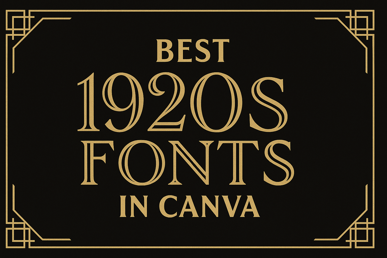
The 1920s were a time of significant change, creativity, and flair, particularly in design. Many people seek ways to capture this vibrant era in their projects, and fonts play a crucial role in achieving that.
Canva offers a variety of stunning 1920s fonts that can bring a touch of vintage sophistication to any design.
From elegant Art Deco styles to playful scripts, these fonts can enhance any branding, invitation, or social media post.
Utilizing the right font can evoke the glamour of the Roaring Twenties, setting the perfect tone for a project.
Readers will discover a selection of the best 1920s fonts available in Canva that can elevate their designs and capture the essence of this iconic decade.
The Charm of 1920s Fonts
The 1920s brought a unique style to typography, marked by elegance and bold designs. This period, known for its Art Deco movement, features fonts that evoke a sense of glamour and sophistication.
Understanding this charm helps in appreciating their use in modern designs.
Defining Art Deco Typography
Art Deco typography is characterized by its geometric shapes and strong lines. Fonts from this era often display bold letters with distinctive curves and sharp angles.
They combine elegance with modernity, making them perfect for various design projects.
These fonts use ornate details and sometimes feature decorative elements, enhancing visual appeal. Well-known examples include Broadway, with its theatrical flair, and Futura, which showcases clean, crisp designs.
Such styles remain popular for invitations, posters, and branding that aims to reflect a vintage yet chic vibe.
Historical Significance of 1920s Fonts
The significance of 1920s fonts goes beyond aesthetics. This period, known as the Roaring Twenties, was a time of cultural upheaval and innovation.
Typography flourished as artists and designers sought to break traditional norms.
Fonts from this decade reflected the optimism and prosperity of the time. They were used in advertising, magazines, and cinema, influencing how messages were conveyed.
The use of these fonts today connects modern designs to a rich historical background, reminding audiences of the glamour associated with the 1920s.
This historical relevance adds depth to any project that features these unique typefaces.
Finding 1920s Fonts in Canva
Canva offers a wide selection of fonts that capture the essence of the 1920s. Knowing how to navigate the font library and recognizing top choices enables users to find the perfect style for their designs.
Navigating Canva’s Font Library
To start, users should log into Canva and open a design project. Once in the editor, they can click on the text tool, usually found on the left side.
In the text options, users will see “Font” with a dropdown list. By clicking it, they can browse the available fonts.
To simplify their search, users can type “1920s” or “Art Deco” in the search bar to find fonts that fit the theme.
Users can also filter fonts based on the style, such as serif or sans-serif. This helps narrow down options and find fonts that evoke the desired feel of the roaring twenties.
Top Picks for 1920s Fonts in Canva
Some standout fonts represent the 1920s aesthetic beautifully. Here are a few favorites:
-
Metropolis: This sans-serif font features geometric shapes and clean lines that embody the Art Deco style. It’s perfect for adding a modern twist to vintage designs.
-
Limelight: Inspired by showcard lettering, this font offers a striking and unique appearance. It’s a great choice for titles or headings.
-
Great Vibes: This script font gives a touch of elegance and sophistication, echoing the glamour often associated with the 1920s.
By combining these fonts effectively, designers can create stunning visuals that reflect the style and charm of the era.
Design Tips for Using 1920s Fonts
Using 1920s fonts can create a stylish and nostalgic feel. Pairing these fonts correctly with colors and balancing different elements is essential for great design.
Pairing Fonts and Colors
When choosing colors to pair with 1920s fonts, it’s crucial to capture the era’s elegance. Shades like gold, black, and deep jewel tones complement these fonts beautifully.
For example:
- Gold: Adds luxury and sophistication.
- Black: Offers a timeless look that enhances readability.
- Emerald Green: Brings a rich, classic vibe.
Mixing fonts is also important. A bold display font works well with a simple sans-serif for body text.
Keep the number of font types to a maximum of two or three to maintain a cohesive look. Avoid overly playful fonts to keep the classy feel of the 1920s.
Balance and Hierarchy
Balance is key in any design, especially when using striking fonts.
Creating a visual hierarchy helps guide the viewer’s eye.
Start with a large, attention-grabbing header in a bold 1920s font.
Next, use a smaller size font for subheadings and body text. This contrast clearly separates the information.
Whitespace is also important. It gives the design room to breathe and prevents clutter.
Aim to leave adequate space around text to enhance readability.
By using these techniques, one can create stunning designs that reflect the charm of the 1920s while remaining clear and engaging.