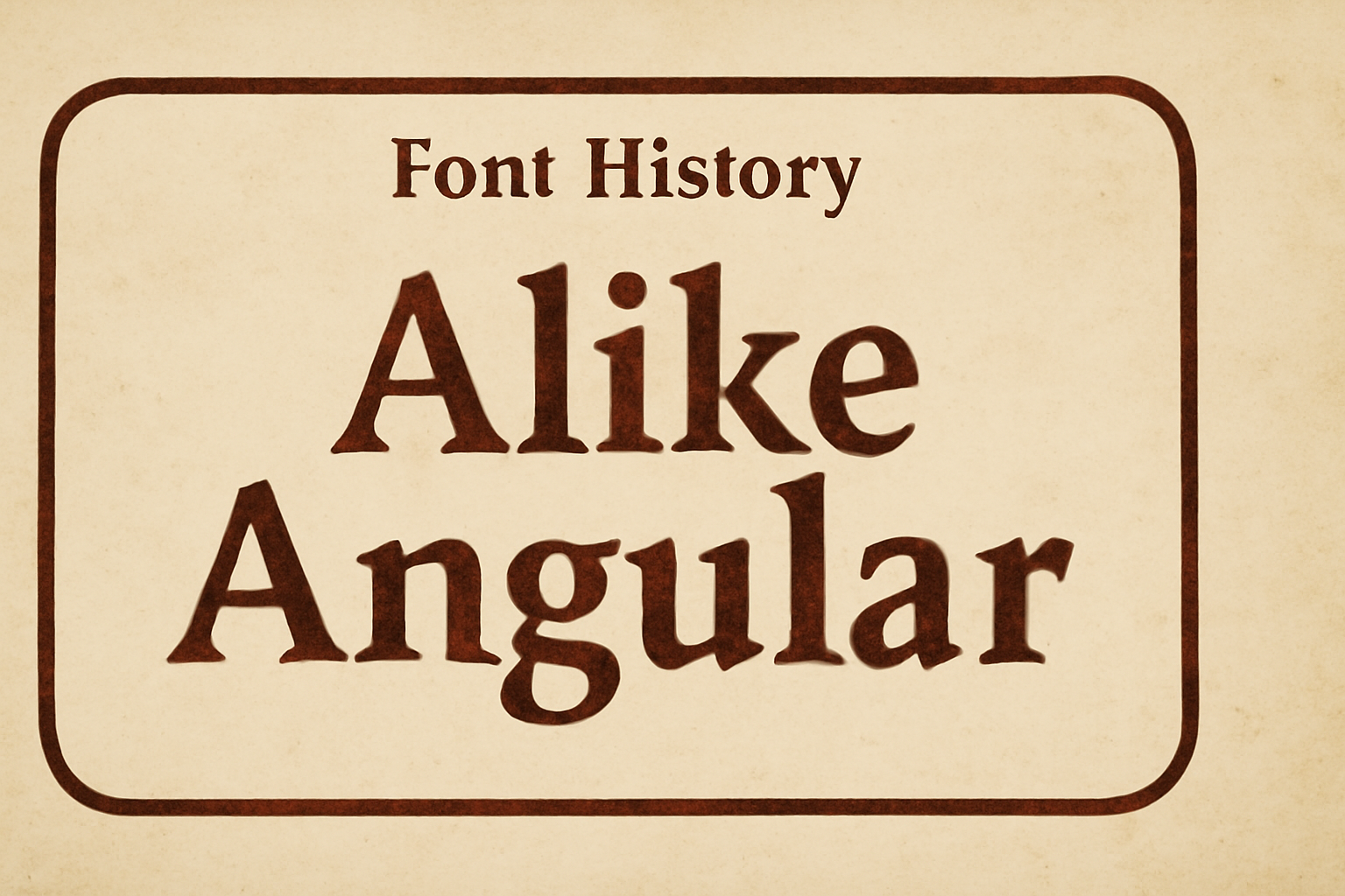
Alike Angular is a unique font designed for larger display sizes. It stands out with its straight letterforms, giving it a distinct look compared to the softer Regular style. This font is often used in headings and titles, where its bold appearance grabs the viewer’s attention.
The font shares the same proportions as its counterpart, Alike, making it versatile and compatible for various design elements. It features expressive designs in characters like T, Z, M, and E. Those interested in a bold and angular look can explore more about its design aspects online.
It can be used in different settings from web design to print media. Its eye-catching design makes it perfect for headlines, logos, or any other text that needs to stand out. To see it in action or to download this font, visit sites like Google Fonts. The font continues to gain popularity among designers for its sharp, modern appeal.
The Evolution of Alike Angular
Alike Angular is a specialized typeface meant for larger display uses. It differs from its counterpart, Alike, by using straight lines in its design. This distinctive approach sets it apart in the world of typography.
Origins and Design Intentions
Alike Angular was created as a titling style to complement Alike. Unlike the rounded form of the original, Alike Angular features straight lines. This choice gives it a sharper and more geometric look, focusing on clean and bold letterforms. The design intentions aimed to make it suitable for larger display sizes where clarity is important.
The font balances modern aesthetics with usability. Specific characters, like T, Z, M, and E, include additional expressive elements. These design choices ensure that Alike Angular stands out in various applications, providing a unique yet compatible look compared to its counterpart.
Early Use in Typography
In its early days, Alike Angular caught the eye of designers looking for more structured fonts. Its use in typography was marked by projects seeking clear and bold titles. Because of its design, it was often selected for headlines or branding where a modern and striking appearance was desired.
The font’s compatibility with Alike allowed for diverse typographic expressions. Designers could pair the two fonts effortlessly. This feature made Alike Angular a favorite in projects where versatility and harmony in design were important.
Rise to Popularity
Alike Angular’s popularity increased as more designers embraced its bold look. It became a go-to choice for digital platforms needing sharp and engaging typography. The clean lines and expressive features helped it stand out in an often crowded visual space.
The font has been showcased in varied uses, such as websites and advertising, demonstrating its appeal. Its rise in use is also supported by platforms like Google Fonts, which offer it as a free resource, making it easily accessible for designers worldwide.
Characteristics of Alike Angular
Alike Angular is a typeface with unique features and variations. Its design is inspired by Romanesque lettering, making it suitable for large display sizes.
Distinct Features
Alike Angular stands out with its angular serifs that add a sharp and crisp appearance. The font emphasizes strong vertical stress, which enhances its clear and bold look. The design includes straight splines, giving the letters a defined shape and structure. Characters like T, Z, M, and E showcase additional expressive elements, offering a visually interesting experience for the reader. This typeface is a great choice for headlines and titles due to its distinctive and striking style.
Font Variations
Designed as a complementary titling style to Alike Regular, Alike Angular shares the same proportions, ensuring compatibility. It was crafted by Eben Sorkin and released in 2011. This serif typeface differs from its regular counterpart through the use of angular lines instead of softer forms. This variation provides a unique aesthetic that pairs well with other fonts, adding emphasis and character to any text. It’s ideal for designers seeking a font that combines a historical touch with modern precision.
Alike Angular in Modern Media
Alike Angular shines on digital platforms and plays a key role in branding and identity. Its unique style makes it a popular choice for different media settings.
Usage in Digital Platforms
Alike Angular is favored for its distinctive angular serifs, making it stand out in digital formats. This makes it ideal for websites and applications where readability is crucial. Developers often choose Alike Angular for its compatibility with larger screen displays, helping textual content remain clear on various devices.
In platforms where the font must grab attention yet remain legible, such as headlines or lists, Alike Angular performs well. Its straight splines give a bold look, allowing for consistency and ease of reading across different platforms.
Branding and Identity
In the world of branding, Alike Angular brings sophistication and a modern twist. Its design, inspired by Romanesque styles, conveys strength and elegance, appealing to businesses looking to convey reliability and tradition. Brands often incorporate Alike Angular in their logos and marketing materials to create a timeless yet contemporary feel.
The versatility of the font helps companies stand out in competitive markets. With expressive features in specific characters, like T or Z, Alike Angular offers creativity, lending uniqueness to logos and ads. This aids in creating a consistent and memorable brand identity that resonates with audiences.
Technical Aspects of Alike Angular
Alike Angular is known for its distinctive straight splines and angular serifs, which give it a bold look. Its design is optimized for display sizes, complementing its counterpart, Alike Regular, while retaining compatibility across various platforms.
Font File Formats
Alike Angular is available in several font file formats that ensure flexibility and broad usability. Common formats include TrueType (TTF) and OpenType (OTF). These formats are highly compatible with most software and operating systems. The TTF format is often favored for its reliability in most applications, while OTF offers advanced typographic features.
OTF allows for a more refined presentation, which is useful for designers seeking precise control over typography. The availability of these formats ensures that users can easily access and implement Alike Angular for diverse projects. The choice of format depends on specific needs, whether prioritizing compatibility or additional typographic options.
Compatibility with Software
Alike Angular exhibits excellent compatibility with various design and word processing software. Programs like Adobe Illustrator, Photoshop, and InDesign efficiently incorporate this font, making it a popular choice among graphic designers. Similarly, word processors such as Microsoft Word and Google Docs support Alike Angular, allowing for its use in both digital and print media.
The font’s compliance with web standards also makes it suitable for online design projects and websites. Its design aligns well with CSS styling, ensuring smooth integration into web pages. This broad compatibility enhances its appeal, offering ease of use across different platforms and applications.
Typography Principles and Alike Angular
Alike Angular combines traditional serif elements with a modern, angular design. Its unique features influence both readability and font pairing, making it a versatile choice for various design projects.
Readability and Legibility
Alike Angular is known for its clear and distinct letters. It is designed for large display sizes, allowing the angular serifs and robust structure to stand out.
The typeface is inspired by Romanesque lettering, featuring geometric shapes and straight lines. This design choice improves clarity, especially in larger text, enhancing readability.
The angular serifs help maintain legibility by offering clean and sharp letterforms. It’s ideal for headings and titles, where clarity is crucial.
Font Pairing Recommendations
Pairing Alike Angular with other fonts requires careful consideration. It works well with simpler sans-serif fonts, providing a contrasting yet harmonious look.
Using it alongside a soft, round typeface can balance the sharpness of its design. For instance, pairing it with a soft font like Alike Regular offers flexibility in various design contexts.
When creating content with varying font weights or styles, it’s important to ensure the complementary font doesn’t overshadow or clash with Alike Angular. This approach preserves visual hierarchy.