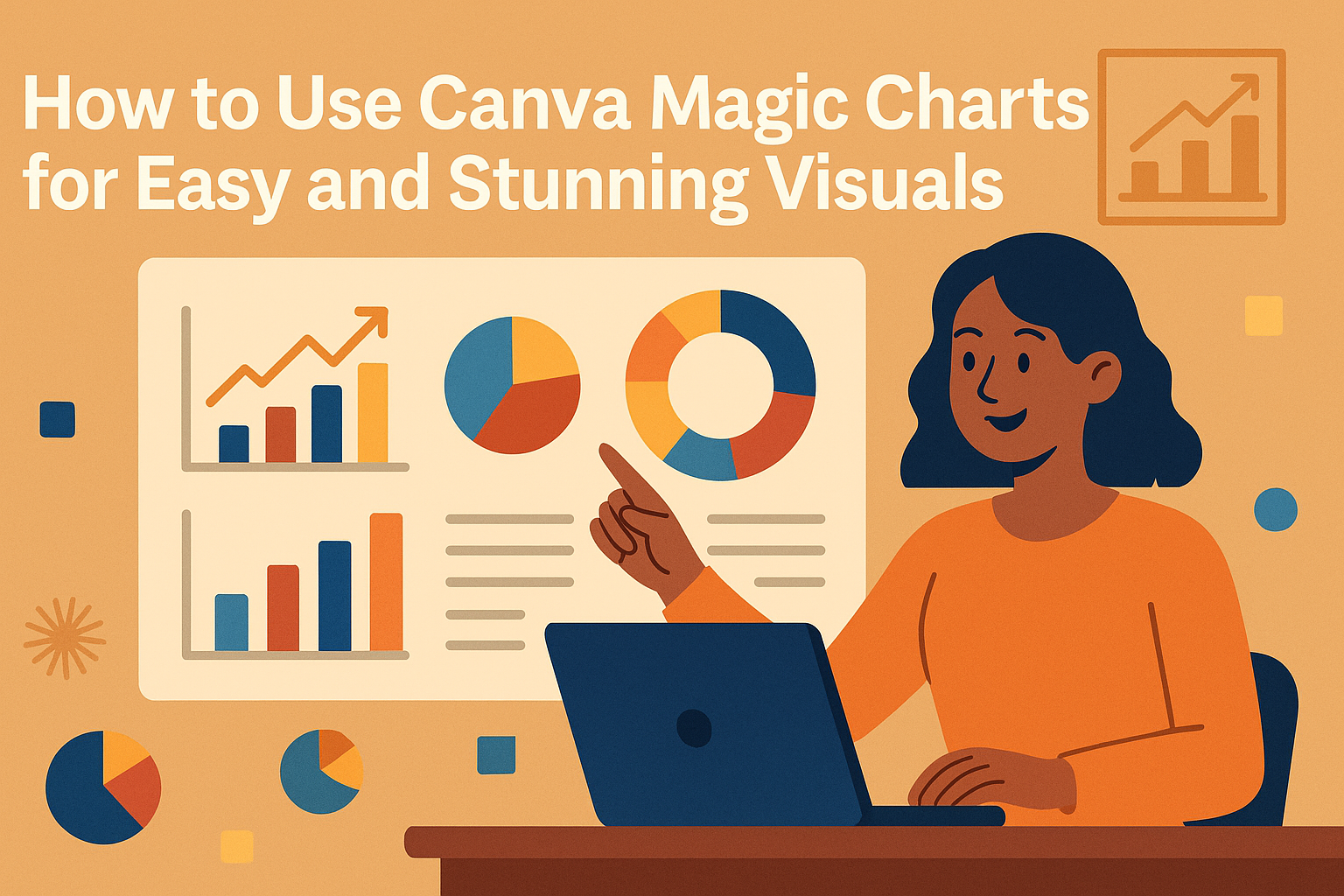
Using Canva Magic Charts makes creating clear and professional charts quick and easy. It lets users turn raw data into visual charts that update automatically when the data changes. This tool helps anyone create smart visuals without needing design skills.
Magic Charts work within Canva Sheets, where data is imported and synced for real-time updates. Users can choose different types of charts like pie, bar, or line charts with just a few clicks.
Because the charts stay connected to the data, users don’t have to worry about manually updating their visuals when the numbers change. This saves time and ensures presentations always look accurate and polished. For more details, check out how to use Magic Charts with AI in Canva Sheets.
Getting Started With Canva Magic Charts
Canva Magic Charts makes it easy to create clear and attractive charts from your data. Users can quickly access the tool, work with a variety of chart types, and customize their designs using templates and style options.
Accessing Magic Charts in Canva
To start using Magic Charts, the user first needs to open Canva Sheets. They should import or enter their data directly into the spreadsheet. Once the data is ready, Magic Charts can be found in the toolbar or chart menu.
The chart updates automatically as the data changes, so the visuals stay in sync. This makes it simple to keep information current without extra steps. No special software is needed beyond Canva itself.
Supported Chart Types
Magic Charts supports over 30 different chart styles. This includes common ones like bar charts, line graphs, pie charts, and scatter plots. Each type is designed to fit different kinds of data and goals.
The variety lets users present numbers in the best way for their message. For example, trend data works well with line charts, while parts of a whole are clear in pie charts. Choosing the right style helps communicate information clearly.
Templates and Design Options
Canva offers many templates to jump-start chart design. These have preset colors, fonts, and layouts that look professional and match different themes. Users can pick a template and then customize everything.
They can change colors, add labels, and adjust fonts easily. This flexibility helps keep charts on brand and visually balanced. Magic Charts also includes options to copy, paste, or delete chart elements for fine-tuning design.
For more help, users can try the quick intro tutorial on using Magic Charts in Canva Sheets. It guides through the setup and customization process step-by-step.
Learn more about using Magic Charts in Canva Sheets with this help center guide.
Creating Your First Magic Chart
Magic Charts in Canva start with clean data, smart AI help, and easy ways to change how the chart looks. This section shows how to get data ready, use AI to build charts fast, and tweak the design to fit your needs.
Inputting Data for Magic Charts
The first step is to add your data into Canva Sheets. You can type in your numbers or import a spreadsheet from your computer. It’s important to organize the data clearly, with labels on top or to the side, so Canva knows what each number means.
After entering the data, Magic Charts link directly to it. When you change a number and press Enter, the chart updates automatically. This live sync keeps your visualization accurate without extra steps. For more details on syncing, see Use Magic Charts on Canva.
Using AI to Generate Charts
Canva uses AI to turn your raw data into charts automatically. You just select the data range and pick Magic Charts from the toolbar. The AI suggests charts that best fit your numbers, like bar graphs or pie charts.
You can generate charts quickly without needing design skills. The feature also updates charts when you add new data or make changes. This makes it easier to track things like sales or survey results. Try watching a tutorial on how to use Magic Charts to see the AI in action.
Customizing Chart Appearance
Once the chart is ready, users can make it look the way they want. Clicking the chart opens options like changing colors, fonts, or labels. They can also add titles or adjust the chart size to fit their document.
There is a menu with more choices like copying or deleting the chart. Customization helps the chart stand out and match the style of your presentation. The ability to quickly update and change the chart makes the whole process smooth and flexible. For step-by-step instructions, check out Canva – How to create a Magic chart.
Advanced Features in Canva Magic Charts
Canva Magic Charts offers several tools that help users create more dynamic and customized charts. These include options to make charts interactive, fine-tune settings for better visuals, and easily bring in data from other apps.
Interactive Chart Elements
Magic Charts allows users to add interactive elements like hover effects and clickable legends. These features make it easier for viewers to explore the data in more detail.
For example, users can enable tooltips that show exact values when hovering over parts of the chart. This helps make the data clearer without cluttering the design.
Clickable legends let viewers turn data series on or off, improving chart readability. These interactions make presentations more engaging and informative.
Adjusting Chart Settings
Users can customize many aspects of their charts in Canva Magic Charts. This includes changing colors, fonts, and labels as well as adjusting axis options.
For instance, axis scales can be set to fixed values for better comparison or left automatic for flexibility. Label fonts and sizes are also easy to update to fit the design style.
Other settings include gridline visibility, data point shapes, and chart background colors. These options help make the chart match the overall look of the project.
Importing Data From Excel or Google Sheets
Magic Charts supports importing data directly from Excel or Google Sheets to speed up the process. Users just copy and paste their data or upload files into Canva Sheets.
Once imported, the data can be instantly turned into charts. This saves time from manually typing numbers or recreating spreadsheets.
Updates made in the source file can be refreshed in Canva, keeping charts current. This integration works well for users managing large or frequently changing datasets.
For a quick demo, check out how to use Magic Charts with AI in Canva Sheets.
Collaboration and Sharing
Canva Magic Charts lets teams work together smoothly and share their work easily. Users can update charts live with teammates and make sure everyone sees the latest data. They also have simple ways to export charts for use in reports or presentations.
Real-Time Collaboration on Charts
Teams can edit Magic Charts at the same time inside Canva Sheets. Changes are visible immediately to everyone with access. This helps avoid confusion caused by multiple versions of the same chart.
Users can leave comments directly on charts to discuss data points or suggest improvements. This keeps all feedback in one place, making teamwork faster and clearer.
Access controls let the chart owner decide who can view or edit. This keeps the data safe but encourages smooth sharing among colleagues or project partners.
Exporting Charts for Presentations
Magic Charts can be exported as high-quality images or PDFs that fit any presentation format. Users can choose the size and style that best matches their slides or documents.
Exported charts keep their design and accuracy, so users don’t have to redo any formatting outside Canva. This saves time when creating reports or pitching ideas.
Charts can also be copied directly into Canva presentations or documents, keeping everything consistent without extra steps. This makes sharing polished visuals simple and quick.
For more details about Magic Charts features, visit Canva’s Magic Charts help page.
Tips for Maximizing Chart Impact
Making charts easy to read and understand is key to sharing data well. Using the right chart type and telling a clear story with the visuals helps people grasp the message quickly. Coloring, labeling, and organizing data carefully can boost the impact of any chart.
Choosing the Right Chart Type
Picking the correct chart type depends on the kind of data and the story it tells. Bar charts work well for comparing amounts across groups. Line charts show trends over time clearly.
Pie charts are good for showing parts of a whole but shouldn’t be used for too many categories. Canva offers 11 different chart types to match different data needs. Using Magic Charts in Canva lets users switch easily between chart types until the best fit is found.
Choosing a chart that fits the data ensures viewers focus on the right information without confusion. Using the simplest chart that shows the point is usually best.
Best Practices for Visual Storytelling
Clear labels and titles help viewers follow the story in the chart. Adding colors consistently can highlight key points or group related data. Avoid using too many colors, as that can distract from the main message.
Using animation on charts can catch attention but should not be overdone. Simplicity helps make the data easy to understand. Canva allows customizing colors, labels, and styles to make charts match the message (learn more).
Keeping data linked to the original source is helpful. It lets charts update automatically when the data changes. This keeps the story current without having to redo the chart manually.
Troubleshooting Canva Magic Charts
Many issues with Canva Magic Charts come from how data is entered or how the charts show up on screen. Fixing these problems often means checking the data format or refreshing the view. Clear steps can help avoid common mistakes.
Resolving Data Input Issues
Data input problems usually happen when the spreadsheet has errors or unsupported formats. Users should make sure numbers are entered correctly and avoid mixing text with numeric fields. For example, a blank cell or a letter in a number column can cause the chart to act strange or not update.
If the chart does not update after changing data, it may be disconnected from the data source. Re-linking the chart to the correct spreadsheet often fixes this. Users can select the data source again inside Canva Sheets to ensure the connection stays active.
It helps to use simple data layouts without extra empty rows or columns. Canva Magic Charts works best when data is clean and organized. Checking for typos and consistent formatting also prevents errors.
Fixing Rendering Problems
Chart rendering problems include visuals not loading or appearing broken. This can happen due to browser issues or temporary glitches in Canva. Refreshing the browser or clearing cache often solves such problems.
If the chart looks distorted or parts are missing, resizing the chart area may help. Sometimes, adjusting the chart size inside Canva allows all elements to display correctly.
Updating to the latest Canva version or switching to a supported browser reduces the chance of bugs affecting charts. Ensuring a stable internet connection also supports smooth rendering and syncing of Magic Charts. For ongoing issues, disconnecting and reconnecting the chart to its data source can reset visual problems.
For more detailed help, users can follow the guide on how to use Magic Charts in Canva.