Creating an eye-catching product review graphic can be simple and fun with Easil.
By utilizing its user-friendly templates and design features, anyone can craft a professional-looking graphic that highlights product ratings, features, and personal insights. This graphic not only enhances visual appeal but also effectively communicates key information to readers.
Easil offers many tools, such as combining images and text, that make it easy for users to showcase products creatively.
With options like text masking and background customization, they can bring their unique vision to life. This allows for clear and engaging graphics that draw in viewers and encourage them to read the full review.
Designing a product review graphic is an excellent way to elevate content and attract attention. The strategy behind a good graphic can lead to higher engagement and make product information more accessible.
With Easil, anyone can start creating beautiful graphics that reflect their style and message.
Understanding Easil Basics
Easil is a user-friendly design tool that simplifies creating graphics. It offers an intuitive dashboard and a variety of templates to help users kickstart their projects.
Navigating the Dashboard
When users open Easil, they are greeted with a clean and organized dashboard.
The main navigation bar is located on the left side and provides access to various tools.
In the center, users will find their recent projects and templates. This makes it easy to pick up where one left off.
At the top right, there is an option to create a new design.
Users can click on this button to view available formats, such as social media posts, flyers, and printables.
Understanding where everything is located helps users work more efficiently. Easil’s layout is designed with the user in mind, making navigation straightforward.
Selecting the Right Template
Choosing a template is a crucial step in designing a product review graphic. Easil offers thousands of professionally designed templates.
Users can filter templates by categories like social media, events, and marketing materials. This helps in finding the perfect base for any project quickly.
Once a template is selected, users can easily customize it.
They can change text, colors, images, and other elements to align with their brand.
Easil’s template options not only save time but also inspire creativity. This flexibility allows users to produce unique and appealing graphics.
Graphic Design Principles for Product Reviews
Effective product review graphics rely on key design principles that enhance clarity, engagement, and brand identity. Understanding the role of color, typography, and layout can make a significant difference in how a product is perceived by the audience.
Color Psychology and Branding
Color plays a vital role in design and can influence how people feel about a product. Different colors evoke different emotions and responses.
For example, blue often conveys trust and dependability, making it a popular choice for tech products.
Using colors that align with the brand’s identity enhances recognition. A consistent color palette helps create a cohesive look across all marketing materials.
It’s smart to choose complementary colors for backgrounds and text to ensure readability.
When creating graphics, consider the target audience. Bold, vibrant colors may attract younger consumers, while softer tones may appeal to a more mature audience.
Remember, the right colors can draw attention and convey the message effectively.
Typography That Communicates Clearly
Typography is more than just words; it is about how those words are presented. Choosing the right font style is crucial for ensuring that the message is communicated effectively.
Fonts should be clear and legible, even at smaller sizes.
Using a combination of font styles can create emphasis. For instance, using bold fonts for headings can capture attention, while lighter fonts can provide details.
Consistency is important; mixing too many styles can confuse the reader.
Additionally, consider the spacing between letters and lines. Proper spacing improves readability and makes the graphic look polished.
A clean, simple font paired with good spacing can elevate the overall design and make the information more digestible.
Use of White Space and Layout
White space, or negative space, is an essential aspect of design. It gives elements room to breathe and prevents the graphic from feeling cluttered.
An effective layout uses white space strategically to highlight important components of the product review.
Creating a balanced layout with distinct sections helps guide the viewer’s eye. For example, placing key points in their own area with ample white space around them draws attention.
Using grids can help maintain alignment and organization within the graphic.
A well-structured layout not only enhances the aesthetic appeal but also improves the overall user experience by making information easy to navigate.
Creating Your Product Review Graphic
Creating a product review graphic involves several key steps. By focusing on inserting product images, adding descriptive text, and incorporating ratings and icons, a user can craft an engaging visual that effectively communicates the product’s value.
Inserting Product Images
To start, a user should upload high-quality images of the product. Clear visuals help attract attention and give a better understanding of what is being reviewed.
Here are some tips for inserting images:
- Choose Bright and Clear Images: Use images with good lighting and clear details.
- Use Multiple Angles: Showcase the product from different perspectives to give viewers a thorough look.
- Consider Scale: Including a common object for scale can help viewers understand the product size.
Using Easil’s tools, it is easy to position images in the design.
Users can drag and resize images to fit harmoniously in the layout.
Adding Descriptive Text
Once the images are in place, the next step is to add descriptive text. This text should highlight the key features and benefits of the product.
Here are some ways to make text effective:
- Keep It Short and Sweet: Use bullet points for easy reading.
- Bold Important Features: Emphasizing top qualities catches the reader’s eye.
- Stay on Point: Focus on what makes the product unique and appealing.
Easil provides formatted text boxes that make it simple to design.
Users can choose different fonts and colors to make the text pop against the background.
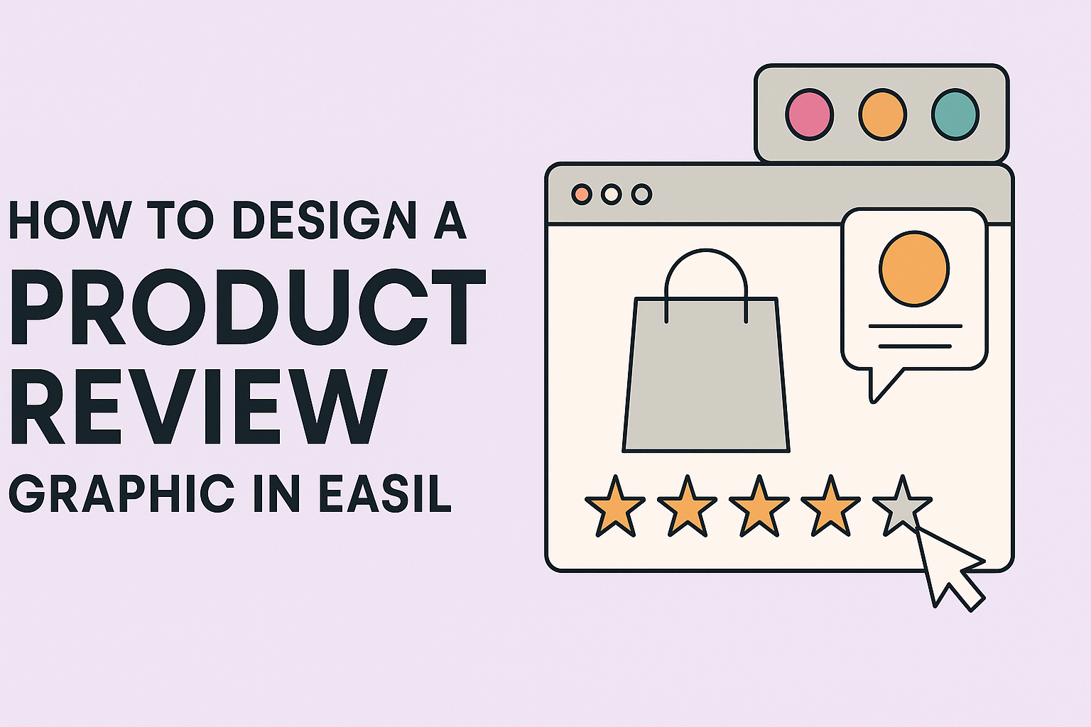
Incorporating Ratings and Icons
Ratings and icons can effectively convey opinions and information in a product review. They add visual interest while summarizing key points at a glance.
Consider these strategies:
-
Star Ratings: Using star icons, users can create a quick visual of product ratings. Each star represents a quality level.
-
Icons for Features: Use icons to represent specific features, like battery life or durability. This method provides instant understanding.
-
Color Coding: Different colors can indicate performance levels, making it easy for viewers to grasp the review at a glance.
In Easil, various icons are readily available for easy incorporation. Users can customize colors to match their design and make sure everything aligns with their branding.