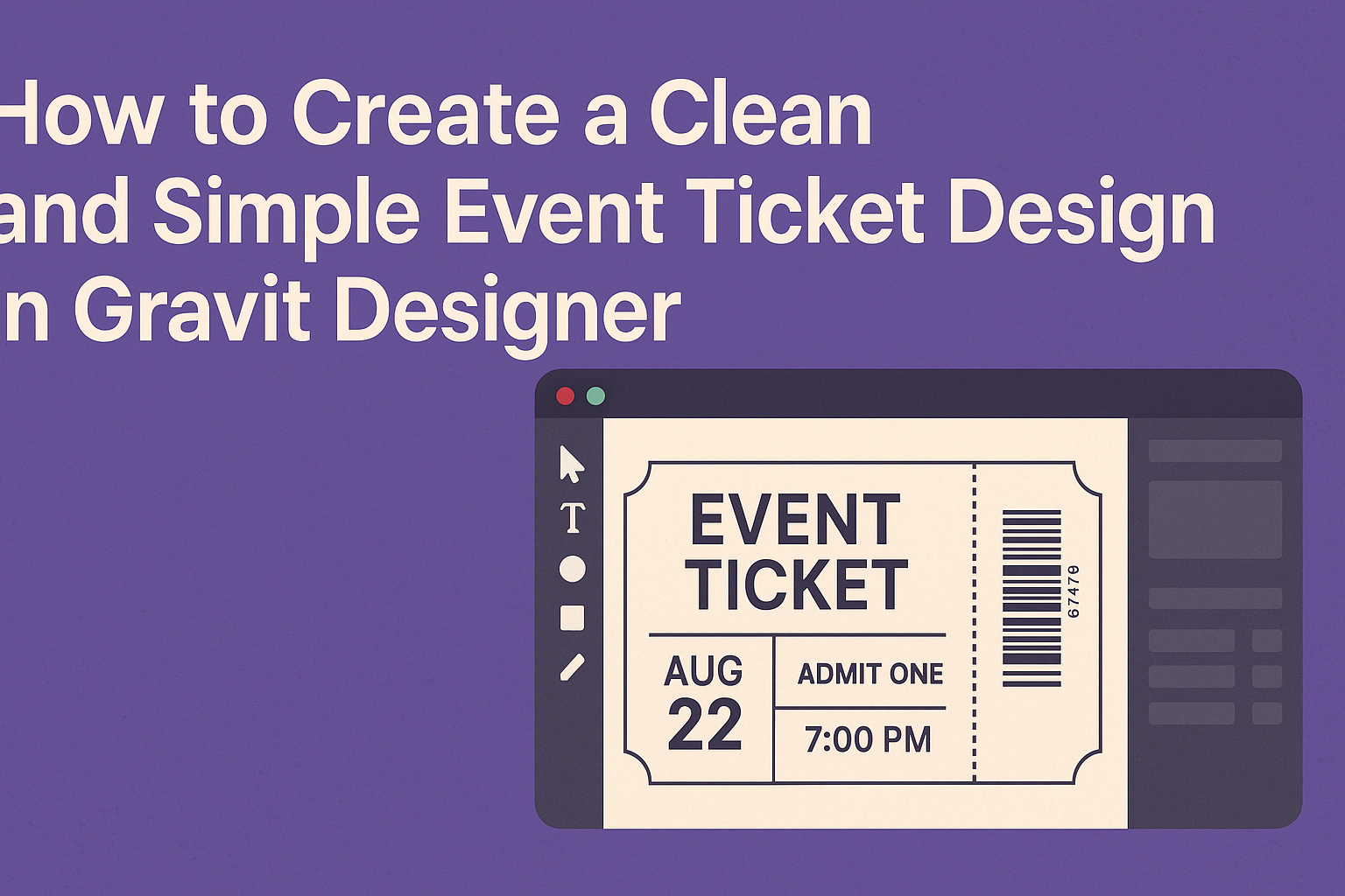
Creating an event ticket that looks professional and stylish can be easier than it seems.
In Gravit Designer, you can craft a clean and simple ticket design by utilizing its straightforward tools and features, making your event stand out.
This article will guide readers through each step, ensuring they feel confident in their design process.
Whether planning a concert, a raffle, or a conference, the right ticket design can enhance the overall experience for attendees.
With Gravit Designer, users have access to a range of templates and customization options that simplify the design process. This makes it possible to reflect the theme of the event while keeping the design neat and engaging.
By the end of the article, readers will not only have the skills to create their own tickets but also the inspiration to unleash their creativity. They will learn how to balance aesthetics and functionality, leading to an eye-catching final product.
Getting Started with Gravit Designer
Gravit Designer is user-friendly and packed with features for creating stunning designs. Knowing the layout and how to set up documents will help anyone start their design journey.
Overview of the Interface
The interface of Gravit Designer is intuitive and clean.
When it opens, users will see a toolbar on the left, a properties panel on the right, and the canvas in the center.
Key tools like selection, shape, and text tools are located in the toolbar. The properties panel allows users to adjust colors, sizes, and more.
Shortcuts are available for quick access to functions, streamlining the design process. Designers can also customize their workspace, making it fit their specific needs.
Setting Up a New Document
To create a new document, users go to File > New. A dialog will appear, asking for document size and orientation.
Selecting a preset size like A4 or Custom provides options for pixel dimensions. There is also the option to choose a background color.
Once the document is set, users can click Create to open their workspace.
It’s important to select the right dimensions for ticket designs, as they should fit standard formats.
After the document opens, users can immediately start adding elements to their design, making use of the tools available to them.
Designing the Layout
Creating an effective event ticket design involves careful consideration of layout elements. Key aspects such as font selection, color schemes, and visual components play a big role in capturing attention and conveying information clearly. Here’s how to approach these elements.
Selecting Fonts and Typography
Choosing the right fonts is crucial for readability and style. Event tickets should include a combination of bold headlines and simple body text.
For the headline, a font like Montserrat or Oswald can provide a modern feel, while a cleaner font like Arial or Helvetica works well for details. Heavier weights can emphasize the event name, while lighter weights for supplementary text help maintain a clean look.
It’s best to limit the number of different fonts to three: one for titles, one for subtitles, and one for body text. Keeping it consistent will ensure a polished design.
Working with Color Schemes
Color schemes set the mood for any event. Bright colors can energize, while soft tones evoke calmness. For event tickets, it’s best to choose a palette of 2 to 4 colors that complement each other.
A common approach is to use a primary color for the background, with a contrasting color for the text. For example, a deep blue background with white text creates an easy-to-read contrast.
Tools like Adobe Color can help in creating a harmonic scheme. Testing the colors on different screens ensures they appear as intended.
Incorporating Visual Elements
Visual elements can enhance the design without overwhelming it. Graphic elements such as icons, logos, or borders help create a unique identity for the event.
Images or patterns should be subtle and shouldn’t distract from key information. Using an event logo in the corner and a small icon next to the date can add interest.
Important details like the date, time, and venue should be easy to locate. Clear separation of these elements through spacing or borders will make the ticket more user-friendly.
Adding Details and Custom Elements
When designing an event ticket, adding thoughtful details and custom elements can enhance its appeal. Focusing on organization, unique backgrounds, and functional features will create a polished look that captures the essence of the event.
Using Layers for Organization
Layers are essential for keeping design elements organized. By using layers, the designer can separate different parts of the ticket. For instance, one layer might hold the background, while another contains text and images. This method allows for easy adjustments without affecting other elements.
Organizing layers also makes it simple to edit. It lets the designer hide or lock parts of the design for more precise work. Naming each layer descriptively can further streamline the process. For example, layers for “Event Name,” “Date,” and “Venue” can be labeled accordingly. This structure saves time and makes it easier to present changes to clients or team members.
Creating Unique Backgrounds
A unique background can set the tone for the event ticket. Designers should consider integrating colors, patterns, or images that reflect the event’s theme. The background should complement the text and other elements without overwhelming them. For simplicity, solid colors or subtle gradients often work well.
Textures can also add depth to the design. Using tools in Gravit Designer, such as the gradient tool or images with low opacity, can create an eye-catching effect. It’s important to ensure that the background doesn’t distract from critical details like the event date and time.
Implementing QR Codes and Barcodes
Integrating QR codes and barcodes enhances ticket functionality. These codes can streamline entry processes by linking to event pages or providing ticket verification. Gravit Designer allows for easy placement of these codes within the design.
When adding a QR code, ensure it’s large enough to be scanned easily but not so large that it takes attention away from other elements. Additionally, placing the code in a logical location, such as the bottom corner, maintains the ticket’s overall aesthetic. This thoughtful inclusion adds a modern touch and improves the ticket’s usability.
Tips for a Clean and Simple Design
Creating a clean and simple event ticket design requires careful attention to detail. Key aspects include balancing information with white space, ensuring readability, and making final touches that enhance the overall look.
Balance Between Information and White Space
When designing an event ticket, it’s crucial to find a good balance between the information presented and the white space surrounding it. White space helps draw the eye to important details, preventing the design from feeling cluttered.
Using lists can help keep information organized. For example:
- Event name
- Date and time
- Location
- Price
Limiting the amount of text and using bullet points makes it easier for attendees to grasp the essential information quickly.
Ensuring Readability and Clarity
Readability is key in any design, especially for event tickets. Selecting the right font is vital. It’s best to choose clean, sans-serif fonts as they are easier to read at a glance.
Contrast should also be considered. Using dark text on a light background, or vice versa, enhances visibility. Keeping the font size large enough ensures that key details like the date and location stand out.
Use design tools to check alignment and spacing. A well-structured layout means attendees won’t struggle to understand the ticket.
Final Touches and Proofreading
Before finalizing the ticket design, it helps to give it a fresh look.
Checking for any spelling or grammatical errors is crucial. Errors can detract from professionalism and cause confusion.
Adding small design elements can elevate the ticket.
Simple lines or icons can provide a visual break without overwhelming the design.
Lastly, getting feedback from others can provide valuable insights.
A second pair of eyes may catch details that were missed, ensuring the ticket is perfect before printing or sharing.