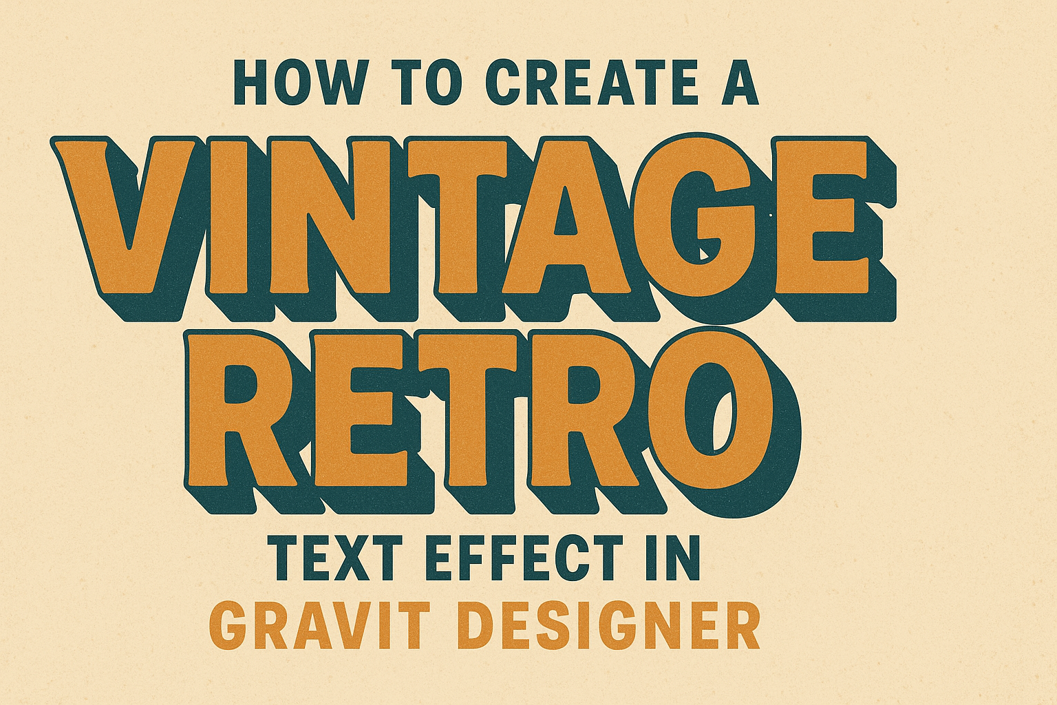
Creating a vintage retro text effect can add a unique flair to any design project.
In Gravit Designer, users can easily achieve this retro look by applying simple techniques and effects that transform ordinary text into eye-catching graphics.
This article will guide readers through the steps to make their text stand out while capturing the nostalgic vibe of past decades.
With a user-friendly interface, Gravit Designer is perfect for both beginners and experienced designers. They will learn how to incorporate textures and effects that evoke the charm of vintage designs.
By the end of this guide, readers will be equipped with the skills to create personalized retro text that enhances their creative works.
Getting Started with Gravit Designer
Gravit Designer is an intuitive graphic design tool perfect for creating various visual projects.
Users can easily set up their workspace and familiarize themselves with essential features to start their design journey.
Overview of Gravit Designer
Gravit Designer is a versatile and user-friendly vector graphic design application. It allows users to create illustrations, logos, and text effects with ease. The software works on multiple platforms, making it accessible on Windows, macOS, Linux, and the web.
Some key features include:
- Vector Editing: Create scalable graphics without losing quality.
- Layers: Organize elements for straightforward design management.
- Text Tools: Easily add and modify text for any design project.
These features make it ideal for both beginners and experienced designers looking to craft stunning visuals.
Setting Up Your Canvas
To begin designing, users need to set up their canvas properly. After opening Gravit Designer, they can create a new file by selecting “New File” from the main menu.
Users should consider these options:
- Canvas Size: Choose the size that fits the project needs, from social media posts to print designs.
- Units of Measurement: Select pixels, inches, or millimeters based on the type of design being created.
- Background Color: Set a background color to work with, which can help visualize the design.
Once the canvas is set, users can start bringing their ideas to life with shapes, colors, and text. This setup is crucial for a smooth design experience.
Creating the Vintage Retro Text
To create a stunning vintage retro text effect in Gravit Designer, it’s important to choose the right fonts and adjust the typeface properly. Each step plays a crucial role in achieving that nostalgic look.
Selecting Suitable Fonts
Choosing the right font is the first key step. A vintage retro look often requires fonts that have personality. Look for fonts that are bold, rounded, or script styles. These fonts mimic styles from the 60s, 70s, or 80s.
Some popular options include:
- Bebas Neue: Simple and bold.
- Pacifico: Fun and casual with a retro vibe.
- Lobster: A classic script font.
It’s best to consider contrast too. Pair a bold font with a softer one for added interest. Always check how the font communicates the desired mood and feel.
Adding Text and Adjusting the Typeface
After selecting fonts, the next step is adding the text. Use the text tool in Gravit Designer to create a text box. Type the desired words and select your chosen font from the menu.
Next, it’s crucial to adjust the typeface settings. Consider modifying the size and letter spacing to enhance visual appeal. Adjusting these can help the text stand out more effectively.
Use bold or italic styles for emphasis. You can also play with the color and opacity. A transparent effect adds a nice retro touch. Finally, experiment with layering and shadows to give depth and character to the text.
Applying Effects and Styles
Applying effects and styles can enhance the look of vintage retro text in Gravit Designer. Techniques like layer styles and custom styles allow for creativity and unique touches to designs.
Using Layer Styles for Text Effects
Layer styles are a powerful tool in Gravit Designer. They help add depth and visual interest to text. By accessing the Layer Styles panel, users can choose effects like shadows, glows, and bevels.
For example, using a drop shadow can create a sense of separation from the background. To apply it, simply select the text layer and adjust the shadow’s opacity, distance, and blur.
Another effective style is the inner glow, which provides a soft highlight to the edges. Users can tweak the color and size to suit their design. Combining multiple styles can result in a unique and eye-catching text effect.
Creating and Saving Custom Styles
Creating and saving custom styles allows designers to reuse their favorite effects. It streamlines the process for future projects. To create a custom style, apply desired effects to a text layer.
Once satisfied, go to the Styles panel and click on “Save Style.” This saves the effects as a new style in the library.
Designers can easily apply this saved style to other text layers by selecting it from the styles library. This feature helps maintain consistency and saves time across various designs. Custom styles can be an essential part of a designer’s toolkit for creating retro text effects.
Final Touches and Exporting
It is important to add the right elements to complete the vintage retro text effect. Adding backgrounds and textures can greatly enhance the overall look. Once finished, exporting the design correctly ensures it appears as intended across various platforms.
Adding Backgrounds and Textures
To really make the retro text stand out, adding a background is essential. Users can choose solid colors, gradients, or even patterns.
Consider using a subtle texture that complements the text style without overpowering it.
Textures like grain or noise can add depth. Gravit Designer allows easy layering, so place the background behind the text layer. Adjust the opacity for a blended effect if needed.
Additionally, shadows can give a 3D appearance. Using layer styles, users can add soft shadows that create a vintage feel. Adjust the angle and distance to achieve the desired look.
Exporting Your Design for Different Platforms
When the design is ready, exporting it properly is the next step. Gravit Designer offers several formats like PNG, JPG, and SVG.
Each format serves different purposes, so selecting the right one is key. For high-quality images, PNG is preferred due to its clear resolution.
JPG is suitable for web use where smaller file sizes matter. SVG is ideal for scalable graphics without losing quality.
Check resolution settings before exporting. A resolution of 300 DPI is best for print, while 72 DPI works well for web.
Finally, always preview the design to ensure it appears as expected before sharing or printing.