Creating a full-screen overlay can be a powerful way to capture leads effectively using Sketch.
By setting up an overlay, designers can block out the background, making it easier for visitors to focus on the lead capture form. This technique not only grabs attention but can also help boost conversion rates.
In this guide, readers will discover step-by-step instructions on building a lead capture overlay.
They will learn how to customize design elements and optimize user experience, making the lead capture process seamless. With tips and tricks along the way, anyone can enhance their prototypes with an engaging overlay.
By understanding the essentials, designers will be equipped to create overlays that stand out. This approach will help in turning visitors into potential customers while keeping their designs sleek and professional.
Understanding Full-Screen Overlays
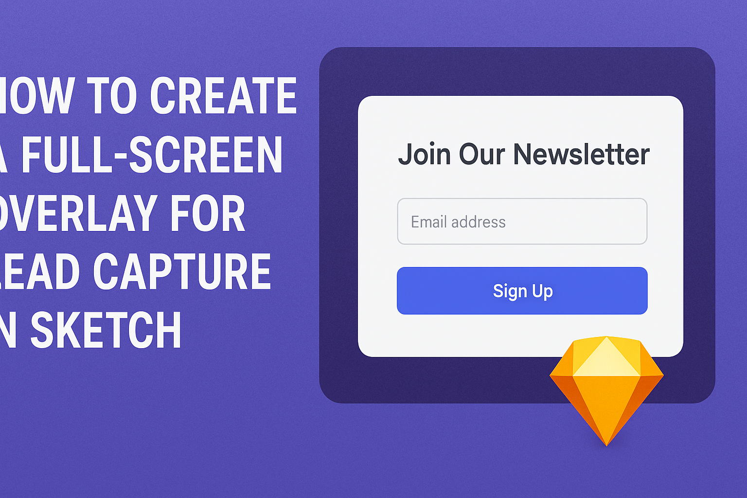
Full-screen overlays are effective tools designed to capture user attention without distractions. They cover the entire screen, allowing for a focused interaction, which is particularly useful in lead capture forms.
Purpose of Full-Screen Overlays
The primary purpose of a full-screen overlay is to convey important messages or prompts that require user interaction.
For example, it can be used to present sign-up forms, special offers, or urgent notifications.
When implemented correctly, these overlays block background information, directing users’ focus to the content within the overlay. This setup helps eliminate distractions, which can lead to higher engagement rates.
Designers often ensure that these overlays are visually appealing and easy to navigate. They should include clear calls to action that guide users toward completion of the intended task.
Benefits for Lead Capture
Full-screen overlays offer several advantages for lead capture. Firstly, they create a sense of urgency. By displaying limited-time offers or exclusive content, users are more likely to take action quickly.
Secondly, these overlays can be tailored to specific user segments or behaviors, making them more relevant. Personalized messages resonate better with users and can significantly increase conversion rates.
Additionally, full-screen overlays simplify the process for users. This streamlined approach minimizes the steps needed to submit information, resulting in a smoother user experience.
Incorporating engaging visuals and concise text enhances the appeal of the overlay. This combination encourages users to fill out forms and submit their information, aiding in effective lead generation.
Designing Your Overlay in Sketch
Creating an effective full-screen overlay in Sketch requires a careful approach. This section includes steps for starting a new project, navigating the user interface, and tips for best practices in overlay design.
Starting a New Project
To design a full-screen overlay, she should begin by creating a new project in Sketch. This involves selecting the correct artboard size. A common choice is the size for desktop views, often set to 1440 x 1024 pixels.
Next, she can name the project appropriately. Naming helps keep things organized later, especially when handling multiple files. Import any images or graphics she wants to use in the overlay.
Finally, she should create a new artboard. This artboard will be where the overlay design takes shape. Setting up the project effectively is crucial for smooth design work.
Utilizing Sketch’s Interface
Sketch has a user-friendly interface that makes designing overlays straightforward. The key areas to focus on are the toolbar and the Inspector panel.
In the toolbar, options like shapes, text, and symbols allow for quick design additions. She can use the rectangle tool to create a full-screen shape for the overlay.
In the Inspector, she can adjust properties like color and opacity. Setting the background color to a semi-transparent shade can create a sophisticated look.
Using layers is essential. Each element of the overlay should be on a different layer in the Layers panel. This organization helps manage the design effectively.
Best Practices for Overlay Design
A well-designed overlay should be visually appealing yet functional. It’s important to balance aesthetics with user experience.
Keep it Simple: Use minimal text and ensure buttons are easy to find. Too much information can overwhelm users.
Contrast is Key: Ensure the text stands out against the background. Dark text on a light background or vice versa usually works best.
Test Responsiveness: Design the overlay to look good on various screen sizes. Sketch offers options to view how the overlay adapts to different devices.
Finally, always gather feedback. Sharing the overlay design with others can provide insights that help improve its effectiveness.
Implementing Lead Capture Features
To effectively gather leads, it’s important to implement key features in the lead capture form. This includes designing intuitive form fields and strategically placing submit buttons to enhance user experience.
Creating Form Fields
Creating form fields requires careful consideration of user experience. Begin by determining what information is most valuable. Common fields include name, email address, and phone number.
Using a simple layout helps minimize user frustration. It’s best to keep the form concise. Too many fields can deter users from completing it.
Additionally, consider using placeholder text to guide users on what information to enter. This small detail can improve clarity and increase the likelihood of successful submissions. Implementing clear labels for each field promotes better understanding.
Adding Submit Buttons
Submit buttons are crucial as they finalizes user interaction with the form. Design submit buttons to be prominent and inviting, using a color that stands out against the background.
Positioning them below the form is standard. However, ensure they are reachable without excessive scrolling. Use action-oriented text like “Get My Free Quote” or “Join Now” to encourage engagement.
It’s also useful to implement visual feedback when users click the button. Changing color or showing a loading icon can assure users that their input was received. This prevents confusion and builds trust in the lead capture process.
Testing and Optimizing
To ensure the full-screen overlay for lead capture works effectively, it’s important to focus on testing and gathering user feedback. These steps can help improve user experience and boost conversion rates.
Previewing Your Overlay
Previewing the overlay before launching is crucial. This allows the designer to see how it appears across different devices and screen sizes. They should consistently check for visual appeal and functionality.
Implementing responsive design is a must. The overlay should adjust seamlessly whether viewed on a desktop, tablet, or smartphone.
Tools like Sketch provide options for previewing designs in various resolutions. Additionally, using prototype tools can simulate interactions, offering a clearer picture of the user experience.
Gathering User Feedback
Collecting feedback from real users provides valuable insights.
Designers should consider using surveys and usability tests.
Questions can focus on clarity, ease of use, and overall user satisfaction.
Engaging with users through simple feedback forms on the overlay can yield direct responses.
Questions might include:
- Was the overlay easy to navigate?
- Did the form ask for information that felt relevant?
This data helps in refining the overlay.
Testing different versions and gathering reactions can lead to better design choices and a higher conversion rate over time.