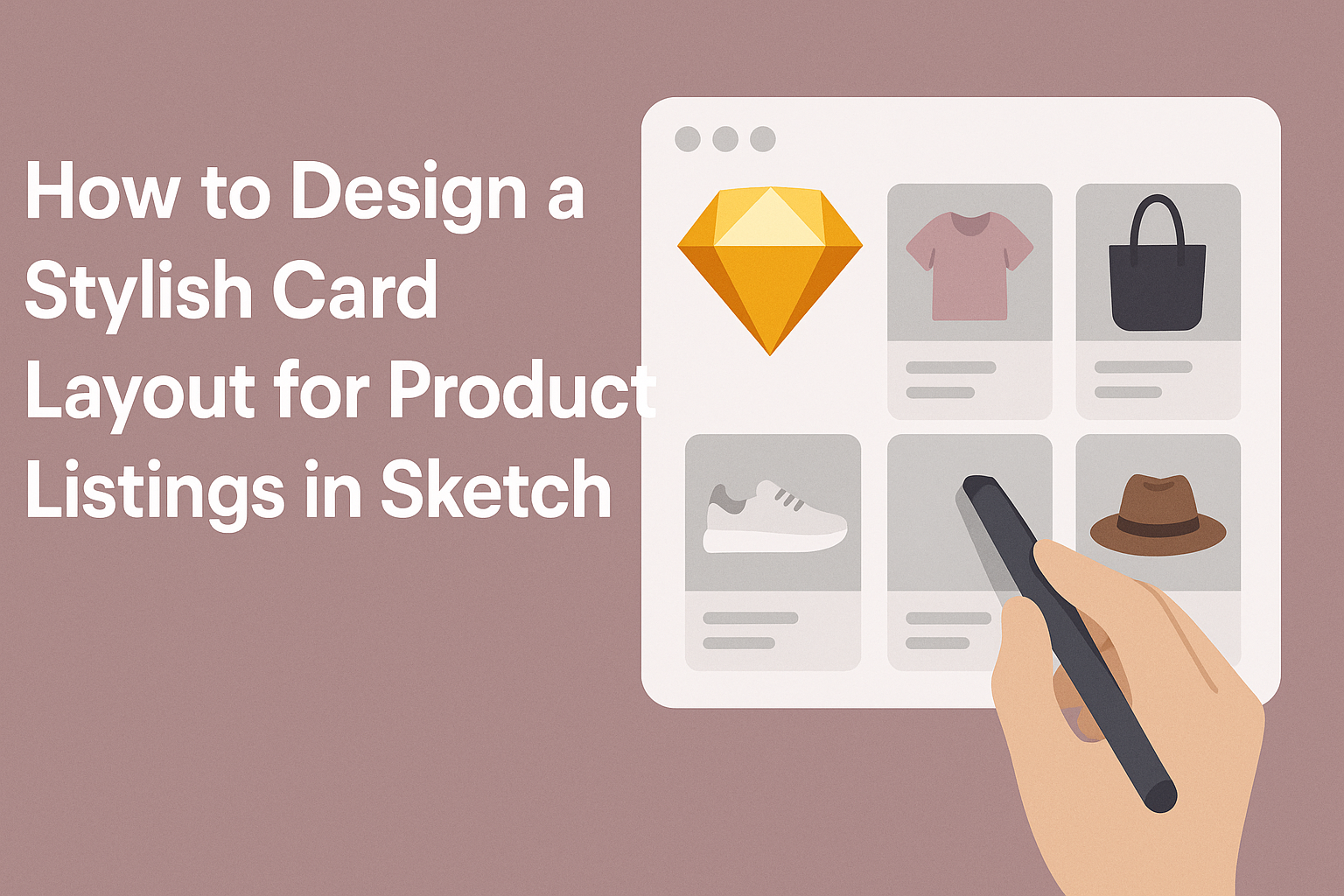
Creating an eye-catching card layout for product listings in Sketch can transform how items are presented. Many designers seek to balance aesthetics with functionality, making cards not just attractive but also easy to navigate.
A well-designed card layout enhances user experience and can boost engagement with the products.
To achieve this stylish look, it’s essential to utilize Sketch’s features effectively. This includes using Smart Layout to maintain consistent spacing and alignment.
By applying simple design principles, anyone can create a layout that stands out and showcases products beautifully.
In this blog post, readers will discover practical tips and tricks to craft stylish card layouts that fit their needs. From selecting colors and fonts to arranging images and text, the process will be straightforward and enjoyable.
With the right guidance, she can easily elevate her design skills and make her product listings more appealing.
Getting Started with Sketch
To begin designing in Sketch, it’s essential to grasp the layout and tools available. Understanding the interface will allow the user to navigate effectively.
Setting up the document correctly ensures a smooth workflow throughout the design process.
Understanding Sketch Interface
The Sketch interface is intuitive and user-friendly. It features a toolbar at the top with tools for selection, shape creation, and text.
Key areas in the interface:
- Canvas: The main area where designs are created.
- Layers Panel: Displays all elements in the current document.
- Inspector: Located on the right, it shows details and settings for selected layers.
Users can zoom in and out, arrange layers, and access different tools from the toolbar. Customizing the workspace helps in organizing elements better, making designs simpler and faster.
Setting Up Your Document
Creating a new document in Sketch starts with choosing the right artboard size. Users can select a preset size or create a custom one based on design needs.
Steps for setting up the document:
- Open Sketch: Start a new file or project.
- Select Artboard Tool: Choose the artboard size that fits the product listing.
- Setup Grids and Layouts: Adjust layout settings for consistent spacing.
Utilizing grids can help in aligning items uniformly. Users can also import assets or create symbols to streamline their workflow effectively. This setup paves the way for a tidy and organized design process.
Designing the Card Layout
Creating an appealing card layout requires careful attention to structure, alignment, and styling. Each element plays a vital role in attracting users and enhancing their experience. Here’s a closer look at how to effectively design a card layout.
Creating the Card Structure
A solid card structure starts with essential components. Each card should include the product image, title, brief description, and price. This layout allows users to grasp key information quickly.
Using a clean design is crucial. Each card should have distinct sections to separate text and images. For instance, the title can be bold, while the description is in a lighter font. This creates a visual hierarchy that guides the user’s eye naturally.
Additionally, provide adequate spacing between elements. This helps avoid clutter and makes the card visually appealing. A well-structured card layout enhances readability and encourages user engagement.
Applying Grids and Alignment
Using grids is essential in maintaining uniformity across the card layout. A grid system helps position elements evenly, which creates a balanced look. For instance, a 3-column grid is popular for product listings as it allows enough room for each card.
Alignment is equally important. Items should be aligned consistently to create a neat appearance. This can be left-aligned, center-aligned, or right-aligned, depending on the desired effect.
Proper alignment enhances the user’s attention to detail.
Consider responsive layout design as well. Cards should adapt to different screen sizes while maintaining structure. This ensures users have a great experience whether on a desktop or mobile device.
Styling with Colors and Fonts
Colors and fonts play a significant role in the card’s appeal. Choose a color palette that reflects the brand’s identity while being visually appealing. For instance, a light background with darker text promotes readability.
Fonts also contribute to the card’s style. Use a clear, readable font for the title to grab attention. For descriptions, a slightly smaller font maintains clarity without overpowering the title.
Don’t forget to incorporate contrast. For example, highlighted buttons should stand out against the card background. This draws attention to important actions like “Buy Now” or “Learn More.”
Adding Product Information
When designing a product card layout, adding essential product information is crucial. This includes high-quality images, clear typography for titles and descriptions, and effective pricing and call-to-action elements. Each of these factors helps create a card that attracts customers and encourages them to make a purchase.
Inserting Images
Images play a vital role in product cards. They should be clear, high-resolution, and represent the product accurately. Using a consistent size for images helps maintain a clean layout.
A good practice is to use a simple, white background. This makes the product stand out and look more appealing. Designers can also consider using a light shadow to add depth. Images can be presented in various ways, such as centered or aligned to one side.
Including multiple images or utilizing a hover effect to zoom can provide customers with a better understanding of the product. This level of detail can significantly enhance the shopping experience.
Typography for Product Titles and Descriptions
Typography should be clear and readable. Choosing the right font can make a significant difference in how the information is perceived. Titles should be bold and easily noticeable, while descriptions can utilize a lighter weight font.
Maintaining a consistent font size helps create a more organized appearance. For example, product titles could be set to 18-24 points, while descriptions might range from 12-16 points.
Line spacing is also important; ample space can improve readability. Using contrast is key as well, with dark text on a light background. This ensures that the text stands out and captures attention effectively.
Pricing and Call to Action Elements
Pricing should be prominently displayed to catch the viewer’s eye. A larger font size, possibly with a corresponding color, can suggest importance. The use of dollar signs or other currency symbols adds clarity.
Next to the price, a clear call-to-action (CTA) button is essential. Phrases like “Add to Cart” or “Buy Now” should be bold and inviting.
The CTA button should be easily clickable and stand out with a contrasting color. Positioning is also crucial; placing the button near the price makes the buying process intuitive. These features together create a smooth and engaging user experience.
Final Touches
Adding the final elements to a card layout can elevate the design and improve user engagement. Attention to detail makes a significant impact on how the product is perceived. Below are important aspects to focus on for a polished finish.
Layer Styles and Effects
Using layer styles and effects enhances the visual appeal of the product card. Consider adding shadows, gradients, or borders to create depth.
- Drop Shadows: These can help the card stand out against the background, giving it a three-dimensional feel.
- Borders: A subtle border can frame the card nicely, adding elegance.
- Opacity: Adjusting the transparency of certain layers can create interesting overlays, making elements interact visually.
Experiment with different styles, but keep the overall aesthetic in mind. Clear and consistent choices help maintain a professional look.
Exporting Your Design
Once the design is complete, exporting it correctly is crucial for presentation.
-
File Formats: Choose formats like PNG for high-quality images or JPG for lighter files.
-
Resolution: Ensure the resolution is set at least 72 DPI for digital use. Higher resolutions are better for print.
-
Export Settings: Use the export options in Sketch to optimize the card size and quality, which directly influences loading times on e-commerce sites.
By following these steps, the final product will be polished and ready for use in listings.