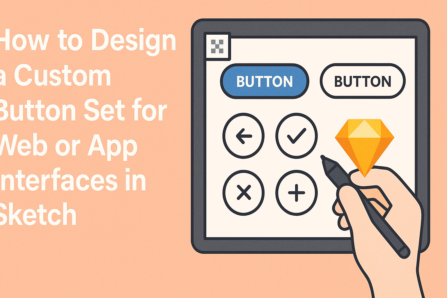
Creating an engaging custom button set for web or app interfaces can greatly enhance user experience.
To design effective buttons in Sketch, one must focus on clarity, accessibility, and visual appeal. With the right techniques, anyone can build buttons that not only look great but also work seamlessly across different platforms.
Sketch provides powerful tools to help designers bring their ideas to life. By leveraging features like nested symbols and smart layout, they can create buttons that are both dynamic and adaptable.
This guide will walk through essential steps to ensure the button designs are functional and stylish.
Whether a designer is just starting or looking to refine their skills, understanding how to design buttons is a key aspect of interface design. Exploring this process in Sketch opens up a wide range of creative possibilities, allowing for unique and user-friendly interfaces.
Understanding Sketch Basics
To design custom buttons effectively, it’s essential to understand the fundamentals of Sketch.
Familiarizing oneself with the interface, setting up the canvas properly, and exploring vector editing tools will help in creating polished designs.
Getting Familiar with the Interface
The Sketch interface is user-friendly, making it easy for designers to navigate. Key elements include the Toolbar, Inspector, and Canvas.
The Toolbar at the top contains tools for selection, shapes, and text.
On the right, the Inspector displays properties of the selected object, allowing adjustments to size, color, and effects. The Canvas is where the design comes to life. Users can zoom in and out to focus on details or view the whole project.
Understanding keyboard shortcuts enhances efficiency. For example, pressing “R” creates a rectangle, while “T” adds text. Familiarity with these tools speeds up the design process.
Setting Up Your Canvas
Setting the canvas is crucial for an organized design workspace.
Start by selecting the appropriate Artboard size for the intended platform, such as mobile or web. Sketch provides templates for common device sizes, ensuring designs fit perfectly.
After choosing an Artboard, designers can adjust its dimensions in the Inspector. A clear grid helps maintain alignment. Users can enable this by going to View > Show Grid. This grid guides placement of items accurately.
Additionally, saving a Style Guide with colors and fonts helps maintain consistency throughout the project. This can be done in a separate Artboard dedicated to styles, simplifying future edits and additions.
Exploring Vector Editing Tools
Sketch specializes in vector editing, which is vital for creating scalable designs.
The Vector tool allows users to draw shapes with precision. Designers can merge, subtract, and reshape objects with ease.
Each shape can be customized with adjustable points. To edit points, double-click the shape, revealing the Vector Editing mode. Users can then manipulate the anchor points to create unique shapes.
Utilizing the Boolean operations such as union, subtract, intersect, and difference helps combine or split shapes. This feature is perfect for crafting distinctive button styles.
Finally, using Sketch’s Symbols for buttons saves time. Creating a symbol allows for easy updates across various designs. Changes made to the symbol automatically reflect everywhere it is used.
Designing Your Custom Button Set
Creating a custom button set requires attention to color, shape, text, and interactivity. Each element plays a crucial role in ensuring that buttons are both functional and appealing to users.
Choosing a Color Scheme
Selecting the right color scheme is vital for button design. Colors should align with the overall brand and purpose of the application.
Designers can experiment with a primary color for the main actions and use secondary colors for less critical features.
Using tools like color wheels can help in finding complementary hues. For example, a bright color can draw attention, while softer tones can instill a calm feeling. Consistency in color use across buttons helps users understand their functions quickly.
Designers should also consider accessibility. High contrast between text and button backgrounds ensures readability for all users.
Defining Button Shapes and Sizes
The shape and size of buttons impact user experience significantly.
Typically, buttons should be large enough to interact with easily, especially for mobile interfaces. A good standard is to make buttons at least 44px by 44px for touch purposes.
Round edges often create a friendly and inviting look while sharp corners can provide a more modern feel. It’s essential to maintain a balance; if they are too large, they can appear overwhelming.
Making variations in size can help differentiate button importance. Primary action buttons may be larger, while secondary buttons can be smaller.
Applying Text and Iconography
Text on buttons should be clear and concise. The use of action words like “Submit” or “Download” helps convey the intended function effectively. Designers can experiment with different font styles, but readability is key.
Including icons alongside text adds visual interest. Icons can quickly communicate the button’s purpose, speeding up user interaction. However, it’s important to ensure icons are easily recognizable.
The text size should be proportional to the button size. Designers should aim for a comfortable margin around the text, enhancing visibility and ease of clicking.
Creating States and Interactions
Buttons need different states to indicate their interaction capabilities.
The normal state shows the button ready for use. When hovered over or clicked, the button should change color or animate to signal interaction.
Utilizing color changes or slight enlargements can provide instant feedback. This responsiveness assures users that their actions are recognized. Designers should also consider adding disabled states for buttons that are not currently functional.
By creating these interactive states, users can feel more connected with the interface. It enhances the overall experience by making actions more intuitive.
Optimizing Workflow
A smooth workflow can greatly enhance the design process in Sketch.
By using tools like symbols and shared styles, designers can achieve consistency and efficiency. Additionally, leveraging libraries and plugins can save time and improve functionality.
Using Symbols and Shared Styles
Symbols are key to maintaining consistency across a design.
By creating a button symbol, any change made to this central design updates all instances throughout the project. This reduces redundancy and ensures all buttons share the same look and feel.
Shared styles work similarly for text and colors. By defining a style once, designers can apply it to multiple elements.
To create or update a shared style, simply select the desired element, access the style panel, and save it for later use. This method streamlines adjustments and maintains visual uniformity.
Leveraging Libraries and Plugins
Sketch libraries allow designers to store and share components.
This means button designs can be saved in a library and are accessible to all team members.
Updates made to a library can be pushed to all users, ensuring everyone has the most current designs.
Plugins offer additional functionality to enhance workflow.
Tools like Craft or Anima can streamline various tasks, such as syncing design changes or creating prototypes.
By exploring and integrating useful plugins, designers can optimize their processes and focus more on creativity rather than repetitive tasks.