Creating a set of custom radio buttons in Sketch can elevate any design project. With the right techniques, designers can craft unique and visually appealing radio buttons that enhance user experience and maintain brand identity.
This post will guide readers through the steps to design these custom elements effectively.
Understanding the basics of design in Sketch is crucial to success. Designers will find useful tips on utilizing shapes, colors, and styles to make buttons that stand out.
The process involves straightforward methods that anyone can follow, even those who are new to Sketch.
By exploring innovative ways to represent radio buttons, designers can add a personal touch to their projects. This article offers insights and practical examples to inspire creativity and boost design skills.
Readers will gain the knowledge needed to improve their designs and engage users more effectively.
Understanding Sketch and Its Interface
Sketch is a powerful design tool tailored for UI and graphic design. Its interface is user-friendly, allowing designers to navigate easily and focus on their creative process.
Understanding the main components will help users make the most of its features.
Exploring the Toolbar
The Toolbar in Sketch is where the design process begins. It contains essential tools for creating and editing designs.
Users will find options for shapes, text, and symbols, making it easy to add elements to a project.
Common tools include:
- Select Tool: For moving and adjusting layers.
- Shape Tool: To create rectangles, circles, and other shapes.
- Text Tool: To add and edit text elements.
Each tool is intuitive, allowing quick access to features. Understanding the Toolbar is vital to efficient workflow in Sketch.
Getting to Know the Layers List and Inspector
The Layers List organizes every element in the design project. It shows all layers, making it simple to select and reorder them. Designers can easily hide, lock, or group layers for better organization.
The Inspector panel displays specific properties of the selected layer. This includes options to change color, size, and effects.
Key features of the Inspector include:
- Fill Color: Choose fill options for shapes and layers.
- Borders: Adjust stroke weight and color.
- Shadow Effects: Add shadows for depth.
Familiarity with both the Layers List and the Inspector enhances the design process, allowing for precise control over the project.
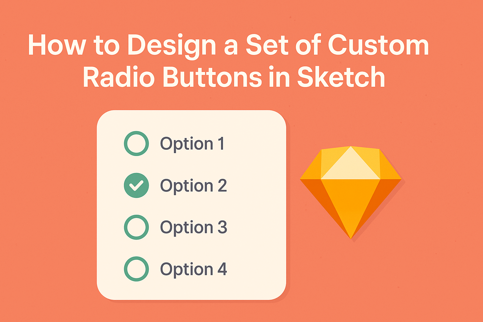
Designing a Custom Radio Button
Creating custom radio buttons in Sketch allows designers to enhance user interfaces with unique style and functionality.
By following specific steps, one can effectively set up the artboard, shape the buttons, apply colors, and add text and icons to complete the design.
Setting Up Your Artboard
To start, users should set up a new artboard in Sketch. Choosing an appropriate size is crucial; a common size for radio buttons could be 40×40 pixels. This size provides enough space for visuals and interaction while being compact.
Select the Artboard tool and draw the desired dimensions. It’s helpful to name the artboard for easy navigation, especially within projects that include multiple designs.
Consider using a grid or guide to keep elements aligned.
Make sure to set the background to a neutral color. This will help the radio buttons stand out during the design process. Additionally, adding a few reference elements around can offer context as the design evolves.
Creating the Base Shape
Designing the base shape of the radio button is next. A simple circle often serves as the foundation. Use the Oval tool and hold the Shift key to create a perfect circle.
To adjust the size, keep it within the dimensions set earlier. A standard radius might be around 15-20 pixels for clarity. Position it centrally on the artboard for balance.
Once the shape is created, the stroke and fill colors need adjustments. A solid fill color can differentiate the button when selected, while a lighter hue can represent the unselected state.
It’s vital to ensure smooth edges for a polished look, so consider using a corner radius that matches the overall design language.
Applying Styles and Colors
Next, it’s time to apply styles and colors to the radio button.
Choosing a color palette that aligns with the overall UI design is essential. Bright colors can draw attention, while muted tones can provide a subtle look.
To apply a fill color, select the button shape and access the Inspector panel on the right. Users can pick a color or gradient that fits their theme.
Don’t forget to set the stroke weight; a thicker outline can improve visibility.
Adding shadows or highlights can elevate the button’s appearance. Utilize Sketch’s styling options to add a subtle shadow effect. This will help the button stand out, creating a more interactive feel for users.
Adding Text and Icons
The final step involves adding text or icons to the radio button. While traditional radio buttons may not have labels inside, adding them can enhance usability.
Use the Text tool to create a label next to the radio button.
Make sure the font is legible and matches the overall design style. A size of around 14-16 pixels is typically appropriate. Position the label close to the button for clarity without crowding.
If desired, small icons can be included for better visual communication. Icons should represent the action of the radio button clearly.
Ensure they are sized correctly and maintain proportionality to the circle. This helps in achieving a cohesive look that enhances user interaction potential.
Optimizing Your Workflow
To enhance efficiency in designing custom radio buttons in Sketch, using symbols and shared styles is essential. These techniques not only streamline the process but also ensure consistency across designs.
Using Symbols for Reusability
Creating symbols in Sketch allows designers to reuse elements easily. When a radio button is built as a symbol, any change made to the symbol updates all instances across the project.
This saves time and helps maintain design consistency.
To create a symbol, select the radio button design, right-click, and choose Create Symbol. Designers can name the symbol to organize it better.
Using symbols also enables quicker adjustments, as one edit reflects throughout every instance of the button.
Additionally, designers can create variations by duplicating the main symbol and adjusting the style or state. This flexibility makes it simple to manage different designs without starting from scratch every time.
Leveraging Shared Styles
Shared styles in Sketch provide a way to maintain consistent text and layer styles. By setting up shared styles for colors, text, and effects, designers ensure uniformity across all radio buttons in their project.
To set a shared style, select the text or shape, then click the Style dropdown in the right panel.
Designers can create a new shared style from here for easy access later.
This approach allows quick updates. Changing a shared style automatically updates every button using that style, simplifying the design process. It’s especially useful in larger projects where consistency is key.
Utilizing both symbols and shared styles in the design workflow promotes efficiency and helps create a polished final product.
Exporting Your Design
When designing custom radio buttons in Sketch, exporting the design correctly is crucial. This ensures that developers can use the assets effectively while maintaining the intended look and feel.
Two important steps include slicing for different resolutions and exporting assets for developers.
Slicing for Different Resolutions
Slicing is essential for creating usable assets at various screen sizes.
Designers should consider exporting assets in multiple resolutions to accommodate different devices. Common resolutions to include are:
- 1x – Standard resolution for most displays.
- 2x – For high-resolution devices like Retina screens.
- 3x – For ultra-high-definition displays.
To slice in Sketch, select the radio button layers, and use the export options to define the scales needed.
This practice helps maintain quality on all devices, ensuring that the design appears sharp and clear.
Exporting Assets for Developers
After slicing, the next step is to export the assets in the right formats.
Designers can choose formats like PNG, SVG, or PDF based on the project’s needs.
PNG is great for images with transparency, while SVG is perfect for vector-based designs.
It’s helpful to organize assets into folders so developers can easily find what they need.
Label files clearly, such as “radio-button-1x.png” or “radio-button.svg,” to avoid confusion.
By doing this, the handoff process becomes smoother, allowing developers to implement the design seamlessly.