Creating a custom pricing card for a SaaS website is an essential part of converting visitors into customers. A well-designed pricing card not only highlights the value of the product but also guides users to make informed decisions.
By using Sketch, designers can craft unique and engaging cards that stand out and effectively communicate pricing options.
In this post, readers will discover practical tips and techniques for designing eye-catching pricing cards that align with their brand’s identity. With a focus on clarity and usability, they will learn how to incorporate essential elements like features, benefits, and support into their design.
This guide aims to empower designers with the tools they need to create impactful pricing cards that resonate with potential clients.
Understanding Pricing Card Design
Designing effective pricing cards is crucial for enhancing user experience and engagement. The right combination of visuals and structure can guide potential customers toward making a decision.
Careful attention to layout, color, and messaging can significantly improve how users perceive value.
The Role of Pricing Cards in User Experience
Pricing cards serve as a key interface element that helps users quickly understand the offerings. They present information in a neat, digestible format. When well-designed, pricing cards reduce confusion and highlight differences between plans.
Successful pricing cards simplify the decision-making process. Users can easily scan through them and find the details they need to make informed choices. A clear layout enhances satisfaction, which encourages users to explore options rather than feel overwhelmed.
Best Practices for Visual Hierarchy
Visual hierarchy organizes elements on a pricing card to guide the customer’s eye. This helps to prioritize the most important features.
Effective use of size, color, and positioning can draw attention to specific plans or options.
For instance, the most expensive or premium plan might be larger or given a unique border. Smaller plans could be less prominent but still clearly visible. Including icons or bullet points can also enhance readability and highlight key features and benefits.
Color Theory and Branding
Color choices play a significant role in pricing card design. Colors can evoke emotions and influence perceptions of value.
Using consistent colors that align with brand identity fosters recognition and trust.
Bright colors may draw attention to important details, such as discounts or popular plans. Soft colors can create a calming effect, making users feel more comfortable.
Understanding color psychology can help in selecting hues that resonate with the target audience while reinforcing the overall brand message.
Setting Up Sketch for Your Project
Setting up Sketch properly can make designing a custom pricing card much smoother. It’s essential to create a new document and use the grid system to ensure everything is aligned and organized.
Creating a New Document
To start, the designer opens Sketch on their Mac. They should select “File” from the menu and then click “New Document”. This creates a blank canvas ready for design.
Once the document is open, the designer can set the dimensions suitable for the pricing card. Common sizes include 400 pixels wide by 600 pixels high. It’s important to ensure that the artboard matches the intended display size for a website.
The designer can also name the document clearly, which helps keep projects organized later. Using a descriptive name will make it easier to find when needed.
Utilizing Sketch’s Grid System
Using Sketch’s grid system enhances the overall design accuracy.
First, the designer should enable the grid by going to the “View” menu. From there, they select “Canvas” and activate “Show Grid”.
Next, setting the grid size is key. Typically, a grid with 8-pixel increments works well for spacing and alignment.
Designers can adjust these settings in the “Preferences” under the “Grid” tab.
With the grid visible, it becomes easier to position elements such as buttons and text boxes. This not only helps with consistency but also ensures a professional appearance for the pricing card.
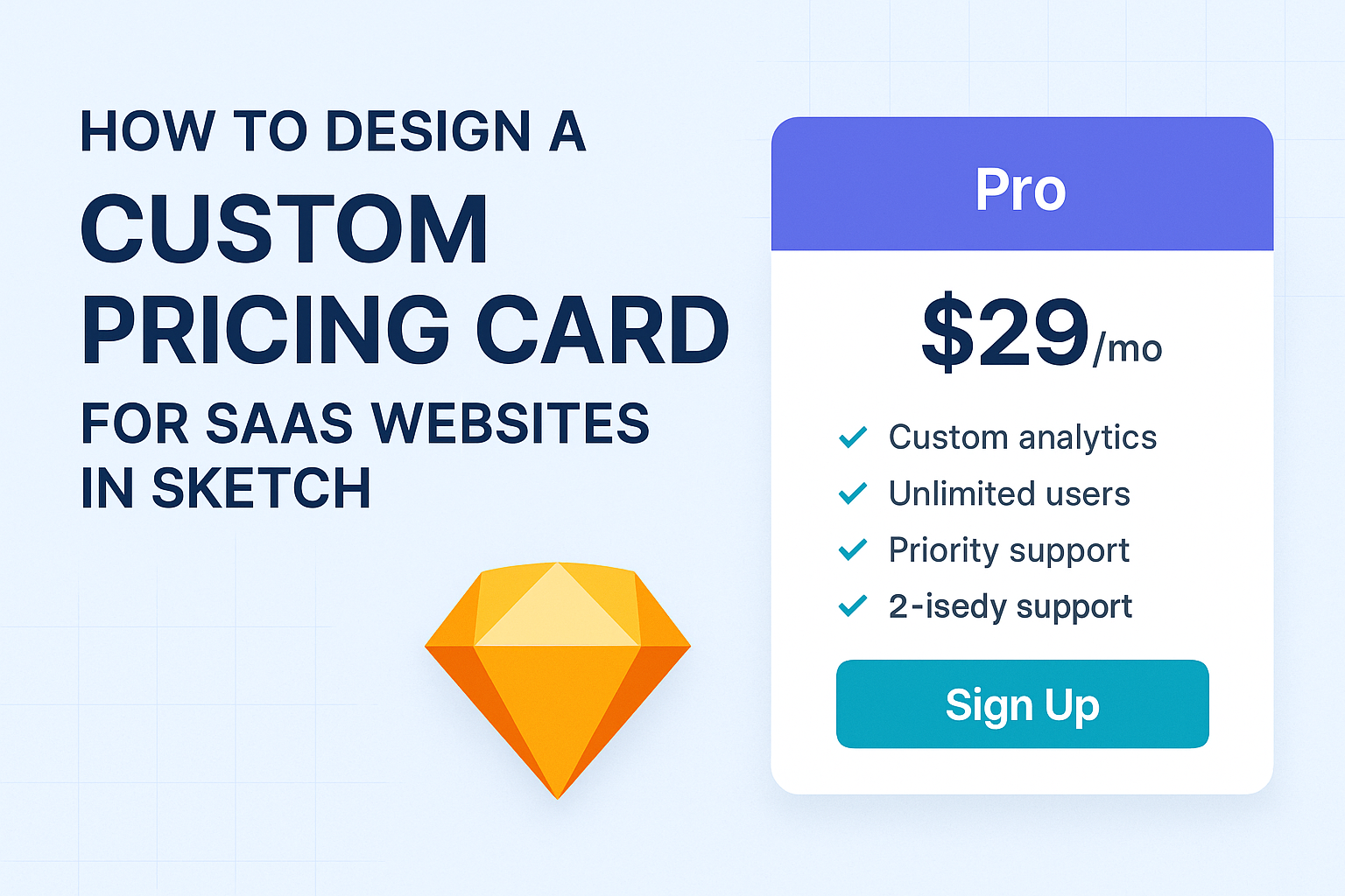
Designing the Pricing Card
Creating a custom pricing card effectively communicates value to potential customers. Key aspects include layout, typography, and interactive features.
Layout and Composition
The layout of a pricing card is crucial for clarity and user engagement. A clean design helps highlight the most important information, like pricing and features.
- Grid System: Use a grid to align elements neatly. This helps ensure visual balance.
- Hierarchy: Prioritize information by size and placement. The most important details, such as the price, should stand out prominently.
- White Space: Incorporate ample white space to prevent clutter. This makes it easier for users to focus on the content without feeling overwhelmed.
Consider a three-column layout, where each column represents a different pricing tier. This allows users to compare options easily.
Typography and Readability
Choosing the right typography is key for readability. The text should be simple and clear, allowing users to understand the details at a glance.
- Font Selection: Select a legible sans-serif font for modern appeal. Use fonts like Arial or Helvetica for their clarity.
- Font Size: Ensure that the pricing lies in a larger size, around 24-30 points. Other details should be smaller, around 16-18 points.
- Contrast: Use high-contrast colors for text and background. Dark text on a light background or vice versa enhances readability.
Using bold or larger fonts for pricing can draw attention. Limit the number of different fonts to maintain consistency across the card.
Adding Interactive Elements
Interactive elements can significantly enhance user experience. These features encourage potential buyers to engage more with the pricing card.
- Hover Effects: Add subtle hover effects that highlight a card when a user moves their mouse over it. This invites interaction and draws attention to options.
- Call-to-Action Buttons: Place clear, standout buttons like “Get Started” or “Learn More.” These should be prominent and easy to find.
- Dynamic Features: Consider using sliders or toggles for annual versus monthly billing. This allows users to see the pricing differences quickly.
Incorporating these elements makes the card not just informative but engaging too. Aim for a balance of usability and aesthetics to cater to users’ needs.
Exporting and Integration
When designing a custom pricing card for SaaS websites in Sketch, exporting assets and integrating them into the website is crucial. Proper preparation and ensuring responsiveness will help create a seamless experience for users.
Preparing Assets for Web
To prepare assets for the web, it’s essential to export images and components in the correct formats.
Common formats include PNG, JPEG, or SVG. Each format has its strengths, with SVG being ideal for logos and icons due to its scalability.
In Sketch, designers can select the layers to export. They should use the Export panel to set the appropriate resolutions, such as 1x, 2x, or 3x for high-density displays.
It’s also helpful to organize assets in folders according to elements like buttons, backgrounds, and icons. This organization aids in easier access during the integration phase.
Ensuring Responsiveness
Responsiveness is key for modern web design.
A pricing card should look good on various devices, including smartphones and tablets.
Using responsive design techniques ensures that the layout adapts seamlessly to different screen sizes.
Developers can implement flexbox or grid layouts in CSS to manage the card’s structure.
Additionally, setting media queries allows for specific styles on different devices.
For instance, adjusting font sizes and spacing based on screen width can enhance usability.
Testing the design on multiple devices ensures that users have a consistent experience regardless of how they access the site.