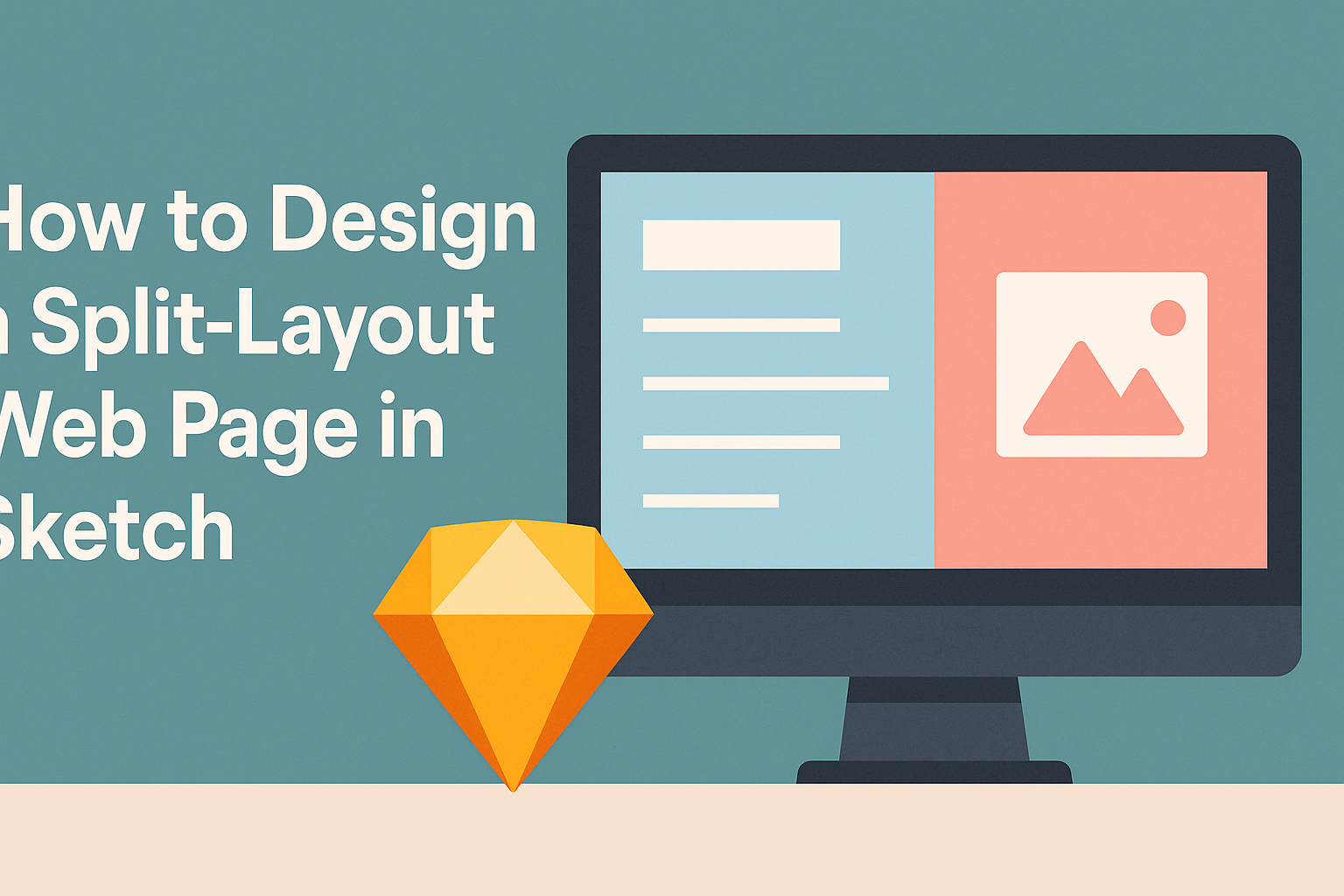
Creating a split-layout web page in Sketch offers a fresh and engaging way to present content. This approach allows designers to juxtapose images and text effectively, making a website visually appealing.
To design a successful split-layout web page in Sketch, one must focus on balancing elements while ensuring that navigation remains intuitive.
As a popular design tool, Sketch provides various features that simplify the process of crafting split-screen layouts. Users can take advantage of its artboard functionalities and grid settings to ensure that each section is aligned and proportionate.
This design technique not only attracts attention but also enhances user experience by guiding visitors seamlessly through the content.
Incorporating a split layout can elevate any web design project. Understanding how to manipulate Sketch’s powerful tools allows designers to create dynamic layouts that stand out.
By following the right steps, anyone can master this style and significantly improve their web design skills.
Getting Started with Sketch
Before diving into design, it’s essential to get familiar with the Sketch interface, set up a document, and understand the vector tools that will aid in the design process.
This foundation will make the design experience smoother and more efficient.
Overview of Sketch Interface
When launching Sketch, users will notice a clean and straightforward interface. The main areas include the toolbar at the top, the inspector panel on the right, and the layer list on the left. Each of these elements plays a crucial role in the design process.
He or she can create artboards directly from the toolbar. The inspector is where adjustments to shapes, colors, and effects happen. Layers help keep elements organized, which is vital for any design project.
Setting Up Your Document
To start, users can create a new document by selecting “File” and then “New.” Sketch allows you to choose different artboard sizes, which is useful for responsive designs.
After selecting an artboard, naming it properly aids in organization.
Next, he or she can customize grid settings by going to “View” and selecting “Canvas” followed by “Layout Settings.” Grids are helpful for aligning elements consistently. This setup ensures a solid base for any split-layout design.
Understanding Vector Tools
Sketch is known for its vector editing capabilities. The vector tools enable users to create scalable graphics easily.
He or she can access tools like the Rectangle, Oval, and Polygon shapes directly from the toolbar.
To manipulate shapes, selection tools allow for easy resizing and adjusting. The Vector tool provides more control, allowing users to edit points and curves precisely. This feature helps in creating complex designs efficiently.
Mastering these tools is key to building stylish split-layout web pages.
Designing Your Split-Layout
Creating a split-layout web page involves careful planning and attention to detail. The structure, grids, and responsiveness all play an important role in how users interact with the design. Here are key aspects to consider for a successful layout.
Defining Your Layout Structure
A clear structure sets the foundation for a split-layout design. He or she should start by deciding how many sections are needed. Common choices include a two-pane design or more segmented options.
Elements should be placed thoughtfully. For instance, the left side might showcase text while the right side displays images. This creates a visual balance.
Using a consistent style for headings and body text improves clarity. He or she should also ensure there’s enough white space between elements. This helps prevent clutter and guides the user’s eye.
Working with Grids and Guides
Grids are essential for maintaining alignment in design. He or she can use a grid system to divide the canvas into equal sections. This helps in organizing content systematically.
Setting up guides in Sketch can aid in placing elements accurately. Using columns allows for flexibility in positioning text and images side by side.
A common grid system is the 12-column layout. This allows designers to create responsive designs easily. They can decide how many columns each section occupies based on its importance.
Responsive Design Considerations
Responsive design ensures the layout adjusts for different screen sizes. He or she should use flexible widths for columns to maintain structure. Media queries can help adapt content based on the user’s device.
To enhance user experience, it’s wise to test designs on various devices. Elements should stack vertically on smaller screens for better readability.
He or she should also consider touch targets for interactive elements. Buttons and links need to be easy to tap, especially on mobile devices, ensuring accessibility for all users.
Adding Content and Styling
When designing a split-layout web page, adding content and styling is essential for creating an inviting and organized look. Key elements include typography, color schemes, and images that work together to enhance the user experience.
Incorporating Typography
Typography plays a critical role in web design. It sets the tone and makes text readable. In a split-layout, using contrasting fonts can add visual interest.
- Headings: Large and bold fonts grab attention. Choose styles that reflect the site’s theme.
- Body Text: Use simple, clean fonts for readability. Stick to font sizes between 14–16 pixels to ensure comfort.
- Hierarchy: Create a clear hierarchy with different sizes and weights for headings and subheadings. This helps guide users through the content.
Experimenting with line spacing and letter spacing can also enhance aesthetics and readability.
Using Colors and Gradients
Colors are powerful tools in design. They evoke feelings and influence user actions. For a split layout, consider the following guidelines:
- Color Palette: Choose a palette with two or three main colors. Use lighter shades for backgrounds and darker ones for text.
- Gradients: Subtle gradients can add depth. Use them in backgrounds or buttons to draw attention.
- Contrast: Ensure high contrast between text and background for easy reading. Tools like the WebAIM Contrast Checker can help.
Remember to maintain consistency with color choices across the site. This builds a cohesive look.
Importing and Editing Images
Images can elevate a split-layout web page. They provide visual breaks and attract user focus.
Here’s how to effectively use images:
- Image Quality: Always opt for high-resolution images. They should be relevant to the content and fit well within the layout.
- Editing Tools: Use tools like Sketch’s image filling options to easily adjust the size and cropping of images. This ensures they fit perfectly within the split layout.
- Alt Text: Don’t forget to add alt text for accessibility. This helps screen readers interpret images and improves SEO.