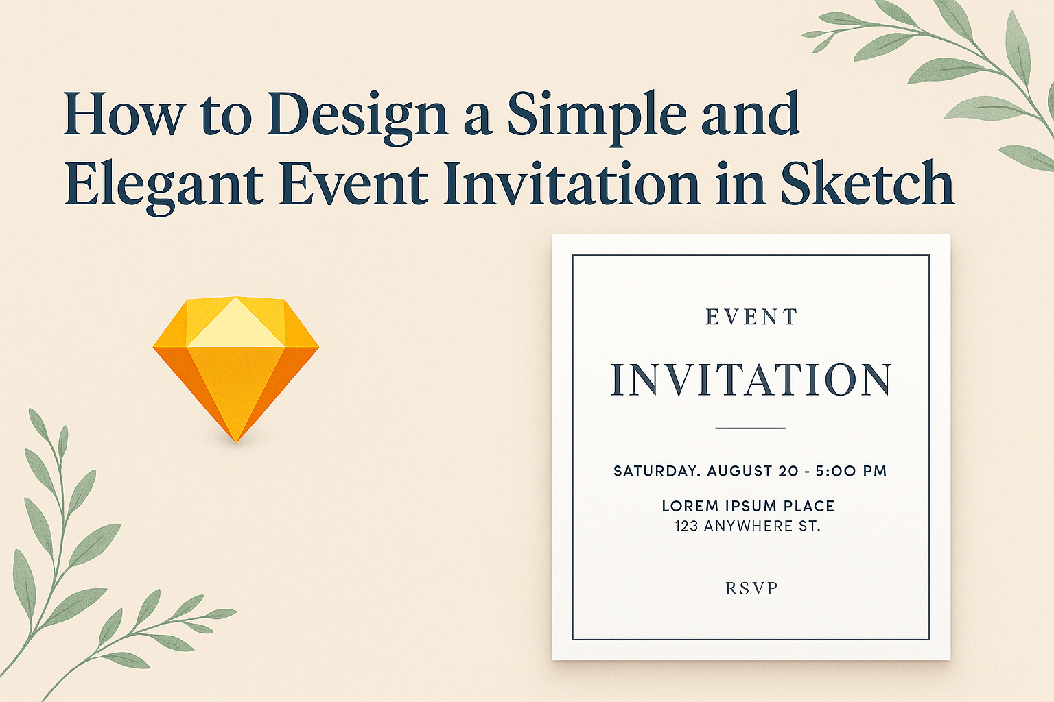
Creating an invitation can be a fun and rewarding process. Designing a simple and elegant event invitation in Sketch allows individuals to express their unique style while keeping the design straightforward and impactful.
Whether it’s for a wedding, birthday, or any special occasion, a well-crafted invitation sets the tone for the event.
Many people look for ways to capture their event’s essence without overwhelming their guests with too much information.
Using clean lines, classic fonts, and a balanced layout can make all the difference.
With the right techniques, anyone can create an invitation that is both beautiful and effective.
This blog post will guide readers through the essential steps to design an invitation that is not only visually appealing but also easy to create. By the end, they will feel confident in their ability to produce an invitation that reflects their personality and event style.
Getting Started with Sketch
Sketch is a powerful tool for designing event invitations. To get started, users need to download and install the app, understand its layout, and set up their documents properly.
Downloading and Installing Sketch
To begin using Sketch, the user must first download the application. Visit the official Sketch website to access the download link.
Sketch is available for macOS only, so those using Windows must consider alternatives.
After downloading, open the installer and follow the prompts to complete the installation. Once installed, the user can launch Sketch and take advantage of a 30-day free trial.
This trial allows exploration of all features, making it easier to know if Sketch fits the user’s design needs.
Understanding the Sketch Interface
The interface of Sketch is designed to be user-friendly. Users will notice a layout with tools on the top and right side, making access easy.
The toolbar includes essential tools like shapes, text, and symbols. On the left side is the layers panel, allowing users to manage different elements of their design.
At the bottom, there’s an option for artboards, which helps organize the invitation design. Familiarity with these areas will improve efficiency when creating designs.
Setting up Your Document
Setting up a document correctly is crucial for a polished invitation. Users should start by creating a new document.
In Sketch, select File > New from the top menu.
Next, it’s important to choose the right artboard size, which should align with the invitation type.
For a standard invitation, sizes like 5×7 inches or A5 are popular. Adjust the dimensions accordingly in the right panel.
Finally, users should consider setting grid and guide features to maintain alignment throughout the design process. This attention to detail can help create an elegant final product.
Designing Your Invitation
Creating an elegant event invitation requires careful attention to several design elements. By focusing on theme, color, typography, and graphics, one can achieve a polished look that captures the essence of the event.
Choosing a Theme and Color Scheme
Selecting a theme is the first step in designing an invitation. The theme should reflect the occasion, whether it’s a wedding, birthday, or corporate event.
For instance, a garden party might inspire floral patterns and soft colors, while a formal gala may call for bold tones and minimalist designs.
The color scheme can greatly enhance the theme. A harmonious palette helps create a visual connection between elements.
It’s essential to choose colors that complement each other. Tools like Adobe Color or Coolors can help visualize combinations. Sticking to two to three main colors keeps the design clean and appealing.
Working with Text and Typography
The choice of fonts can set the mood for the entire invitation. For formal events, elegant serif fonts work well. For casual gatherings, playful sans-serif fonts are a great option.
It’s important to ensure that the text is legible, so selecting clear typefaces is crucial.
In addition to choosing fonts, establish a hierarchy with text size and weight. The event name should stand out, while details can be smaller. Using different weights, like bold for names and regular for details, can enhance readability. Aligning text properly also supports a balanced design.
Adding Graphics and Logos
Incorporating graphics can elevate an invitation’s visual appeal. Simple illustrations, patterns, or icons related to the event theme can make the design unique.
For instance, a wedding invitation might feature floral graphics, while a corporate event could have a logo.
When using graphics, balance is key. Avoid overcrowding the invitation with too many images. It’s best to let the text breathe.
Also, consider the placement of logos; they should be positioned where they complement the overall design without overwhelming it. Using a transparent background for logos can give a sleek, modern look.
Finalizing Your Invitation
After creating the design, it’s time to make the final touches. This includes arranging the elements on the canvas to ensure a balanced look and exporting the design in the right format for printing or sharing. Attention to detail at this stage is crucial for a polished outcome.
Arranging Elements on the Canvas
When arranging elements on the canvas, balance is key. Begin by placing the most important information, like the event title and date, in prominent positions. This draws the reader’s eye first.
Next, consider the spacing between text and images. Use consistent margins to create a clean look. Align text and graphics to avoid clutter. Grids can be helpful for this.
In addition, choose fonts that complement each other. Limit the number of different fonts to two or three. This maintains readability and style.
Lastly, review the overall design from a distance to see how everything works together. A cohesive look enhances the invitation’s elegance.
Exporting Your Design
Once satisfied with the arrangement, it’s time to export the design. Begin by choosing the correct file format.
For digital invitations, PNG or JPEG is often ideal. For print invitations, consider PDF for higher quality.
Before exporting, double-check all text and details. Any last-minute typos could detract from the invitation’s professionalism.
Set the resolution to at least 300 DPI for print. This ensures clarity. Lastly, save a copy of your original design file so you can come back to make changes if needed.
Exporting the invitation correctly will ensure it looks great, whether printed or sent online.
Tips for Elegant Design
Creating an elegant invitation involves thoughtful design choices that enhance visual appeal. Key elements include using white space effectively, selecting fonts wisely, and ensuring a balanced visual hierarchy.
Incorporating White Space
White space, or negative space, is crucial in design. It gives elements room to breathe and enhances overall elegance.
When designing an invitation, he should aim for balanced spacing around text and images. Avoid cluttering the layout with too much information or imagery. This helps the important details stand out.
Using white space effectively can lead to a more inviting and sophisticated look. Large margins or gaps between sections allow the reader to focus on each part of the invitation without feeling overwhelmed.
Selecting Appropriate Fonts
Fonts play a significant role in setting the tone of the invitation. For elegant designs, choosing fonts that reflect sophistication is essential.
A combination of a decorative font for headings and a clean sans-serif or serif font for body text often works well. It adds visual interest while maintaining readability.
He should also ensure that font sizes are appropriate. Headings should be larger and bolder to grab attention, while body text should remain legible. Sticking to two or three complementary fonts can create a cohesive look.
Balancing Visual Hierarchy
Visual hierarchy guides the viewer’s eye through the invitation.
Establishing a clear order of information is key to effective design.
He should use font sizes, colors, and spacing to create a hierarchy.
Important details, like the event’s name and date, should stand out.
Lesser details can be in smaller fonts or subdued colors.
Color can also enhance hierarchy.
Using contrasting colors can make critical information pop while softer colors create a background effect.
Properly balancing these elements ensures the invitation is not only beautiful but also functional.