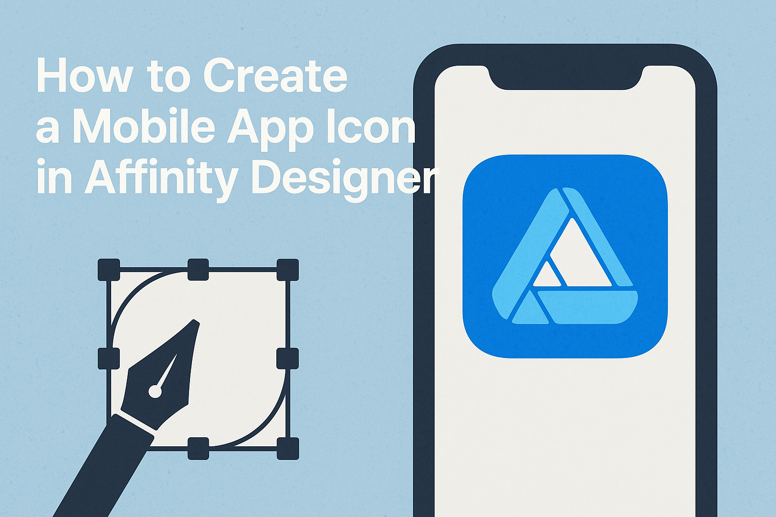
Creating a mobile app icon can be exciting and rewarding.
With Affinity Designer, anyone can design a professional-looking icon that captures the essence of their app.
This guide will walk through the steps to create a stunning icon that stands out in app stores.
Users often find designing an icon challenging, but it doesn’t have to be difficult.
By using simple shapes and effective color strategies, he or she can develop an eye-catching design.
This article will provide tips and tricks to make the process smoother and more enjoyable.
Whether for a personal project or a professional application, having a striking app icon matters. It is the first thing potential users notice, making it crucial to get it right.
Readers will discover how to create an icon that not only looks good but also communicates their app’s purpose effectively.
Getting Started with Affinity Designer
To create a mobile app icon, it’s important to begin with a solid understanding of the Affinity Designer workspace and how to set up a new document effectively.
This knowledge will provide a strong foundation for designing an appealing icon.
Understanding the Workspace
Affinity Designer offers a user-friendly workspace that includes several panels and tools.
Users will notice the Toolbar on the left, which contains essential tools for drawing and editing. The Layers Panel on the right helps manage all design elements, allowing users to organize and group items easily.
The Color Panel allows for quick adjustments of fills and strokes. A major feature is the Artboard Tool, which helps create different design layouts.
Understanding how to navigate these essentials will enable them to start designing with confidence.
Setting Up Your Document
Setting up a new document in Affinity Designer is simple. To begin, go to File > New. A dialogue box will appear where users can choose their document size.
For mobile app icons, a common size is 1024×1024 pixels.
Select a Transparent background to make it easy to visualize the icon’s shape. Once users confirm the settings, they can start their design.
It’s beneficial to create multiple artboards for different variations of the icon, allowing quick comparisons.
Having a clean setup streamlines the creative process and helps in achieving a polished final product.
Design Principles for Icons
Creating an effective mobile app icon requires careful attention to specific design principles. These principles focus on making the icon recognizable, functional, and visually appealing across various platforms.
Simplicity is Key
A simple design stands out and ensures clarity. An effective icon should avoid clutter, including too many details or excessive text.
Instead, it should capture the essence of the app with minimal elements. For example, using bold shapes and limited color palettes helps in creating a clear visual that users can easily recognize.
Using white space effectively enhances simplicity by allowing the icon to breathe. Icons that are straightforward make a stronger impact and are often more memorable.
As users scroll through numerous apps, a clean and simple design can catch their eye instantly.
Consistency Across Platforms
Maintaining a consistent design across different platforms is crucial. Icons should reflect the app’s brand identity and values, regardless of whether they are viewed on iOS or Android.
This means using similar colors, shapes, and overall styles to create familiarity.
Consistency helps in building trust with users. When the icon looks and feels the same on different devices, it reinforces brand recognition.
Designers can also refer to platform guidelines to adjust the icon slightly while retaining the core design, ensuring it meets user expectations.
Design for Scalability
An icon needs to look great at various sizes. Apps are used on different devices, from smartphones to tablets, and the icon should remain clear and effective in any size.
Designers should create vector graphics in Affinity Designer, as this allows for scaling without losing quality.
Testing the icon in different sizes helps to pinpoint areas that may become unclear or lose detail.
Icons designed for scalability retain their visual appeal and functionality, which is essential for user engagement. Creating adaptable icons ensures that the design serves its purpose, no matter where it appears.
Creating Your Icon
Creating a mobile app icon in Affinity Designer involves several steps. This section breaks down the key techniques for drawing shapes, applying colors, and adding text or logos to complete the icon.
Drawing and Shaping Techniques
To start drawing an app icon, one can use the shape tools in Affinity Designer. These tools allow users to create basic shapes like circles, squares, and triangles.
He or she can combine shapes using the Pathfinder tool to achieve complex designs.
Using the Pen Tool is also effective for creating unique and custom shapes. It lets one draw freeform paths to match specific design needs. Adjusting anchor points is vital for perfecting curves and angles.
For icons, simplicity is key. Keeping designs minimal will make the icon easily recognizable. It is wise to avoid unnecessary details that may clutter the design.
Applying Color and Texture
Color plays a vital role in app icon design. Using bold and bright colors can make an icon stand out.
One fun approach is to create contrast by pairing light and dark shades effectively.
Affinity Designer offers various color palettes and gradients. Using gradients can add depth and dimension to the icon’s design.
Individuals should experiment with these options to find a color scheme that aligns with the app’s brand.
Texture can also enrich an icon. This can be added through patterns or by applying effects such as shadows and highlights. Textures enhance visual interest without overwhelming the viewer.
Adding Text and Logos
Adding text or logos to an app icon should be done carefully. The text must be legible even at smaller sizes. Using a bold and simple font can ensure easy readability.
When placing logos, it’s important to maintain balance within the design. The logo should complement the overall look without dominating it. Keeping logos in a single color can help maintain a cohesive design.
Lastly, testing the icon at different sizes will help determine how effective the text and logos are. Ensuring that components remain visible and clear on all devices is necessary for a successful app icon.
Exporting and Testing
When creating a mobile app icon, proper exporting and testing are crucial. This ensures that the icon looks great on all devices and meets platform guidelines.
Exporting Different Sizes and Formats
Affinity Designer allows for exporting icons in various sizes and formats. This is important since different app stores require specific dimensions.
For instance, iOS app icons typically need sizes ranging from 60×60 pixels up to 1024×1024 pixels.
Users can select the right export options by navigating to the Export Persona. After selecting the desired layers, they should choose File > Export. Formats like PNG and JPG are ideal for app icons.
PNG maintains transparency, while JPG is useful for non-transparent backgrounds.
Creating slices can simplify the process. Users can easily manage and export multiple icon sizes at once, avoiding repetitive tasks.
Previewing on Different Devices
Testing the app icon on various devices is essential for assessing its appearance.
Different screen sizes and resolutions can affect how the icon looks.
Users should test the icon on both high and low-resolution displays.
To preview icons, users can utilize tools like the Simulator for iOS or Android devices. This simulates how the icon appears in actual usage.
Additionally, exporting samples and viewing them on physical devices provides a better perspective.
It helps identify any necessary adjustments for clarity or visibility.
By checking the icon across devices, users can ensure a polished final product.