Creating a responsive web design mockup is an essential skill for any designer looking to build effective and user-friendly websites. With Affinity Designer, designers can easily create mockups that adjust seamlessly to various screen sizes. This software offers powerful tools to help visualize layouts, colors, and typography, ensuring that the design works well across devices.
As designers dive into the process, understanding how to utilize the constraints panel is key to effective mockup creation. By mastering this feature, they can save time and enhance their workflow.
With the right techniques, designers can turn their ideas into polished, responsive designs that impress clients and users alike.
This guide will provide step-by-step instructions on creating a responsive web design mockup in Affinity Designer, making the complex process manageable and enjoyable. Readers will discover tips and tricks that simplify the design process and lead to stunning results.
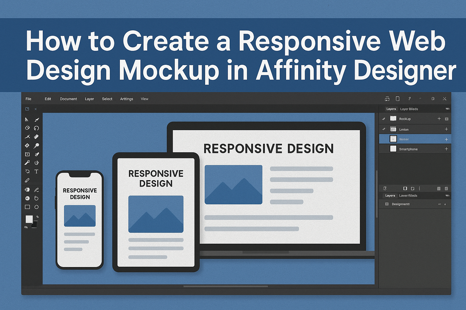
Getting Started with Affinity Designer
Affinity Designer is an intuitive design tool that allows users to create detailed mockups for web design. Understanding its interface and tools can help users start creating professional layouts quickly.
Understanding the Affinity Designer Interface
When first opening Affinity Designer, users will notice a layout similar to other design software. The main toolbar is located at the top, presenting commonly used tools.
On the left side, the toolbox contains essential functions, such as the selection and shape tools.
In the top-left corner, users will find personas. These are special modes that let users switch between vector design and pixel design. Each persona has its own tools and functions, making it easy to adjust the design style as needed.
Familiarity with these components is crucial for efficient workflow.
Setting Up Your Document
To create a new project, users should start by setting up their document correctly. Clicking on “File” then “New Document” opens a window where they can select dimensions.
Choosing responsive design sizes, such as 1920 x 1080 pixels, sets a solid foundation.
Users can also opt for specific artboard sizes for different devices. Remember to select DPI settings for screen use, typically set at 72 DPI. This ensures designs look sharp on digital displays.
Organizing layers early on will assist in managing elements throughout the design process.
Choosing the Right Tools for Mockup Creation
Affinity Designer provides a range of tools tailored for mockup creation. The Rectangle Tool is vital for creating layout frames, while the Text Tool helps input typography.
Users can access shape tools under the toolbox to easily draw buttons or other UI elements.
For adding images, the Place Image Tool allows users to insert graphics seamlessly. Additionally, the Effects Panel provides options to add shadows or glows.
For anyone creating web mockups, utilizing these tools effectively will lead to more polished and professional designs.
Designing Responsive Layouts
Creating a responsive web design mockup requires an understanding of how layouts adapt to different screen sizes and devices. Focusing on core principles and techniques will help in achieving a user-friendly design.
Fundamentals of Responsive Design
Responsive design is based on fluid grids, flexible images, and CSS media queries. Fluid grids allow elements to resize proportionally, ensuring a consistent look across various devices.
Developers should use percentage-based widths rather than fixed pixel sizes to achieve this flexibility.
Images must also be flexible. Setting a maximum width of 100% allows images to resize within their containing elements.
CSS media queries are essential for applying different styles based on screen size. For example, a stylesheet might alter font size, spacing, or layout when the viewport width changes.
Working with Adaptive Layouts
Adaptive layouts offer a different approach by creating distinct layouts for specific devices. This method is beneficial when targeting specific screen resolutions.
Designers can create a set of layouts, for instance, one for smartphones, one for tablets, and one for desktops.
With adaptive layouts, elements change size or rearrange based on device specifications. This can involve hiding certain elements on smaller screens or adjusting navigation menus to fit limited space.
Planning layouts ahead of time ensures a smooth user experience, making navigation easy on any device.
Utilizing Constraints for Flexibility
Using constraints in Affinity Designer helps create flexible and responsive components. Constraints can be set to maintain an aspect ratio or align elements relative to their parent containers. This ensures that as the design scales, elements remain proportionate and in place.
Incorporating constraints involves dragging elements to set their position and size relative to surrounding components.
Designers can specify which edges should stay fixed or stretch. Appropriately using constraints helps maintain visual harmony, improving usability and aesthetics.
By planning the layout with constraints from the start, designers can save time during the overall design process.
Adding Interactivity to Your Mockup
Interactivity enhances mockups by showing how users will engage with a design. By incorporating elements like hover states and animated transitions, designers can create a more dynamic and realistic experience.
Creating Hover States
Hover states provide feedback when users move their cursor over an element. To create this effect in Affinity Designer, a designer can start by selecting the target element and duplicating it.
Next, they can change the appearance of the duplicate, such as altering its color or adding a shadow. This visual change will signal to users that the element is interactive.
Using layers helps manage these states easily. Designers can group the original and hover states, allowing quick access and edits. This technique not only enhances user experience but also makes the design visually engaging.
Animating Transitions
Animating transitions can bring a mockup to life. Designers can include movements like fading, sliding, or scaling elements.
This is often done by using the timeline feature in Affinity Designer.
To animate, they should select an object and set keyframes to define its starting and ending positions. For example, an image can slide in from the left as it enters the screen.
By adjusting the duration and easing, the animation can feel natural and smooth. These small details help create a more immersive experience for users, attracting them to the website or app design.