Creating readable and engaging presentations is essential in today’s fast-paced world. When inserting and styling text boxes properly, presenters can enhance clarity and capture their audience’s attention effectively.
Learning these skills can make a significant difference in how information is conveyed.
Text boxes offer a unique way to display content, making it easier for viewers to process information.
By adjusting size, font, and color, anyone can transform basic text into a dynamic visual element that complements their message. This approach turns ordinary slides into eye-catching tools for communication.
Whether it’s for school, work, or personal projects, mastering text boxes can elevate any presentation.
Readers will discover straightforward steps to insert and style text boxes, making their slides not just informative but also visually appealing.
This guide provides valuable tips that can lead to more successful presentations.
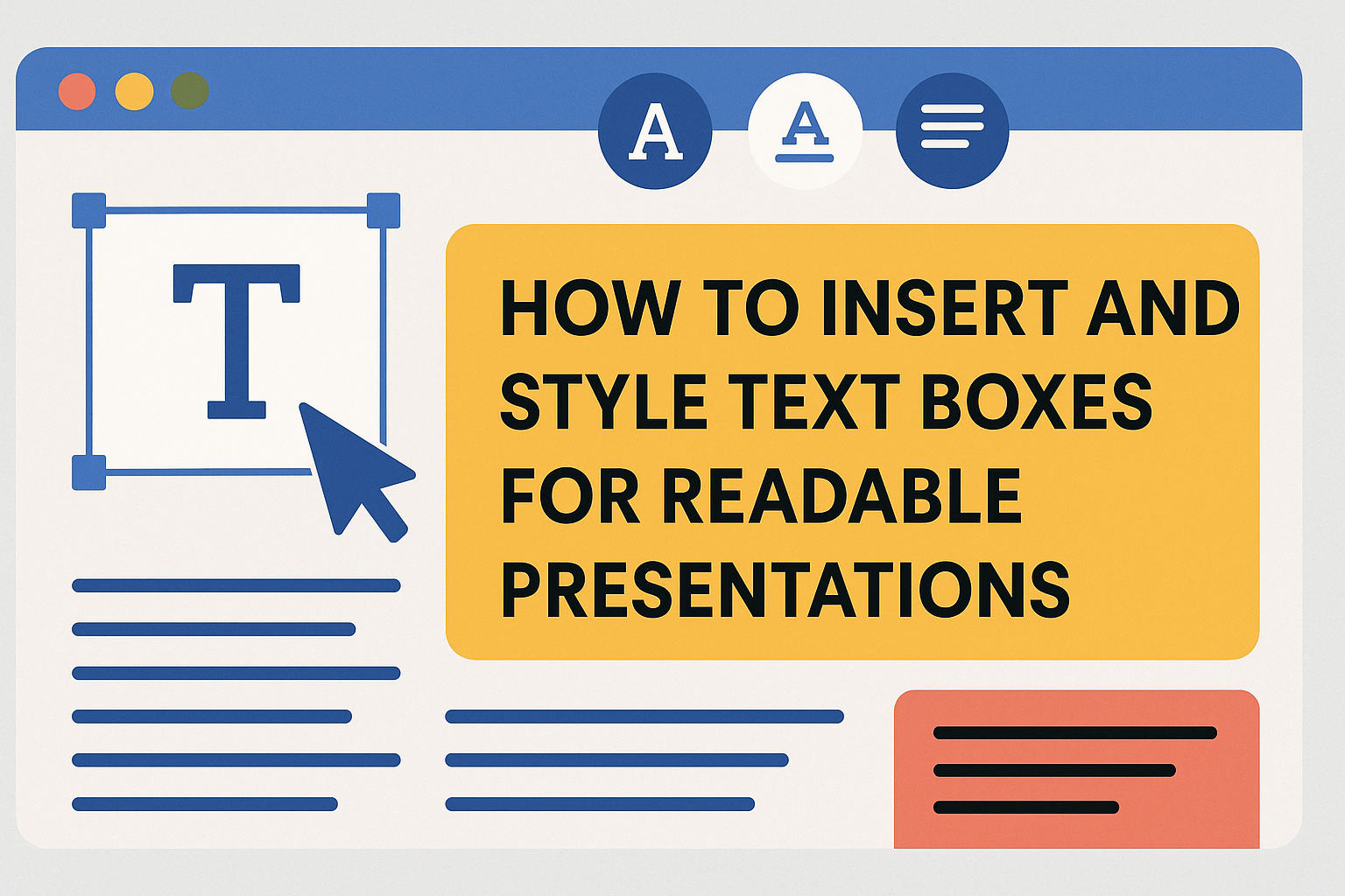
Understanding Text Boxes in Presentations
Text boxes are important tools in presentations. They allow users to add and arrange text on slides easily. This enhances the clarity and appeal of the information shared.
Inserting a Text Box:
- Open the desired slide in PowerPoint.
- Go to the Insert tab.
- Click on the Text Box button and draw it on the slide.
Text boxes can hold any text, such as headings, bullet points, or descriptions. They can be resized or moved to fit the design.
Formatting Options:
Users can change the look of text boxes with various formatting tools. Here are a few options:
- Font Size: Change the size for emphasis.
- Text Color: Use colors to make text stand out.
- Borders and Backgrounds: Add these for better visibility.
Using text boxes effectively can help communicate messages clearly. They also help break up crowded slides. This makes presentations more readable and engaging.
Text boxes enable users to keep their slides organized. With the right use, they can make a lasting impression on the audience.
Choosing the Right Tool for Text Box Insertion
When creating presentations, choosing the right tool for inserting text boxes is essential. Each program has unique features that can enhance the presentation’s readability and style.
PowerPoint
In PowerPoint, users can insert text boxes easily. They should go to the Insert tab and click on Text Box. This allows them to click anywhere on the slide to draw the desired text box size.
PowerPoint offers tools to format text boxes. Users can adjust the fill color, outline, and shadow effects. This flexibility helps make the text stand out against the background.
For more visual appeal, users can add animations to text boxes. This can be done by selecting the text box and choosing Animations from the top menu. This feature can help retain the audience’s attention during the presentation.
Google Slides
In Google Slides, inserting text boxes is straightforward. Users can find the Text box icon on the toolbar or select Insert > Text Box from the menu. This allows them to click and drag on the slide.
Formatting options in Google Slides are user-friendly. Users can adjust font styles, sizes, and colors easily. They can also align the text within the text box for better visibility.
Additionally, Google Slides supports collaboration. Users can share the presentation with others, allowing for real-time editing of text boxes. This feature is great for group projects or teamwork.
Keynote
Keynote provides a simple way to add text boxes. Users can click on Text in the toolbar or go to Insert > Text Box. This creates a text box that can be moved around the slide easily.
Keynote offers various styling options. Users can choose from different fonts, sizes, and colors. They can also apply effects like drop shadows and outlines to enhance the text box.
Keynote also includes features for organizing text boxes. Users can align text boxes with guides, ensuring a clean look. This attention to detail can significantly improve the overall presentation quality.
Inserting a Text Box
Inserting a text box into a PowerPoint presentation allows for clear and effective communication. There are two main methods: using default text boxes and adding custom text boxes. Each method caters to different needs and preferences.
Using Default Text Boxes
To start with the default text boxes, users should open the desired PowerPoint slide. They can find the “Insert” tab at the top of the screen and click on it. From there, they should look for the “Text Box” button in the “Text” group.
After clicking the “Text Box” option, the cursor will change to a downward-pointing arrow. Users can then click and drag on the slide to create the text box. Once the box is created, they can start typing their text directly.
This method is quick and effective for adding standard text. Additional formatting can be applied later to suit the slide’s design.
Adding Custom Text Boxes
For those who want more flexibility, adding custom text boxes is a great option. Start by navigating to the “Insert” tab. Again, click on the “Text Box” option to initiate the process.
Users can draw the text box in any size or shape that fits their needs. This offers more control over design elements.
After creating the text box, text can be added and formatted further. For example, colors and fonts can be adjusted to enhance readability. Custom text boxes allow creativity while ensuring the information stands out.
Styling Your Text Boxes for Maximum Impact
To create impactful text boxes, one must focus on several key elements: font choices, color contrasts, border styles, and alignment. Each of these aspects plays a vital role in enhancing readability and viewer engagement.
Choosing Fonts and Sizes
Selecting the right fonts is crucial. Sans-serif fonts like Arial and Helvetica are often preferred for their clarity. They are easy to read on screens, especially from a distance.
When it comes to sizes, titles should be larger than body text. A good rule of thumb is to use at least 24-point size for headings and 18-point for the main text. This size difference helps guide the viewer’s eye across the slide.
Avoid using too many font types. Sticking to two or three complements the overall design without overwhelming the audience. Consistency in font usage keeps the presentation looking professional.
Color Schemes and Contrasts
Using appropriate color schemes enhances visual appeal. A balanced mix of light and dark colors is effective. Light backgrounds with dark text or vice versa improve readability.
It’s vital to ensure strong contrasts between text and background. For example, dark blue text on a light yellow background is easier to read. Tools like color contrast checkers can help determine whether the contrast meets accessibility standards.
Using color strategically can highlight important information. For example, a different color can be used for key points or quotes. This method draws attention without distracting the audience.
Borders and Fills
Borders can help define text boxes and create visual interest. Simple lines or subtle shadows add depth without becoming too flashy. This makes the text boxes stand out while keeping the focus on the content.
Filling the text boxes with subtle colors can also enhance aesthetics. Light colors can create a soft background that complements the text. Alternatively, slightly darker fills can make the text pop.
It is important to avoid overly bright fills or borders that clash with the text. A consistent style throughout the presentation helps maintain professionalism and cohesion.
Alignment and Spacing
Proper alignment can improve clarity. Left-aligning text is generally preferred, as it creates a predictable reading path. Centering can be used for titles, but it may slow down reading flow.
Spacing between lines, known as line height, should be generous. Aim for a line height of at least 1.5 times the font size to ensure ease of reading. Additionally, using padding within the text box creates a clean look.
Leave enough space between separate text boxes to avoid clutter. Empty space can enhance the presentation’s overall readability. A clean layout allows the audience to focus fully on the message being shared.
Incorporating Text Boxes into Your Slide Design
Adding text boxes effectively enhances slide design and readability. Integrating them with visuals while maintaining consistency and strategic positioning helps ensure the audience stays engaged.
Balancing Text and Visuals
A good design balances text and visuals to engage the audience. Using too much text can overwhelm viewers, while too many visuals may distract from key messages.
To find this balance, keep text concise. Aim for bullet points instead of paragraphs. For instance, limit each point to a single sentence. This helps in quickly conveying ideas.
Incorporate visuals like images or graphs that complement the text. For example, when discussing sales figures, a simple graph can provide immediate clarity. This way, the text supports the visuals and vice versa, creating a cohesive look.
Consistency Across Slides
Consistency is key for a professional presentation. Using the same font style, size, and colors throughout reinforces the message. Select a standard font for all text boxes to maintain a uniform feel.
Color can also help convey meaning. For instance, using red for warnings and green for successes creates instant recognition. This consistent use of colors aids the audience in following along easily.
Additionally, stick to a specific layout for text boxes. Whether aligned left, right, or centered, keeping the alignment the same on all slides makes the presentation visually pleasing.
Positioning for Readability
Positioning text boxes correctly ensures readability. Place them where they don’t block critical visuals or distract from the main message. Positioning in the lower third or upper third of slides generally works well.
Leave ample space around text boxes to enhance visibility. This white space allows viewers to focus easily on the contents. Avoid cluttering slides with too many text boxes; fewer, well-placed boxes can often be more effective.
Lastly, make sure text boxes are large enough for easy reading. A type size of at least 24 points is ideal. This guarantees that your audience can read everything, regardless of their seating position.
Advanced Text Box Features
Text boxes can take presentations to the next level by adding visual elements and engaging animations. Two important features include adding effects and shadows, as well as animating text boxes to catch the audience’s attention.
Adding Effects and Shadows
To enhance the appearance of text boxes, effects and shadows can be added. These features create depth and make text stand out.
-
Accessing the Effect Options: Click on the text box, then go to the “Format” tab. Here, options for Shape Effects are available.
-
Choosing Effects: Some popular effects include:
- Shadow: Provides a drop shadow effect.
- Glow: Adds a colored glow around the box.
- Reflection: Creates a mirrored effect at the bottom of the text box.
-
Adjusting Transparency: Users can also alter the transparency of these effects for a more subtle look. This capability allows for a polished and professional finish.
Animating Text Boxes
Animating text boxes adds energy and excitement to presentations. This feature draws attention to key points and keeps the audience engaged.
-
Selecting an Animation: Click on the text box, then select the “Animations” tab. Choose from options such as Fade, Fly In, or Zoom.
-
Timing and Duration: Each animation can be customized in terms of:
- Start: Choose between on-click, with previous, or after previous.
- Duration: Set how long the animation lasts, usually ranging from 0.5 to 2 seconds.
-
Add Sound Effects: Adding sound can heighten the impact of the animation. Options exist for choosing subtle sound effects to accompany the text box movement.
Using these advanced features can greatly enhance the effectiveness of a presentation.
Best Practices for Readable Presentations
Creating presentations that are easy to read is essential for effective communication. By focusing on content conciseness, highlighting important points, and ensuring accessibility, presenters can greatly enhance audience engagement and understanding.
Keeping Content Concise
To ensure that the audience stays focused, it’s vital to keep content concise. Presentations should avoid overcrowding slides with excessive text. Aiming for bullet points instead of lengthy paragraphs can help.
Tips for Concise Content:
- Use short sentences.
- Limit bullet points to 3-5 per slide.
- Focus on one main idea per slide.
This approach allows the audience to absorb the key messages quickly without getting lost in details.
Highlighting Key Points
Highlighting key points is crucial for guiding the audience’s attention.
Important information should stand out through font size or color changes.
Methods to Highlight Key Points:
- Use bold or larger fonts for main ideas.
- Consider color contrast to enhance visibility.
- Utilize icons or images to support text.
This reinforces the message and makes it easier for the audience to remember the presented information.
Accessibility Considerations
Making presentations accessible for all audience members is essential.
This includes considering those with visual impairments or learning disabilities.
Accessibility Tips:
- Choose high-contrast colors between text and background.
- Use readable fonts like Arial or Calibri with a minimum size of 18 points.
- Ensure text is simple and clear.
Incorporating these practices will help all members of the audience engage with the content effectively.