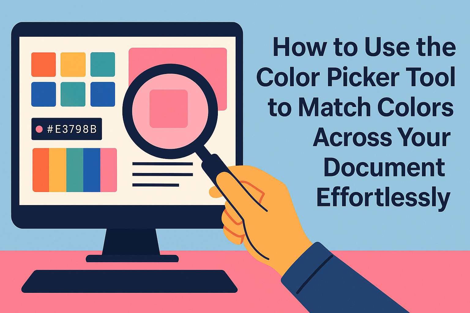
Matching colors in a document can take it from ordinary to professional. The color picker tool is a helpful feature that allows users to select and match colors effortlessly.
By using this tool, anyone can create a cohesive look across text, shapes, and backgrounds in their documents.
Understanding the Color Picker Tool
The Color Picker Tool is an essential feature that helps users select and match colors accurately in their documents. It provides various options to ensure that the chosen colors fit well with other elements in a design or presentation.
Color Picker Basics
The Color Picker Tool allows users to select colors precisely from an image, shape, or text within a document. Typically, it can be accessed by clicking on an icon resembling an eyedropper.
When the tool is selected, the cursor changes, enabling users to hover over different colors.
Once a color is selected, it can be applied directly to backgrounds, fonts, or shapes. This tool is useful for ensuring color consistency across different elements in a project. Users simply click on the desired color, and it will automatically adjust the selected element.
Color Models and Definitions
Color Picker Tools often utilize various color models to represent colors. The most common models include RGB and CMYK.
- RGB (Red, Green, Blue) is used mainly for digital displays. It combines different intensities of red, green, and blue light to produce various colors.
- CMYK (Cyan, Magenta, Yellow, Black) is mainly used for printing. It represents colors through the mixing of these four pigments.
Understanding these models helps users select the right color format for their projects. Different applications may have specific color settings to adjust hues, saturation, and brightness easily. This knowledge empowers users to make informed choices when matching colors in their documents.
Using the Color Picker in Your Document
Matching colors accurately is crucial when working on a document. The color picker tool allows users to select exact shades from illustrations or text. This section will explain how to choose colors, save them for later use, and adjust color tolerance for more flexibility.
Selecting the Exact Color Match
To select the exact color, the user should first open the color picker tool. This can usually be found under the color options in the toolbar of most document editing programs.
Once the tool is active, hovering over a color will show a preview. Clicking the desired color applies it instantly. For precise matching, it’s helpful to use the eyedropper option, which allows users to pick colors directly from images or graphics on the screen.
Saving and Reusing Colors
After selecting a color, saving it for future use can streamline the design process. Many programs provide an option to add the chosen color to a custom palette or color library.
This can usually be done by clicking an option such as “Add to favorites” or “Save color”. Users can easily access these saved colors later, reducing the need to constantly reselect the same shades.
Establishing a personal color palette can improve efficiency and promote visual consistency throughout the work.
Adjusting Color Tolerance
Adjusting color tolerance can enhance how colors are matched and displayed. This setting allows users to fine-tune how closely the colors need to match for them to be recognized as identical.
For instance, if a user is working with a range of similar colors, increasing the tolerance can help include variations that are slightly different.
This feature is particularly useful when dealing with scanned images or various screens displaying colors differently. A little adjustment can make a significant difference in achieving the desired look.
Advanced Color Picker Techniques
Using the Color Picker Tool can greatly enhance design projects. Mastering advanced techniques helps in selecting and managing colors effectively for a more polished look.
Working with Color Libraries
Color libraries are resources that provide a collection of colors. They can be particularly useful for designers wanting consistency across projects.
Most design software includes preset libraries. He can access these by going to the Color Picker and selecting a library option. Popular libraries include Pantone, CMYK, and RGB.
To use a color from a library:
- Open the Color Picker.
- Select “Color Libraries.”
- Browse or search for the desired color.
- Click to apply the color directly to his design.
This feature streamlines color selection and ensures accuracy when matching with industry standards.
Creating a Cohesive Color Palette
A cohesive color palette unifies a design. It helps in expressing a specific emotion or brand identity.
To create one, she can start with a primary color. Then, choose 2-3 complementary colors.
These can either enhance or contrast the primary color. Using the Color Picker, it’s easy to experiment with variations.
Tips for creating a palette:
- Use analogous colors for harmony.
- Include one neutral color for balance.
- Test the palette on various backgrounds to ensure it works well.
By actively managing their palette, designers can maintain consistency and appeal throughout their work.

