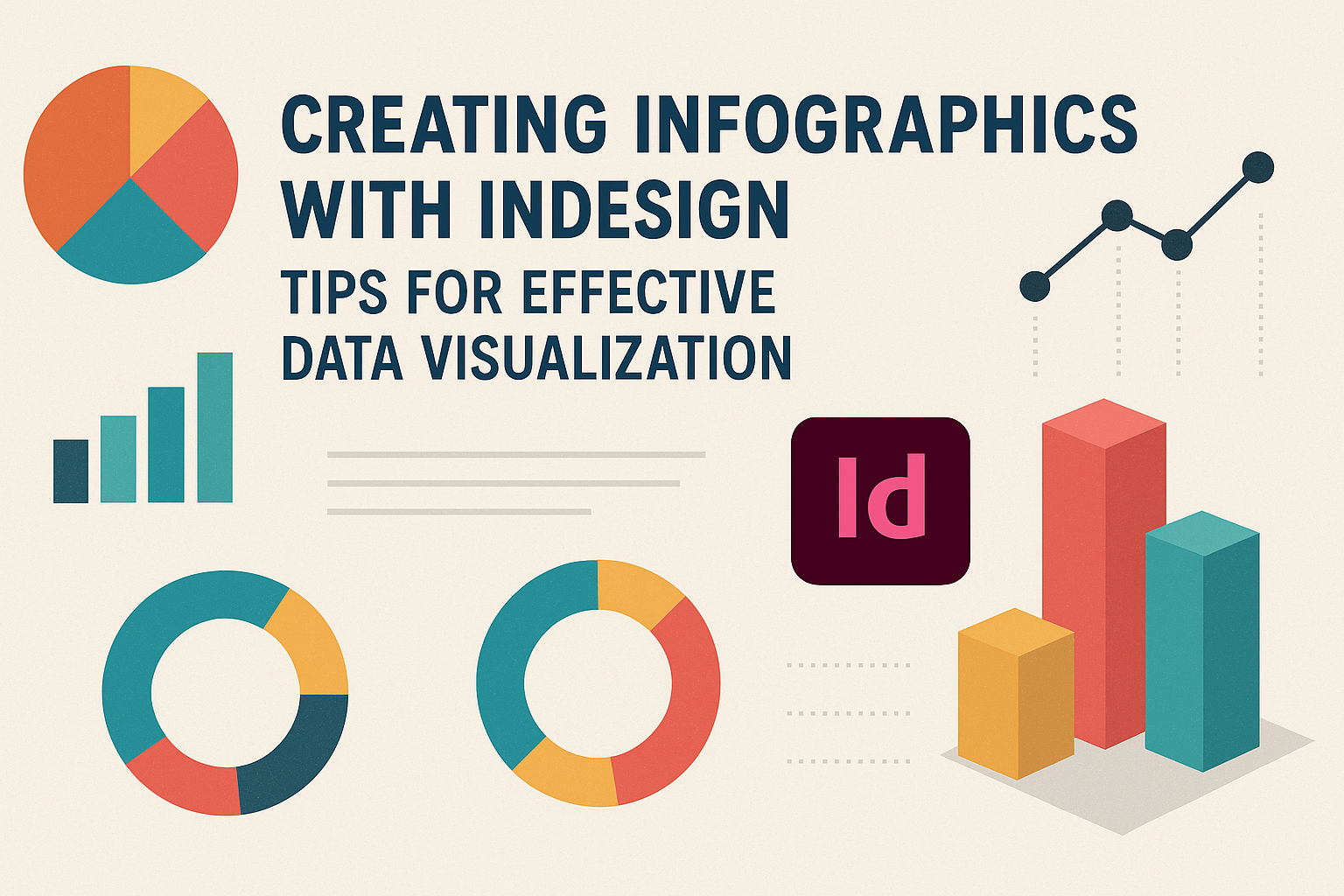
Creating infographics with InDesign is an effective way to visualize data and communicate information clearly. InDesign’s powerful tools make it easy for anyone to design engaging graphics that make complex numbers easier to understand.
This blog post will explore tips and tricks for making compelling infographics, ensuring that the audience grasps key insights at a glance.
Infographics serve as a bridge between raw data and visual storytelling, making them essential in various settings, from business reports to educational materials. They combine text, images, and design elements to present information in a way that is not only informative but also visually appealing.
Readers will learn how to structure their infographics for maximum impact.
Whether a beginner or an experienced designer, creating infographics can enhance any project. With the right techniques and tools, anyone can transform data into visually striking graphics that tell a story.
This article will provide the guidance needed to elevate infographic design skills.
Getting Started with InDesign for Infographics
To create effective infographics in Adobe InDesign, understanding the workspace and how to set up documents is essential.
Familiarity with the panels and menus will make the design process smoother and more efficient.
Understanding the InDesign Workspace
The InDesign workspace is designed to facilitate the design process. It includes several key components: the Tools panel, Control panel, and Pages panel.
- The Tools panel contains tools for editing, selecting, and drawing.
- The Control panel offers options to modify selected objects.
- The Pages panel allows easy navigation among pages of the document.
Knowing where to find these elements helps users create infographics effectively. He or she can customize the workspace layout to fit their preferences, making the design process even easier.
Setting Up Your Document
Setting up a document correctly is crucial for creating infographics. First, open InDesign and navigate to File > New Document.
- Choose Print or Web based on the final output.
- Set the number of pages and deselect Facing Pages for a simple layout.
Next, users should define the page size and margins. Large dimensions generally work well for infographics, especially for print. Proper setup ensures ample space for text, images, and data.
Navigating Panels and Menus
Navigating the panels and menus in InDesign is important for efficient work. Some essential menus include File, Edit, and View.
- The File menu helps with saving and exporting work.
- The Edit menu is where users find options to undo actions or copy elements.
Panels like Swatches and Layers play key roles too. The Swatches panel allows designers to select and save colors easily. Meanwhile, the Layers panel helps manage various elements of the infographic.
Familiarity with these features enhances a user’s ability to create visually appealing designs.
Designing Effective Infographics
Infographics communicate data visually to make information easy to grasp. Key aspects like color choices, layout design, and the use of images and icons play vital roles in their effectiveness.
Choosing Colors and Fonts
Color selection is crucial in infographic design. It helps convey the intended mood and message. For example, vibrant colors can grab attention, while softer tones may suggest professionalism.
Create a color palette with 3-5 harmonious colors. Use contrasting colors for text and background to enhance readability.
Fonts should be simple and clear. It’s best to use no more than two types of fonts to avoid distraction. One font can be used for headings, while another serves for body text.
Choosing the right colors and fonts can significantly impact user engagement.
Creating Layouts and Grids
A well-planned layout organizes information clearly. Start by sketching a few layout ideas on paper to visualize your design.
Using grids can help maintain balance and consistency. Dividing the infographic into sections allows viewers to follow the flow of information easily.
Keep the most important elements at the top or center, as this draws attention. White space is also essential. It prevents clutter and helps highlight critical information.
Maintaining a clean layout ensures a better user experience.
Working with Images and Icons
Images and icons enhance the visual appeal of infographics. They help break up text and can clarify complex information.
Choose high-quality images that relate to the content.
Icons serve as visual shortcuts. They can quickly convey information without needing words. For instance, a lightbulb can represent an idea.
Ensure that images and icons match the chosen color scheme. This consistency adds professionalism to the design. Using a mix of images and icons can make the infographic more engaging and informative.
Visualizing Data with InDesign
InDesign is a powerful tool for creating engaging infographics that effectively display data. By utilizing graphs, charts, and thoughtful design, a designer can make information clear and easy to understand.
Creating Graphs and Charts
Designers can create various graphs and charts directly in InDesign. They can use the built-in tools to generate pie charts, bar graphs, and line charts.
To start, select the “Graph” tool from the toolbar. A window will appear for entering data. Once the data is input, the graph will generate automatically.
Customizing colors, fonts, and sizes helps the graph match the overall design.
Additionally, designers can link Excel files to keep data updated easily. This feature allows for real-time changes, ensuring that the visuals always represent the latest information.
Incorporating Data into Your Design
Properly incorporating data into an infographic is crucial for conveying the right message. Information should be placed where it supports the overall design without overwhelming viewers.
Using hierarchy in font sizes helps guide the reader through the content. Important data points can be emphasized using bold text or contrasting colors.
It’s helpful to include brief descriptions or labels for graphs and charts. This provides context and helps viewers understand the data quickly. The right balance makes the design appealing and informative.
Tips for Clarity and Readability
Clarity is key in infographic design. Keeping designs clean and simple ensures that information is easily digestible.
Choose fonts that are legible and appropriate for the audience. Sans-serif fonts often offer better readability for infographics. Limiting the color palette to three or four colors can also enhance focus.
Using white space effectively allows the design to breathe. Important data should stand out, making it easily identifiable. Finally, test the design with others to gain feedback on clarity and comprehension. This can help identify areas needing improvement.
Finalizing and Exporting Your Infographic
Before finishing the infographic, attention to detail is key. Revising the design ensures clarity and visual appeal. Then, understanding export options allows for the best file type that suits the intended use.
Revising and Polishing Your Design
Revising a design is crucial for a polished final product. Take time to check for any spelling or grammatical errors. Mistakes can distract from the overall message.
Next, ensure that colors and fonts are consistent. Use the same color palette throughout to create harmony.
Adjust images for quality and clarity. Ensuring graphics are high-resolution avoids pixelation in prints or screens.
It may help to get feedback from peers. Fresh eyes can catch things that may have been missed. Make necessary adjustments based on suggestions to enhance the infographic.
Export Options and File Formats
Exporting the infographic correctly is essential. InDesign offers various formats such as PNG, JPEG, and PDF. Each format serves different purposes.
For online use, PNG is preferred for its quality. JPEG is good for photos but may compress graphics. If printing is the goal, PDF is the best option because it maintains quality across different devices.
To export, go to File > Export and choose the desired format. Make sure to set the quality and resolution. For web, a resolution of 72 ppi is common. For print, consider using 300 ppi for crisp images.
Accessibility Considerations
Making infographics accessible is an important step.
Consider using alt text for images. This helps visually impaired users understand the content.
Also, use high contrast between text and background. This enhances readability for everyone.
Avoid overly complex layouts; simplicity aids in comprehension.
Finally, test the infographic with different screen readers to ensure it conveys the intended message.
Making sure that all users can access the information is vital to effective communication.