Canva offers a range of font effects that can transform any design into something special. These effects, like shadows, curves, and animations, help text stand out and capture attention.
Whether it’s for a social media post, a presentation, or a marketing flyer, using font effects can enhance the visual appeal and effectiveness of the message.
With its user-friendly tools, anyone can easily apply various text effects in just a few clicks. From creating eye-catching headlines to adding depth with shadows, Canva makes it simple to elevate a design.
As they explore the different options, designers can discover new ways to express their creativity through typography.
By understanding how to effectively use these features, creators can engage their audience more effectively. The right font effects can make a significant difference in how a message is received.
Users are encouraged to dive into the world of Canva’s font effects and see how they can enhance their projects.
Getting Started with Canva Font Effects
Canva offers a variety of font effects to enhance designs. Understanding how to choose the right font and access different effects can greatly improve the final outcome of any project.
Choosing the Right Font
Selecting the right font is key to any successful design. Canva provides a plethora of fonts suitable for various themes, from modern to classic.
Users can filter fonts by style or popularity. It’s helpful to consider the message each font conveys. For instance:
- Serif Fonts are often seen as traditional and professional.
- Sans-serif Fonts offer a clean and modern look.
- Script Fonts evoke a sense of elegance and creativity.
Experimenting with different font choices allows users to find the perfect match for their design vision.
Accessing Font Effects
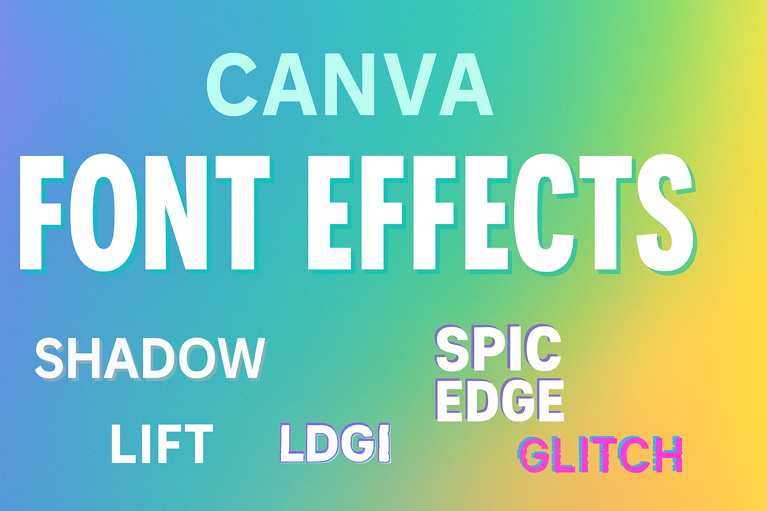
To access font effects in Canva, start by selecting the text you want to edit. After selecting the text, users can find the Effects option in the top menu.
Clicking this will open a side panel with various options. Here are some popular effects:
- Shadow: Adds depth to text.
- Outline: Creates a defined border around letters.
- Glow: Makes text stand out with a halo effect.
Adjusting the intensity, color, and settings of each effect makes it easy to achieve the desired look. Users can preview changes instantly, ensuring their designs stay eye-catching and unique.
Applying Basic Effects
Canva offers a variety of basic text effects that can enhance any design. Two popular effects are shadow and glow, as well as curve and neon options. Each effect can significantly change the look and feel of text in a design.
Shadow and Glow
Adding shadow and glow effects can create depth and make text stand out. The shadow effect allows users to place a dark outline behind the text, making it easier to read over busy backgrounds.
To apply this effect, a user must select the desired text. Then, they can click on “Effects” in the top menu. Options for adjusting the shadow’s color, angle, and distance from the text are available.
Glow works similarly but adds a softer, light-colored outline. This effect can give the text a more vibrant look. Users can adjust the glow’s color, intensity, and spread for different results. Both effects are useful for creating eye-catching titles or emphasis in designs.
Curve and Neon
The curve effect lets users bend text into various shapes, adding a fun element to designs. This effect is great for logos or playful graphics.
To curve text, select the text box, then navigate to “Effects.” Users can choose how much to curve the text, allowing for various styles, from gentle arches to dramatic curves.
The neon effect adds a bright, glowing look to text. Users can choose colors that pop against the background. To apply the neon style, they select “Effects” and pick the neon option. Adjusting brightness and color customization helps fit the glow with the overall design theme. Both effects can elevate any Canva project.
Advanced Text Features
Canva offers some great advanced text features that help users make their designs unique. Spacing, alignment, color, and gradient options play a critical role in enhancing text visuals. Exploring these features allows for better presentation and creativity.
Spacing and Alignment
Spacing impacts how text is perceived. Users can adjust letter spacing (the space between characters) and line spacing (the space between lines) within their text box. This control helps in making text more readable and visually pleasing.
For aligning text, Canva provides options like left, center, right, or justified alignment. Proper alignment creates a more polished look. It can also influence the flow of information, making designs more effective.
Here’s a quick tip: Experimenting with various spacing settings will help users find the perfect fit for their text. A little adjustment can greatly enhance the overall design.
Color and Gradient
Color is vital in text design.
Canva allows users to change text colors easily, helping to convey mood and tone. Choosing the right color can evoke emotions and draw attention.
Additionally, users can apply smooth gradients to their text.
Gradients blend two or more colors, creating a visually striking effect. This feature can be particularly useful for making headlines stand out.
To effectively use color and gradients, consider the overall color scheme of the design.
Picking complementary or contrasting colors enhances visibility and impact. With these tools, users can create attractive text that captures the viewer’s attention.