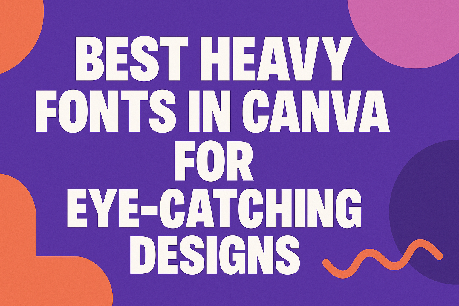
Choosing the right font can make a significant difference in design projects, and heavy fonts are popular for their bold and distinct styles. The best heavy fonts in Canva can elevate any project, drawing attention and making a strong statement.
Whether for a logo, a poster, or social media graphics, the right heavy font can enhance visual communication.
Canva offers a variety of heavy fonts that cater to different aesthetics and purposes. From modern geometric styles like Cosmic Octo Heavy to classic options such as Arturo Heavy, designers have plenty of choices.
Exploring these fonts helps him or her discover the perfect match for their creative vision.
Using heavy fonts effectively can add personality and professionalism to designs. With the right selections, they can create eye-catching visuals that resonate with their audience, making any project stand out.
Understanding Heavy Fonts
Heavy fonts play a key role in design by creating visual impact and attracting attention. They are often used to emphasize important information, making them useful for various projects.
Defining Weight in Typography
In typography, “weight” refers to the thickness of the characters in a font. Heavy fonts, also known as bold fonts, have thicker strokes compared to regular styles.
This difference in weight enhances readability, especially at larger sizes.
Heavy fonts are typically used in headings, titles, and any text that needs to stand out. They can evoke feelings of strength and stability. Designers often consider how the weight of a font complements the overall style of their project.
With Canva, users can find a variety of heavy fonts to suit their needs. These options allow for quick changes and adjustments in design, making it easier to achieve the desired look.
Benefits of Using Heavy Fonts
Heavy fonts offer distinct advantages in graphic design. First, they grab attention and help direct the viewer’s focus. They are excellent for making statements in advertisements, logos, and social media posts.
Using heavy fonts also improves readability in titles and headlines. When text needs to be noticed quickly, a bold font can convey messages effectively.
This makes heavy fonts a popular choice for impactful communication.
Additionally, heavy fonts provide a sense of professionalism. They can enhance brand recognition, as bold typography is memorable and distinct. Many designers find that bold fonts elevate the visual appeal of their work, leading to more engaging designs.
Top Heavy Fonts in Canva
Choosing the right heavy font can make a project stand out. Here are some helpful tips and a selection of popular options that can create impactful design choices.
Canva Font Selection Tips
When selecting a heavy font in Canva, consider the purpose of your design. It’s important to ensure that the font matches the theme of your project.
For example, a modern design may benefit from a bold, geometric font.
Legibility is key, especially for headlines. Choose fonts that are clear and easy to read from a distance. Testing the font in various sizes can help in making a better choice.
Also, consider mixing fonts wisely. Pair a heavy font with a lighter one for contrast. This approach can create visual interest and highlight the main message without overwhelming the viewer.
Popular Heavy Fonts for Impactful Headings
Some fonts stand out as top choices for impactful headings in Canva. Cosmic Octo Heavy features a bold, futuristic look, making it ideal for tech-related projects. It captures attention with its sharp lines and geometric shapes.
Laila Bold is another great option. This modern serif font is versatile and works well for digital and print materials. Its clean design ensures that it remains readable and appealing across sizes.
Arturo Heavy boasts traditional styling while still commanding attention. This font is excellent for creating a classic feel in any project. These fonts help communicate strength and clarity in messaging.
Choosing the Right Heavy Font for Branding
When it comes to branding, selecting the right heavy font is crucial. A font should reflect the brand’s identity and values. It needs to resonate with the target audience effectively.
For a contemporary brand, a font like Geometra can create a modern feel. Its bold weight helps in establishing a strong presence.
In contrast, a more traditional font like Arturo Heavy may suit brands wanting to convey reliability and tradition.
It’s also important to consider the emotional impact of the font. A heavy font can evoke strength, confidence, and urgency. The right choice can help reinforce the brand message and improve recognition.
Designing with Heavy Fonts
Using heavy fonts in design can significantly enhance visual impact and attract attention. It’s essential to consider how these fonts interact with other design elements to create an effective layout.
Contrast and Legibility
Contrast is vital when using heavy fonts. A bold font against a similarly bold background can lose clarity. To improve legibility, designers often choose lighter backgrounds or use contrasting colors.
For instance, a dark font on a light background, or vice versa, often works best. This contrast helps the text stand out and makes it easier for viewers to read.
It’s also helpful to limit text length in heavy fonts. Long sentences can overwhelm the reader. Instead, designers should focus on short phrases or key messages that pop.
Pairing Fonts and Text Hierarchy
Pairing fonts requires careful consideration. Heavy fonts work well with lighter, simpler fonts to create balance.
For example, using a bold headline font with a clean sans-serif body font can establish a clear hierarchy. This contrast allows the viewer to easily grasp the important information first.
Designers can also use varying weights and styles to define sections and guide readers through the content.
A good practice is to keep font pairings to two or three types. Using too many fonts can make the design look cluttered. Limiting choices helps maintain an organized and professional appearance.