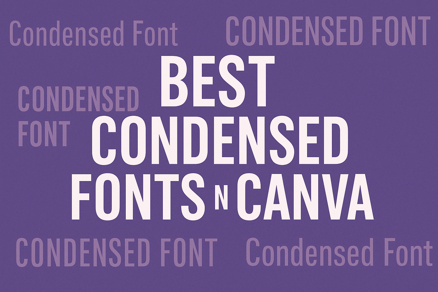
When designing graphics in Canva, choosing the right font can make a big difference.
Some of the best condensed fonts in Canva include Paalalabras Condensed, Bebas Neue, and Six Caps. These fonts are perfect for headlines and titles, giving text a modern and elegant look.
Condensed fonts are great for projects where space is limited but impact is needed. They allow for more text without overcrowding the design while still maintaining readability.
By using these fonts, designers can elevate their projects, making them stand out in a crowded space.
Whether for a poster, social media post, or website header, selecting a condensed font can enhance the overall aesthetic. This blog post will explore the best options available in Canva and how they can be effectively used to achieve stunning results.
What Are Condensed Fonts?
Condensed fonts are typefaces that have narrower letterforms compared to standard fonts. They are designed to save space while maintaining readability.
These fonts can add a modern touch to various design projects.
Defining the Condensed Style
Condensed fonts are characterized by their slim and tall letter shapes. Each letter is designed to take up less horizontal space, making them visually distinct. This style is often used in headlines and titles where the designer wants to attract attention without using too much space.
Many condensed typefaces have a geometric or modern appearance. Some popular examples include Roboto Condensed and Sansterdam Condensed. Each of these fonts maintains clarity, even in a tight layout.
Condensed fonts can vary in weight, allowing for flexibility in design.
Benefits of Using Condensed Fonts
Using condensed fonts offers several advantages for designers. First, they help in creating visually striking headings or titles that stand out.
Their narrow design means they can fit more text into a limited area which is useful in posters or social media graphics.
Moreover, these fonts can enhance the overall aesthetic of the design. They are ideal for modern, minimalist looks.
Condensed fonts also work well in combination with wider typefaces, creating a balanced design. Their efficient use of space makes them a popular choice in various design applications.
Top Condensed Fonts in Canva
Canva offers a variety of condensed fonts that are perfect for making designs stand out. These fonts can be classified into several categories including sans serif, serif, slab serif, and display fonts. Each type has its unique traits, making them suitable for different design needs.
Sans Serif Condensed Fonts
Sans serif condensed fonts are modern and clean, making them ideal for digital designs. They lack the small lines at the end of strokes, giving them a sleek look. Examples include Paalalabras Condensed and Sansterdam Condensed.
- Paalalabras Condensed has a geometric design, making it suitable for headlines.
- Sansterdam Condensed offers a minimalist style that works well on posters and social media graphics.
These fonts maintain readability even at smaller sizes, making them versatile for various uses.
Serif Condensed Fonts
Serif condensed fonts offer a classic and elegant touch to designs. They have small lines or decorative strokes at the ends of letters. This style is excellent for branding or formal invites.
Some popular serif condensed fonts in Canva include Cooper Hewitt. It features strong arches and curves, making it ideal for separating headings and body text.
Using serif fonts can add a sophisticated feel to any design project. They are typically used in print but can also shine in digital formats.
Slab Serif Condensed Fonts
Slab serif condensed fonts combine the modern appeal of sans serif with unique, bold elements typical of serif fonts. This makes them stand out, especially in advertising and branding materials.
One great example is the League Spartan. Its bold letters capture attention while providing clear readability.
These fonts can add a strong character to projects, especially when displaying titles or important messages. They work well in both digital and printed formats, maintaining clarity and style.
Display Condensed Fonts
Display condensed fonts are striking and attention-grabbing, making them perfect for titles or key messages. They often have a creative flair that enhances designs, giving them personality.
Fonts like Six Caps are known for their narrow, tight appearance. This makes them excellent for posters and event graphics where space is limited.
Using display fonts wisely can create memorable designs. They should be paired with simpler fonts to maintain balance and ensure message clarity.
Best Practices for Using Condensed Fonts
Using condensed fonts can enhance design by saving space and creating a modern look. Keeping a few best practices in mind ensures these fonts work effectively without sacrificing clarity or style.
Legibility and Readability
Condensed fonts are often narrower, which can affect legibility. It’s important to choose a font with a clear design.
Fonts like Paalalabras Condensed are designed with high x-heights, making them easier to read at various sizes.
When implementing condensed fonts, limit their use. They work best for headings or emphasized text rather than large blocks of body text. This keeps the design from feeling cramped.
Test your design by viewing it at different sizes. This helps determine if the text remains readable. Choosing appropriate colors can also improve legibility, especially against busy backgrounds.
Pairing with Other Typefaces
Condensed fonts can be paired with regular typefaces for a balanced look. A good combination improves visual hierarchy.
For example, Bondie or Devant Pro can catch attention in a headline, while a simple sans-serif font works well for body text.
When pairing, maintain a contrast between styles. Mixing a bold condensed font with a light, airy font creates visual interest. Avoid using two condensed fonts together, as this can lead to clutter.
Remember to consider the tone of the project. A modern sans-serif may suit a tech blog, while a more playful font can fit creative designs.