Gradients can transform simple shapes into eye-catching graphics that add depth and visual interest to any design project. Users can apply gradients directly to shapes in Canva by selecting their element, clicking the Color tile, and choosing from default options or creating custom gradients with up to 10 different colors. This powerful feature works on backgrounds, shapes, table cells, and frames to create professional-looking designs.
Many designers struggle with making their graphics stand out in a crowded digital landscape. Gradient shapes offer an elegant solution by creating smooth color transitions that draw the viewer’s eye and add a modern, polished look to any project.
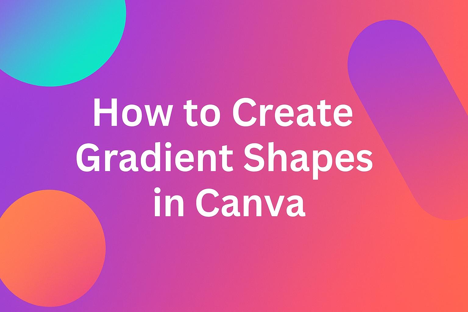
Understanding Gradients and Their Design Impact
Gradients add visual depth and movement to designs by smoothly blending colors together. They help create professional-looking graphics that catch the eye and enhance the overall appeal of any project.
What Are Gradients?
A gradient is a smooth transition between two or more colors that creates a flowing effect. Unlike solid colors, gradients blend seamlessly from one shade to another. This creates visual interest and depth in any design element.
Gradients can be applied to backgrounds, shapes, and other design elements in Canva. They work by gradually changing from one color to another across a specified area. The transition can be subtle or bold depending on the colors chosen.
Common gradient applications include:
- Background designs
- Shape fills
- Button designs
- Header graphics
- Social media posts
The colors in a gradient can be similar shades of the same color or completely different colors. Designers often use gradients to create mood and atmosphere in their work.
Benefits of Using Gradient Designs
Gradients make designs look more modern and professional than flat colors alone. They add dimension that makes elements appear to pop off the page. This visual depth helps draw attention to important parts of a design.
Key advantages include:
- Enhanced visual appeal – Creates eye-catching effects
- Modern aesthetic – Keeps designs current and trendy
- Better hierarchy – Helps guide viewer attention
- Brand differentiation – Makes designs stand out
Gradients also help create smooth transitions between different sections of a design. They can soften harsh edges and make layouts feel more cohesive. Many successful brands use gradient effects in their designs to create memorable visual identities.
The subtle color changes in gradients can evoke emotions and set the tone for content. They work especially well for digital designs and social media graphics.
Types of Gradients: Linear and Radial
Linear gradients flow in straight lines from one point to another. The color transition follows a direct path across the shape or background. Users can control the angle and direction of the color flow.
Linear gradients work well for backgrounds and rectangular shapes. They create clean, structured looks that fit many design styles. The transition can run horizontally, vertically, or at any diagonal angle.
Radial gradients spread outward from a central point in a circular pattern. The colors radiate from the center like ripples in water. This creates a spotlight or burst effect that draws focus to the center.
| Gradient Type | Best For | Effect Created |
|---|---|---|
| Linear | Backgrounds, banners | Clean, directional flow |
| Radial | Circles, spotlight effects | Central focus, burst pattern |
Radial gradients work perfectly for circular shapes and buttons. They can also create interesting background effects that highlight central content. Both types can be customized in Canva with multiple colors and stops.
Setting Up Your Canva Project
Getting your Canva workspace ready is the foundation for creating beautiful gradient shapes. The right template, design format, and artboard setup will make your gradient design process smooth and professional.
Choosing the Right Canva Template
Canva offers thousands of templates that work well with gradient shapes. Users can start with blank templates or choose pre-designed ones that already include gradient elements.
Blank templates give complete creative freedom. They work best when you want full control over gradient placement and design elements.
Pre-designed templates can speed up the process. Many templates already include gradient backgrounds or shapes that you can modify.
Popular template categories for gradient work include:
- Social media posts (Instagram, Facebook, LinkedIn)
- Marketing materials (flyers, brochures, posters)
- Presentations and slide decks
- Business cards and headers
Templates with minimal text work best for gradient experiments. This gives more space to showcase gradient effects without visual clutter.
Selecting Design Formats for Gradient Shapes
Different design formats affect how gradients appear and perform. The format you choose depends on where you plan to use your gradient shapes.
Social media post formats work well for gradient backgrounds and accent shapes. Square formats (1080×1080) are popular for Instagram posts.
Flyer formats provide more vertical space for gradient effects. The standard 8.5×11 inch format gives plenty of room for creative gradient layouts.
Presentation formats need gradients that look good on screens. The 16:9 aspect ratio works well for gradient slide backgrounds and shape overlays.
Consider these format factors:
- Print vs digital – Print formats need higher resolution
- Viewing distance – Large formats can handle more complex gradients
- Color profiles – Different formats may display gradients differently
Understanding Artboards and Layouts
Artboards in Canva act as your design canvas where gradient shapes come to life. Understanding how they work helps create better gradient designs.
Each artboard has fixed dimensions based on your chosen format. These boundaries affect how gradients stretch and display across your design.
Layout grids help position gradient shapes evenly. Canva’s alignment tools make it easy to center gradients or distribute multiple gradient elements.
The artboard background interacts with your gradient shapes. Transparent backgrounds let gradients stand out more than busy background patterns.
Key artboard tips for gradients:
- Use guides to align gradient shapes precisely
- Consider margins when placing gradients near edges
- Test gradients at actual size to see how they’ll appear
- Keep important elements away from artboard edges
Multiple artboards let you create gradient variations quickly. You can copy designs and test different gradient combinations across several layouts.
Creating Basic Gradient Shapes in Canva
Canva offers several ways to add gradient effects to shapes, from using pre-made gradient elements to creating custom color blends with the color picker. Users can adjust gradient direction and save their designs in various file formats for different uses.
Using Built-In Gradient Elements
The easiest way to start with gradient shapes is by searching for pre-made elements in Canva’s library. Users can type “gradients” in the search bar to find built-in options that are ready to use.
Once they find a gradient element they like, users can click on it to add it to their design. These elements come in various shapes like circles, rectangles, and abstract forms.
The built-in gradient elements provide a quick starting point. Users can resize these shapes by dragging the corner handles. They can also layer them behind text or other design elements to create depth.
Customizing Colors with the Color Picker
Users can create custom gradients by selecting an element and clicking the Color tile. This opens the color picker panel where they can modify existing gradients or build new ones.
In the color picker, users should look for the “Gradient” tab. Here they can add up to 10 different colors to create complex gradient effects.
The color wheel allows users to select specific hues for their gradient. They can also input hex codes for exact brand colors. Users can click and drag the color stops to change how the colors blend together.
Key gradient customization options:
- Add or remove gradient colors
- Adjust color intensity
- Change blend positions
- Use brand swatches for consistency
Adjusting Gradient Orientation
The gradient orientation controls how colors flow across the shape. Users can change this by selecting different style presets in the gradient panel.
Common gradient orientations include:
- Linear: Colors flow in a straight line
- Radial: Colors spread from a center point
- Diagonal: Colors flow at an angle
Users can experiment with different orientations to match their design needs. A radial gradient works well for creating spotlight effects. Linear gradients are good for backgrounds and banners.
The preview updates in real-time as users make changes. This helps them see how different orientations affect their design before finalizing.
Saving and Exporting Your Design
Once the gradient shape looks right, users need to save their work. Canva automatically saves designs to the user’s account as they work.
For sharing or printing, users should download their design. They can choose from several file formats including PNG, JPG, and PDF. PNG works best for designs with transparent backgrounds.
Common file formats for gradient designs:
- PNG: Best for web use and transparent backgrounds
- JPG: Good for photos and social media
- PDF: Best for printing
Users can also save custom gradients to use again later. This helps maintain consistency across multiple designs and projects.
Advanced Customization Techniques
These advanced methods help users create complex gradient effects by adjusting color stops precisely, combining filters with blending modes, and using clipping masks to shape gradients into custom forms.
Manipulating Color Stops for Unique Effects
Color stops control where each color appears in a gradient and how smoothly they blend together. Users can create custom gradients by adding up to 10 different colors and positioning them at specific points.
Dragging color stops closer together creates sharp color transitions. Moving them farther apart produces smooth, gradual blends between colors.
The position of each color stop determines the gradient’s overall appearance. Placing multiple stops near one end creates an asymmetrical effect. Spacing them evenly produces balanced color distribution.
Advanced color stop techniques include:
- Creating rainbow effects with multiple closely-spaced stops
- Building sunset gradients with warm colors clustered together
- Making metallic looks using similar shades with slight variations
Users can duplicate existing color stops by selecting them and pressing Ctrl+D. This creates consistent color patterns throughout the gradient.
Adding Filters and Blending Modes
Canva Pro subscribers can apply filters over gradient shapes to create unique visual effects. The brightness and contrast filters work especially well with gradients.
Blending modes change how gradient shapes interact with elements beneath them. The multiply mode darkens underlying content, while screen mode lightens it.
Popular filter combinations for gradients:
- Blur + Low Opacity: Creates soft, dreamy backgrounds
- Contrast + Saturation: Makes colors more vibrant and bold
- Brightness + Warmth: Produces golden hour lighting effects
Layering multiple gradient shapes with different blending modes creates complex color interactions. Each layer should use a different opacity level for the best results.
The overlay blending mode works particularly well for creating vintage or retro gradient effects. It enhances both highlights and shadows in the underlying design.
Applying Clipping Masks for Creative Shapes
Clipping masks allow users to fit gradients into custom shapes like letters, icons, or complex designs. This technique creates professional-looking logo effects and artistic text treatments.
Users first create or select a shape to act as the mask. Then they position the gradient element above it and apply the mask effect through Canva’s layering options.
Steps for creating clipping masks:
- Place the gradient shape above the mask shape
- Select both elements together
- Use the position menu to apply the mask
- Adjust gradient colors and direction as needed
Text makes excellent clipping mask shapes for gradient effects. Bold, thick fonts work better than thin or script typefaces because they provide more surface area.
The mask shape determines the final appearance, while the gradient provides the color and pattern. Users can resize and rotate both elements independently before applying the mask.
Enhancing Gradient Shapes with Text and Graphics
Adding text and graphics to gradient shapes creates visually striking designs that grab attention. The right font choices, icons, images, and animations can transform basic gradient shapes into professional-looking graphics.
Selecting and Styling Fonts
Choosing the right fonts makes gradient shapes more effective and readable. Bold, sans-serif fonts work best over gradient backgrounds because they stay clear and easy to read.
Users should pick fonts that contrast well with their gradient colors. Light text works well on dark gradients, while dark text shows up better on light gradients. Medium-weight fonts often provide the best balance between readability and style.
Font pairing tips for gradient shapes:
- Use no more than two font families per design
- Combine a bold header font with a simple body font
- Avoid script fonts on busy gradient backgrounds
- Test font sizes at different viewing distances
The text generator feature in Canva helps users experiment with different font combinations quickly. This tool shows how fonts look together before applying them to the final design.
Font spacing and alignment also affect how text appears on gradient shapes. Centered text works well for logos and headers. Left-aligned text is better for longer content blocks.
Incorporating Icons and Images
Icons and images add visual interest to gradient shapes without making designs look cluttered. Simple, flat icons work better than detailed ones because they stay clear against gradient backgrounds.
Users can place icons in corners or alongside text to create balanced compositions. White or black icons often show up best on gradient shapes. Colored icons should contrast with the gradient colors to stay visible.
Best practices for adding graphics:
- Use vector icons that scale without losing quality
- Keep icons simple with minimal detail
- Match icon style to overall design theme
- Position graphics to guide the viewer’s eye
Images work well as overlays on gradient shapes when they have transparent backgrounds. Users can adjust image opacity to blend graphics smoothly with gradients. This technique works especially well for logos and brand elements.
Small decorative elements like dots, lines, or geometric shapes can fill empty spaces without overwhelming the design. These elements should use colors that already appear in the gradient.
Combining Gradients with Animations
Animations bring gradient shapes to life and make designs more engaging. Simple movements like fade-ins or slide effects work well with gradient backgrounds without being distracting.
Canva’s animation features let users add motion to both gradient shapes and the text or graphics on top of them. Subtle animations work better than flashy effects for professional designs.
Popular animation types for gradient shapes:
- Fade: Text appears gradually over gradient backgrounds
- Slide: Elements move in from sides or top/bottom
- Zoom: Graphics grow or shrink to draw attention
- Pulse: Shapes gently expand and contract
Users should time animations so text appears after the gradient shape loads. This creates a smooth reveal effect that looks professional. Fast animations (under 2 seconds) keep viewers engaged without being annoying.
Animated gradient shapes work well for social media posts and presentations.
Exporting and Sharing Gradient Designs
Different file formats work better for different uses, with SVG being ideal for web graphics and PNG working well for social media posts. The right export settings help maintain gradient quality across platforms.
Choosing Optimal File Formats
PNG files work best for most gradient designs because they preserve color quality and transparency. They’re perfect for social media posts, presentations, and print materials.
JPEG format compresses files smaller but can reduce gradient smoothness. Use this format when file size matters more than perfect quality, like for email attachments or web images.
PDF files keep the highest quality for professional printing. Choose this format when sending designs to clients or print shops.
| Format | Best For | Quality | File Size |
|---|---|---|---|
| PNG | Social media, web | High | Large |
| JPEG | Email, web | Medium | Small |
| Printing, professional | Highest | Large |
Exporting as SVG for Web Graphics
SVG files scale to any size without losing quality, making them perfect for web graphics. They work well for logos, icons, and website backgrounds with gradients.
Most web browsers support SVG gradients natively. This means faster loading times and crisp graphics on all screen sizes.
To export as SVG in Canva, users need a Pro account. The SVG format keeps gradients smooth and allows developers to modify colors later if needed.
Limitations include limited support for complex effects and filters. Simple gradient shapes work best in SVG format.
Tips for Social Media and Professional Use
Social media platforms compress images, which can affect gradient quality. Export at higher resolutions to maintain smoothness after compression.
Instagram works best with square or vertical designs at 1080×1080 pixels. Facebook posts look good at 1200×630 pixels for optimal display.
For professional presentations, use PNG or PDF formats at 300 DPI. This ensures gradients look smooth on large screens and projectors.
Brand consistency matters when sharing gradient designs. Save color codes and gradient settings to recreate the same look across different projects and platforms.
Comparing Canva Gradients with Other Design Tools
Canva offers a simpler approach to creating gradients compared to professional software like Photoshop and Illustrator, though each platform has distinct advantages.
Canva vs. Photoshop for Gradient Shapes
Photoshop provides advanced gradient tool options with precise control over color stops, opacity masks, and blending modes. Users can create complex radial, linear, and angular gradients with unlimited customization.
Canva simplifies the process with pre-made gradient elements and backgrounds. Users simply search for “gradient” in the elements panel and apply ready-made options to shapes and backgrounds.
Color management differs significantly between platforms:
| Feature | Photoshop | Canva |
|---|---|---|
| Custom color stops | Unlimited | Limited |
| Gradient editor | Full control | Basic adjustment |
| File formats | PSD, TIFF, PNG, JPG | PNG, JPG, PDF |
| Learning curve | Steep | Minimal |
Photoshop excels for professional print work requiring precise color matching. Canva works better for social media graphics and quick web designs.
The gradient creation process in Canva takes seconds rather than minutes. This speed advantage makes it ideal for content creators who need multiple designs quickly.
Canva vs. Illustrator and Illustrator Artwork
Illustrator creates vector-based gradients that scale infinitely without quality loss. The illustrator artwork maintains crisp edges at any size, making it perfect for logos and print materials.
Canva’s gradients are primarily raster-based when applied to shapes. They work well for digital use but may pixelate when enlarged significantly.
Advanced typography support sets Illustrator apart. It handles Arabic and Hebrew type with proper text direction and character formatting within gradient designs.
Canva’s text tools are more basic but sufficient for most Latin-based languages. Complex typography projects requiring right-to-left text flow work better in Illustrator.
Gradient mesh capabilities in Illustrator allow for photorealistic color transitions. Users can create complex lighting effects and dimensional appearances that Canva cannot match.
However, Canva’s template system speeds up the design process. Users access thousands of pre-designed gradient combinations without starting from scratch.
Benefits of Canva Pro for Gradients
Canva Pro unlocks additional gradient options and premium design elements. Subscribers access a larger library of gradient backgrounds and shapes compared to free users.
The brand kit feature allows teams to save custom gradient combinations. This ensures consistent branding across multiple designs and team members.
Advanced transparency controls in Canva Pro enable better gradient layering. Designers can blend multiple gradients together for more complex visual effects.
Pro users get priority access to new gradient styles and seasonal color palettes. These premium gradient options update regularly with trending design styles.
Background removal tools work seamlessly with gradient overlays. Users can isolate subjects and place them over custom gradient backgrounds with one click.
The magic resize feature adapts gradient designs across different social media formats. A single Instagram post with gradients automatically adjusts for Facebook, Twitter, and LinkedIn dimensions.
Pro subscribers also receive higher resolution exports. This benefits gradient designs intended for print or large-scale digital displays where quality matters most.